Marx Design breaks down thinking behind GoodFor’s beautiful (and award-winning) eco-design

Idealog: What is the driving idea or concept behind the design you’ve done for GoodFor?
Ryan Marx, founder of Marx design: At the time the flagship GoodFor store was in Ponsonby, Auckland. GoodFor is a wholefood refillery whose vision is to make sustainable shopping easier by eliminating plastic packaging. We needed to create a brand that would resonate ethically and visually with Ponsonby locals to be successful and become a destination for shoppers outside of the area.
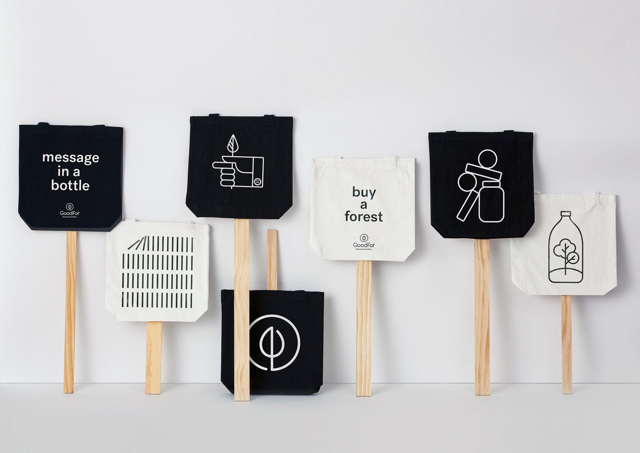
Our single minded idea for the GoodFor identity and brand communication is embracing the ethos of reduction. The GoodFor logo symbolises the circle of recycling and their pledge that for “every purchase made at GoodFor we plant a tree”. We connected the ‘scoop and the leaf’ into the brand symbol.
GoodFor now has four stores in Auckland: Ponsonby, Parnell, Mt Eden and Takapuna.


What was the design process like in figuring that out? Did you face any challenges along the way?
We had a very tight deadline of three days before Christmas 2016 to get the logo complete, due to the client (James Denton, my brother-in-law) needing to move quickly for production reasons. We had three designers each working on a concept. The logo was created first, with the brand communication piece starting after the Christmas break. GoodFor’s vision and concept was clear, so we had a lot to hang on to. From the outset our job was to visually communicate reuse, recycle, scoop and ‘planting a tree’ in the logo. We presented three logo concepts in total – James loved our favourite concept.
As the client was family, we saw it as an opportunity to make some mischief in the early stages. We presented a bunch of fake logos just to mess with him. One logo was leaf symbol with the words “the incredible bulk”. It was completely silly and James went very red and very quiet in the presentation. Once we let on that it was a wind-up there were some relieved belly laughs. Having some fun helped reduce stress levels with a really tight deadline for the real concept.


Once we got back from our Christmas break we got started on the brand communication piece. We had a cork wall installed in the studio and started pinning quick prototypes of designs to get the juices flowing. It was a really collaborative process with long discussions on what was working and what wasn’t. We were challenging reduction to find the perfect balance in the executions. This gave us the insight of only using one colour, the design being very mono with typography and illustration in the same line width. We challenged every concept to make sure it held true to the ideas behind the brand – there is a really fine line between sophisticated and basic. Tristan our design director at Marx, broke GoodFor’s key messages down into two categories “ethos” and “offer”.
Ethos = better for the planet and offer = high quality organic food. Another insight came from the humour of “the incredible Bulk” copy in the fake logo’s. We gauged reactions and discovered the brand could come across as too earnest and worthy. We engaged with Kate Hughes, an amazing Auckland copywriter, to write a bunch of light hearted and witty copy for the various touch points.
How would you describe its look and feel?
Ethical, modern, timeless and witty.
Was this quite an easy job to take on, design-wise, seeing as GoodFor is such a unique brand in the New Zealand market? You didn’t find yourself stuck for inspiration ever?
We were very hungry for the opportunity to work on a project like GoodFor. Marx is mostly know as a packaging-design company, yet clients often ask us if we work on brand and brand communication work. Winning a Gold at the Best Awards for the GoodFor project has really solidified Marx as brand designers and built internal confidence in our abilities.


Did you find GoodFor’s values/brand ethos to be nicely aligned with your own?
It 100 percent percent aligns with our own. As a packaging design company, we feel responsible for helping make sustainable packaging more accessible to consumers. We are researching new materials and recommending alternatives to clients. As part of a working group led by the Sustainable Business Network coming up with solutions to deliver to the 2025 Packaging Accord, we see ourselves as part of the solution. Through our own recycle and reuse behaviour, learning, advocacy and design stewardship we aim to continue to make a difference.
How has it been received in the market? What kind of feedback have you had?
It has received a very positive response. GoodFor opening more stores proves both the proposition and the brand have been successful. As for Marx, this is a portfolio piece we are most proud of.


Can you tell us a bit about Marx Design and how it came to be?
Marx Design is in its 10th year this year. I was working as a freelance designer and simply had too much work to manage on my own. That’s when I set up the company with my wife Pru, and we started to build our team. We’ve been lucky to attract really talented staff and contractors and our work continues to attract awesome briefs and clients from New Zealand and Australia. I am the managing director and creative director, leading the design team to create the very best work.
There were some key hires that have propelled the business forward. Five years ago we hired our now general manager, Janine Bickerton who joined Marx as an account director. She was our first Accounts Service hire and we were lucky – Janine’s industry expertise and business acumen have been integral to our growth. Another key hire was design director Tristan O’Shannessy an outstanding designer whose talent has added another level to the business.
I’ve always made sure the work is the hero and truly believe we are only as good as our last project. Marx works on having a differentiating idea to ‘hang-on’ to in our design process. There is a real desire to push our work and deliver the best outcomes for the client, creatively and commercially.


What are some of your favourite projects you’ve worked on prior to GoodFor?
We are really lucky as there many historical projects we are still really fond of. As a design company you find yourself looking forward more than looking back, although I believe we learn a lot from our previous work and it’s important to reflect on it. If I strip back any of the projects I most proud of they have a strong idea that relates to a real consumer need and have a strong reason for being. All our favourite projects have a strong client relationship and a fond memory of the journey with the design team. And to be honest, they were the hardest projects to crack. Three projects that come to mind are: True Honey, Living Earth and Thankyou.
I read you’re based in Birkenhead within an emerging community of design studios who’ve fled the inner city. Who’s in there with you, and what’s this experience been like leaving Auckland’s concrete jungle behind?
Inhouse, PHD 3, Sea Change and Unordinary are all based in Birkenhead. I hear International Rescue have just purchased a building up the road as well. We moved here from Britomart six years ago. At first I felt unsure about where we were as it wasn’t seen as a cool place to be. I kept on telling myself it’s about the work you produce, not the fancy address. Now that there are more of us ,it makes it a really nice creative community. We are so happy with the area we have just purchased a building and will make Birkenhead our permanent home. Coffee is great, parking is easy and we enjoy a great view of the harbour.


