
Deconstructing design: ‘Modern: New Zealand Homes from 1938 to 1977’
Have you ever wondered what the inspiration was behind a beautiful piece of design? ‘Modern: New Zealand Homes from 1938 to 1977’ is one of those books that makes you want to dig deeper and not just see it as words and images on a page. We’re not the only ones that think so highly of it – the book was the overall winner at the this years PANZ Book Design Awards, held in July.
We sat down one rainy evening with the designer behind it all, Arch MacDonnell of Inhouse Design.
Typography
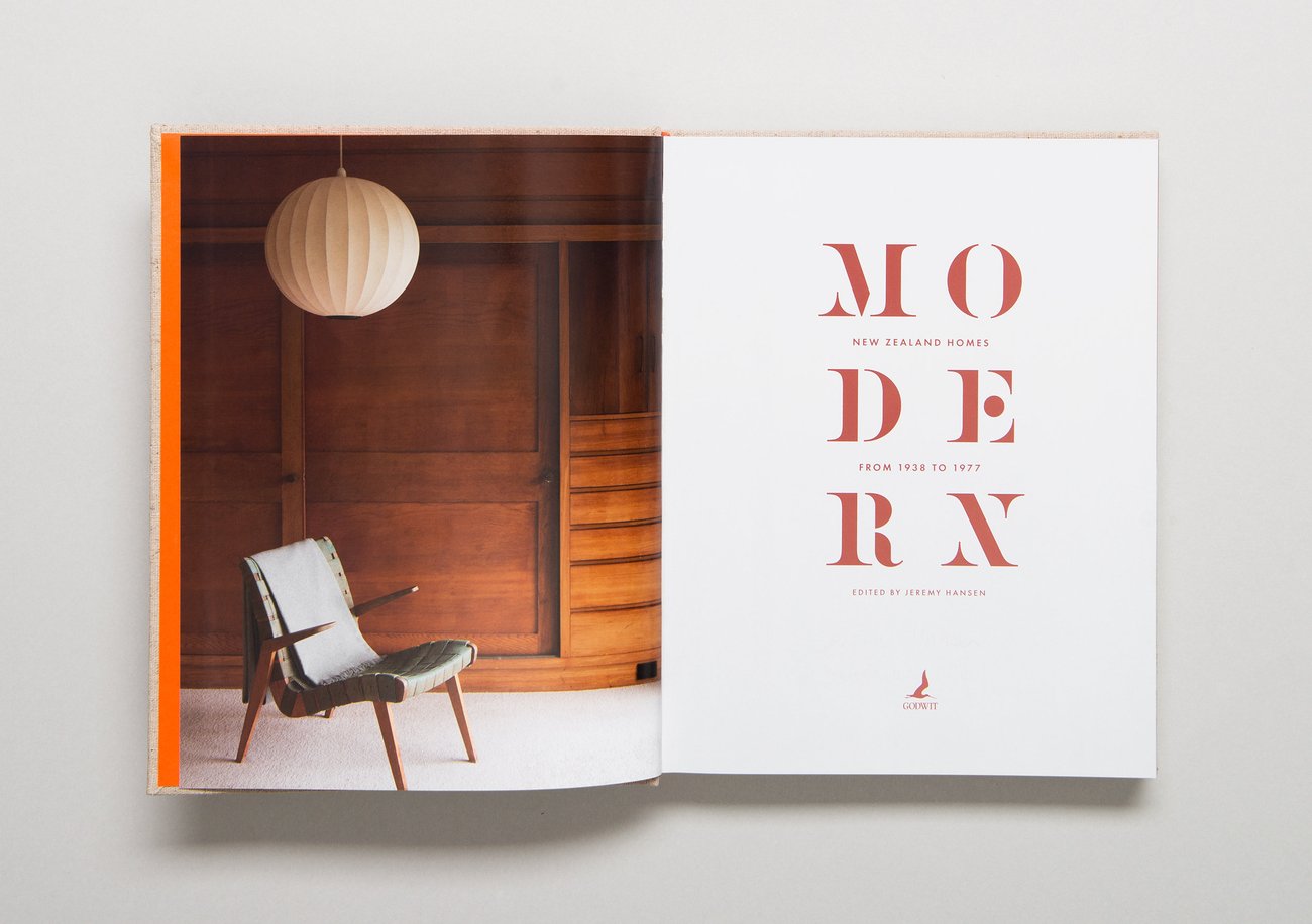
The book is about modernism, the architectural trend which took New Zealanders out of villas and cottages into sleeker, more open plan homes. For this reason, Arch MacDonnell wanted the typography to give a nod to the modernism era.
Sabon, the main body serif font, was a product of the modernist period – it was designed by the German typographer Jan Tschichold between 1964 and 1967 to be “the most readable font in the world” at the time.

Meanwhile the title font Grist, while actually created in 2012, “harks back to that time”, says Arch.

The PANZ judges chose Modern for best typography category because “the typefaces are period, but set in a contemporary way that makes them seem new and fresh”. This is particularly noticeable at the beginning of each new chapter, where Arch was able to “show a clear typographic hierarachy”.
The chapter numbers also allowed the designer to show off the numeric side of Grist which, as he says, can sometimes look a bit like “an odd collection of geometric shapes”.
Dust jacket and cover
Although Arch was more excited about the minimalist embossed linen design of the cover, one of the specifications for the book from the publisher was that it should have a dust jacket. He saw this as an opportunity to do something a little out of the ordinary.

The judges liked the fact that the dust jacket of ‘Modern’ had the type for the book title and the other details set into a background which was the same colour as the type in the main body copy.
Folded up, the jacket has the book title and description which unfolds into a poster-sized panorama of the interior of one of the profiled modernist period houses.

As well as working as a single, large photo, Arch wanted the dust jacket to create independent images when it was wrapped around the book. The front, spine and back of the book are all fragments of the larger image, but somehow they also work independently of each other. Having a dust jacket also meant Arch didn’t have to include any information apart from the six letters of the title on the front of the book itself. He could just concentrate on the typography.
“The jacket hides a wonderfully bold piece of stacked typography deeply embossed into the linen case,” the judges said. “It not only says ‘Modernism’ but ’70s’, ‘design’ and architecture simultaneously.”
Colour
Arch looked to his childhood when choosing the colour scheme for Modern. The rusty brown primary colour – which also serves as a wash over the photos on all the pages at the beginning of a chapter – was inspired by terracotta tiles common in many 1970s homes. He paired this with a poppy orange, the colour of one of his family’s old lounge suites. These colours worked well with the warmth of the photographic material.

Photography
Photography is a major component of the book, and led to Modern taking out the Best Illustrated book award. Arch says he tried to get lots of the photos to bleed across a double page so as to achieve maximum impact. The trouble was he was incorporating a lot of older photographs with different formats – square, for example – so instead he often bled the image to one edge of the page.

The photos were ordered in such a way that the reader would feel they were physically moving through the house, he says. This often meant starting at the outside, going through the rooms of the house and then finally ending up outside once again.
Arch also wanted to make sure that when two photos appeared next to each other, they related to each other in some way. This could be to do with the focal point, colours or angles. This subtly made the pages more harmonious, he says.

See here for more of the winners from the 2014 PANZ Book Design Awards.