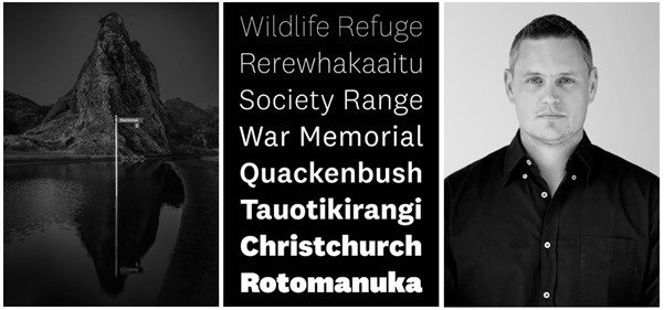

The exhibition, titled There is no such thing as a New Zealand typeface, is on display at Objectspace’s main gallery space from Friday 29 June to Saturday 4 August. It explores the 10-year time period between the release of National and National 2, and questions whether the unique 31,744 letterforms have integrated into our physical and digital design culture during the decade our nation was searching for a way to define our design language.
First released in 2007 by Sowersby’s independent typeface design studio, Klim Type Foundry, National was a local response to the typefaces on the international stage. Exploring the relationship between type and space, Sowersby noted the origins and uses for typefaces around the world; The British have Gill Sans, the French, Garamond, the Italians, Bodoni, the Swiss, Helvetica.
Aotearoa had few typefaces to choose from beyond reaching for international faces, prompting Sowersby set out on a mission to create a typeface that local designers, brands and organisations could use to communicate with that was wholly New Zealand.
“There may be no such a thing as a New Zealand typeface, but anywhere we want to say New Zealand we seem to reach for National,” says Dean Poole from Alt Group.
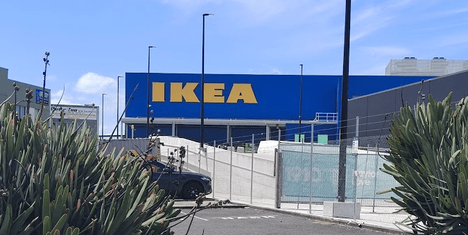
Now National is everywhere, especially here at home. It’s on the front cover of the Anthology of New Zealand Literature and in the New Zealand Fashion Design encyclopaedia. It’s there every time you pass a Z petrol station or a Westpac billboard. It’s at Te Papa Tongarewa, the Christchurch Art Gallery, and throughout the branding of Victoria University. It’s on everything at Xero. It’s the face of newzealand.com for New Zealand Tourism. It’s even been pulled into politics by the Green and Labour parties.
Furthermore, Sowersby told Radio New Zealand that despite its popularity in New Zealand, around 95 percent of its sales are overseas, and that he suspects by and large, most font sales are an emotional response to the shape of particular letter forms.
“Typefaces can say things about who we are and what we represent; they also say things about who we would like to be and what we would like to represent.
“Typefaces give form to the alphabet. They function as carriers of information, selected and circulated through labour, capital and culture. We encounter letterforms daily, but most of the time we are oblivious to their origins or craft. Yet it is through use that typefaces become meaningful to people – and not just to designers. When a typeface is used intensively within a community of practice, over time it can become a signal for that community’s values. That typeface might say things about who belongs to that community and what they represent,” Sowersby explains.
Claude Garamond’s typeface is a cornerstone of the French typographic tradition, while the Swiss’ Helvetica became synonymous with the global exposure it provoked with the International Style. Considering this, Sowersby pondered his National typeface and what it means within the local context nearly 10 years from its initial release.
Sowersby sought to refine the aesthetics of the original National typeface, releasing National 2 in 2017. It was Klim Type Foundry’s largest family to date, with 64 fonts over four widths.
As he was redrawing the letterforms, Sowersby reflected on his motivations 10 years prior as being a “confused, pseudo-patriotic impulse” and the state of visual communication in a modern world, where typefaces undergo “endless re-contextualisation.”
Through the act of reading, we may be unaware we are in the presence of a piece of New Zealand design. With 31,744 unique letterforms in the National 2 family, Kris Sowersby could be considered New Zealand’s most published designer while his audience remains unaware of his output.
Typefaces have personae and create atmosphere, but these characteristics seldom point back to their place of origin or their maker. This poses the question: Is there such a thing as a New Zealand typeface? Head along the Objectspace to find out.


