
What do you do when you need to end a campaign after years of successful promotion?
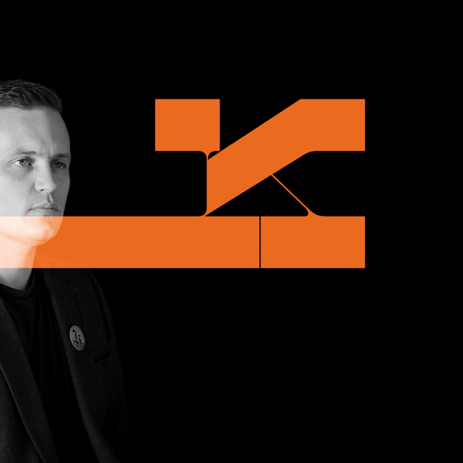
While wiping the slate clean and starting from scratch would be the obvious answer, Tourism New Zealand has gone the path of reinvention, updating the iconic slogan by way of a new ’100% Pure’ logo created by Rangi Kipa and typographer Kris Sowersby.


Kris Sowersby, via Fontfont.com
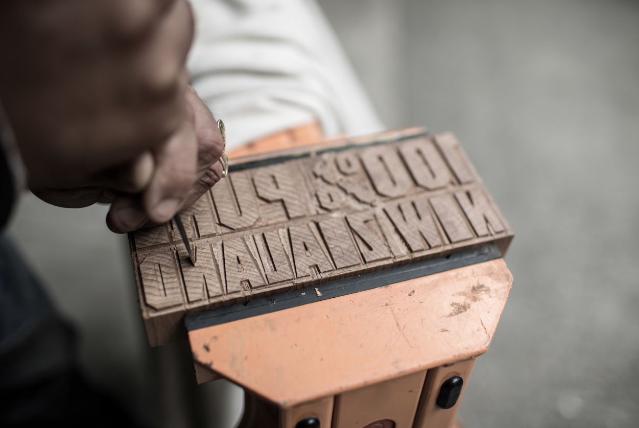
Hand-carved by Kipa out of natural kauri wood, the new logo sports a font designed by Sowersby called ‘Pure Pakati’.


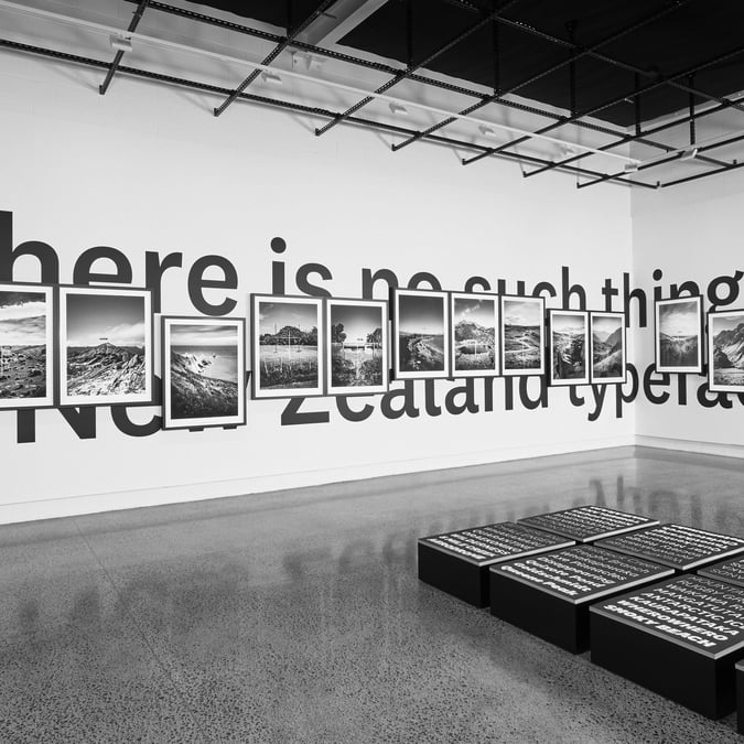
According to design director Philip Kelly, the art director of Whybin TBWA, the new typeface is a reflection of our national identity.
“The brief that was set up was about showing New Zealand through this lens of being a place where it’s beautiful culture, people, and landscape embrace,” Kelly says.
For Kelly, that meant updating the typography. The original type came from old pharmaceutical type made in the 19th Century, and what it said about our national identity, according to Kelly, was not ideal.
“The only thing unique about [the original logo] was the percentage mark, which used the North and South Islands,” he says.


By carving it out of kauri, the grain of the wood becomes part of the visual motif, making the logo “unmistakably from this place”, says Tourism NZ chief executive Kevin Bowler.
According to Kipa, New Zealand as a whole is coming to terms with its cultural identity and starting to embrace its diverse heritage.
“The reality is that the demographic in New Zealand is changing, and it’s changing rapidly,” Kipa says. “M?ori and Pacific communities are growing larger than Pakeha, and anyone in business will realise that.”
“The time of my grandparents and my parents’ generation, where the pendulum of power, public opinion, and education, was skewed to one side. Now it’s swinging back, and that’s a good thing,” Kipa says.
This is especially true with businesses such as ANZ decorating their ATMs with a Matariki design, and a company tohu designed by Derek Lardelli set to be released by BNZ. Companies such as Air New Zealand and Sealord have also incorporated tikanga into their branding.
For Kipa, the most important part of promoting ourselves on the international stage means being sure that what we do is anchored in our identity and unique world view, and the new logo for Tourism New Zealand is the first step in the right direction.


