Kris Sowersby talks etching New Zealand into the global typographic landscape


Photograph by Daniel Rose.
In 2005, Kris Sowersby set out to carve new spaces in the sparse fields of type design in Aotearoa. After graduating from Whanganui School of Design in 2003, he made a risky move, and opened the Klim Type Foundry in Wellington. At the time, aside from the bricks laid by Samoan New Zealander Joseph Churchwood, type design was mostly shipped in from overseas and New Zealand lacked any coherent contribution to the visual typographic landscape. Findlay Buchanan chats candidly to Kris Sowersby about the changing nature of type design in Aotearoa, questions its meaning and value in our lives, and discusses his plans for the future.
In the 14 years since he founded his business, Sowersby has sewn our national fabric into the global tapestries of type design. His work touches local supermarkets, airlines, galleries, petrol stations, bank notes, products, apps, newspapers, websites, cars and political parties.
He has gained strong international recognition, he was named an ADC Young Gun in 2010 and is one of two local members in the Alliance Graphique Internationale, an elite club of the world’s leading graphic artists and designers. He has won all sorts of pins at the Designers Institute of New Zealand’s annual Best Award awards: purple ones, gold ones and a black one, too. And he is now one of ten recipients of the 2019 Arts Foundation Laureate, for design and typography.
His first release, Feijoa, was distributed to the international market in 2007. Then came National in 2008, which won a Certificate of Excellence from the New York Type Directors Club. Later, in 2014, Sowersby was commissioned by The Financial Times to draw a typeface family for its redesign – a serif named Financier, was designed to be an “elegant, authoritative serif with versatility”, which he details alongside his many other creations and accolades in his blog.
Sowersby’s work has been widely covered, used, and referenced by type designers across the world. The typical, prodigious, storyline of the Hastings man who rose from the ashes to reach international acclaim has been told by many. To the point where his wife and business partner, Jess Sowersby, mentioned prior to this interview: “He [Kris] does lots of interviews so always prefers to be asked questions that are fresh”. Here is an attempt.
Kris Sowersby may be globally acclaimed, but he is still “slightly bogan”. He was born in Hastings and enjoys provincial metal and rock bands like Beastwars and Head like a Hole. His voice is a sort of Shayne Carter and Jermaine Clement fusion – a regional yet intellectual tone – which is comforting and familiar but also honest and intimidating to chat with on the phone.
Asked how a bogan fits into the esoteric international design community, he says, “The design community is full of pretty normal fucking people. There are bogans through all strata of life and society.”
Sowersby says it’s difficult to know whether his upbringing in Hastings and education in Whanganui have informed a certain style of type design, similar to say, the distinct lettering that Neil Pardington created for the book Parihaka: The Art of Passive Resistance, which was said to have a uniquely Māori or Pacific voice.
“I would say that wherever you grow up or put down roots influences you as a person and how you think and act. But how exactly my lived experiences translate into my typefaces, I really don’t know,” Sowersby says. “I don’t think you could point to a certain style and say ‘Ah, yes, there is a serif, you’ve definitely lived in Whanganui.’”
The move to set up the Klim Type foundry in Wellington was a timely one. In the early 2000s, the internet continued to shift the discourse of type design, from a heavy industrial process practiced by few into a cheap and accessible industry exercised by many.
Fortunately, Sowersby exploited these new independent freedoms. Klim sold, and continues to sell, its typefaces directly through the website, using a variety of forms and styles, both for retail use and custom typefaces. Sowerby has also been able to explore his own national backyard, a relatively empty space in the global typographic landscape.

“There is no local tradition or easily identifiable style of making type and so there were no expectations or ancestry to guide. So that was liberating. On the other hand, there was nothing easily to grasp so it was a bit harder to see what I was doing. I look at the international typographic historic corpus as pretty well up for grabs, so I take quite freely from everywhere else.”
The design community is full of pretty normal fucking people. There are bogans through all strata of life and society.
People freely take from his depository, too. It is the ever-evolving nature of type design, similar to many other creative practices, whereby typefaces are pulled from an existing lineage, changed, and then put back out to the world to be used and manipulated again.
“I’m not entirely concerned about the idea of originality, but I am very interested in the idea of a continuation of an idea or a style or genre. Particularly for making fonts for New Zealanders that New Zealanders could use. To perhaps give them a voice and embed it into the visual culture,” Sowersby says.
“I was wondering yesterday if I will be alive to see my work revived or interpreted in a fundamental way, then that would be quite lovely.”
A new culture
Sowersby has seeded a new vision for type designers here in Aotearoa. As a recent graduate from the musky communications course at Wellington’s Massey University, many close friends studied design and were often heard quoting his blog to classmates for strong posturing in the library.
His blog has served as more than romantic fuel for excitable students, though. It’s become a sort of informative design diary, a rare local resource for the type community, but also an opportunity for Sowersby to give back to a community that didn’t exist for him as a student.
“To some degree, I’m writing to myself 15 years ago when I didn’t really know much and wanted to know how things came about and the thinking behind them. I’ve found a very important part of what I do is explaining why it happened and how it happened rather than just presenting the final thing.”
The blog is scrupulous, funny, and well written. He dispatches what typefaces are and equally what they aren’t, shares updates of his work, and unearths problems, which for many don’t yet exist. It’s refreshingly accurate in a world plagued by mistruths and slovenly terms. In one post, he rebuffs the idea that a typeface is a tool, declaring: “The assertion ‘a typeface is a tool’ is a typical justification for making new typefaces. It’s convenient, reassuring and sounds practical. It’s also false.”
So, are there other semi-slanderous terms communicators should be wary of using to describe typefaces? He says, “Nothing comes to mind. Probably because those phrases are so embedded into how we think. You have to stand quite a way back to examine what they are. Within the type community there are things that get bandied about like legibility and readability. Those things are often conflated. Sometimes a stylistic trait of a typeface will be said to aid readability, which is bullshit because there is no proof. It’s true because it is part of the designer’s intention, but it is simultaneously not true because there is no way you could prove it.
“There are ideas that float around, like serifs are easier to read than san serifs. There is not a lot of proof to back this up. And there is also the weight of tradition. So, it is hard to convince a newspaper to typeset the entire thing in a san serif because it’s always pretty much been serifs. You end up with a loose, unproven idea coupled with the weight of tradition and those things are very hard to move.”
A mixed perception of type design in Aotearoa
It’s difficult to gauge how much businesses and communities value type design here in Aotearoa. On one hand, entire design campaigns are built on a considered typeface, then on the other, typefaces can be completely neglected from the design process.
“Certain styles and aesthetics of graphic design can rely quite heavily on the typeface. It can do a lot of heavy lifting,” Sowersby says. “But that is the exception rather than the rule. A lot of visual communication is more than just the typeface: colours, imagery and illustration and motion that goes into it as well.”

Perhaps, a strong example of its neglect was during Auckland’s Semipermanent 2019 festival, when graphic designer, educator and fellow member of member of the Alliance Graphique Internationale Eric Brandt used an analogy about how the movie Avatar cost billions to make due to its expensive CGI budget with the best designers at Weta working on it, and yet someone made the decision to use the Papyrus font for the title.
Sowersby says, “I think it [typography] is valued as much as anything else, not really that much. Unless you have someone that knows about it, is trained about it, or is passionate about it. It is just how it is, the mahi is to make it valuable and understood, so people can make conscious choices rather than reflexive choices to use Papyrus for Avatar.
“But on the other hand, you know, that might have been a very deliberate, conscious choice. James Cameron might have absolutely loved Papyrus and saw within it inherent visual qualities that went along with his mediocre movie.
“As designers we hate it, we say ‘Ew, Papyrus, it’s a default font’, but for everyone else it might have been quite appropriate. I assume typographic knowledge and understanding is a lot like anything else. You can’t have everything all the time.”
Telling the story
This discussion ties into another part of Sowerby’s work, which is to communicate the meaning of type design to the wider public. It presents a difficult challenge, because for most of us, typefaces are processed subliminally. We read words but forget about the typeface that makes them visible.
Therefore, communicating the value without ballooning its meaning into something else requires an acute balance.
“Typefaces work in plain sight. They are so blatant yet invisible at the same time. That’s the tricky area that I’ve been working in, the myriad ways the alphabet can be expressed,” he says.
To help explain the narrative, Klim has teamed up with local design firm, Alt Group, to present exhibitions, campaigns and public talks. It provides new grounds for local designers and communities who can examine the value of local design, understand the context of its work, and consider the wider importance of design practice.
I’m not entirely concerned about the idea of originality, but I am very interested in the idea of a continuation of an idea or a style or genre. Particularly for making fonts for New Zealanders that New Zealanders could use. To perhaps give them a voice and embed it into the visual culture.
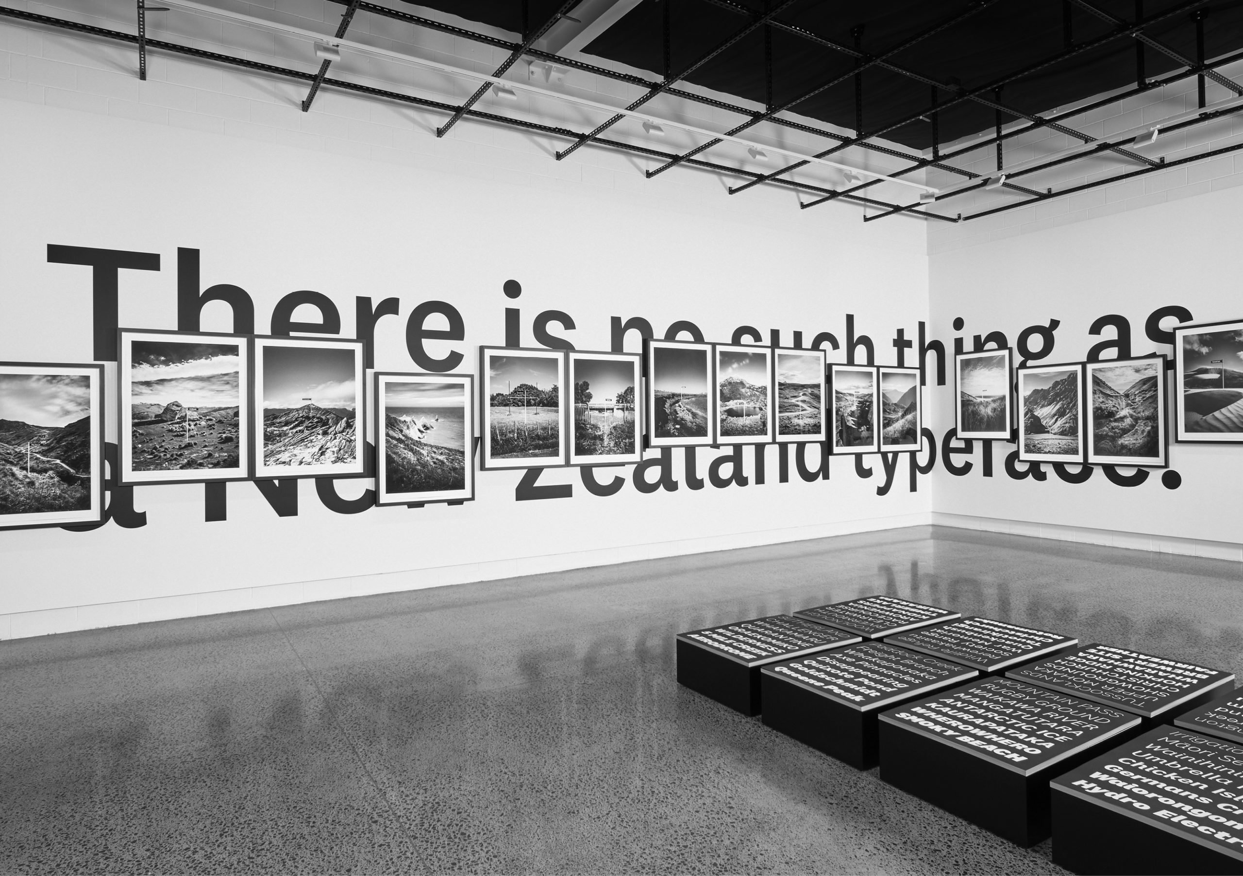
An example was the exhibition held at Objectspace last year called There is no such thing as a New Zealand Typeface, which explored whether a typeface could have an accent. It asked questions about the relationship between typography and place, text and landscape, and ultimately identity. And provided the public with a small beam of light into the otherwise blurry, arcane, field of typography.


Sowersby credits his wife Jess, who came on board with Klim almost four years ago and deals with marketing, media and sales, with guiding and broadening the horizon of what Klim can achieve as a foundry.
Part of that, he says, “is working with Alt to realise and manifest typographic concepts”.
“On one hand it is marketing, creating a campaign around a typeface and creating an understanding of what a typeface is and what it can mean. On the other, it helps me understand what Klim is, what Klim can be, and what a type foundry can be and mean to others,” Sowersby says. “From that aspect it has been great. The flow-on effect financially has been great, sales are better than ever.”
New types, new digs
Sowersby is currently working on, “about seven [typefaces] seriously and twenty or forty are bubbling away at various stages”, which seems like quite a few projects to juggle at once, but he doesn’t see it that way.
“I don’t work from start to finish on a single typeface in a linear manner, there are always multiple streams of typefaces in various stages of production or completion. So, if one hits a wall or gets held up or goes off for mastering, then I can move onto something else.
“It is quite nourishing and helps me to maintain fresh eyes and fresh focus from project to project. But, that’s not unusual for any design process.”
Furthermore, there are many other works in incubation. Klim is set to unveil a new website in the next month or two, which Sowersby says, “will trash everything about the old one and start fresh”.
Sowersby adds, “We are launching a new typeface, Söhne, which is my version of Akzidenz-Grotesk, we’re building a studio, we’re working on a book, and there are another few fonts up our sleeve, which we are building campaigns and merchandise for.”
Asked when the studio is set to be complete, Sowersby says, “Any time you talk about building and timelines you curse it by fifteen percent by price and time. We’ll see, patience with these things is always appropriate.”


