Money where their mouth is: K?kako promotes the circular economy while embracing new brand and new HQ

As K?kako director Mike Murphy says, the company added a macron to its name – changing to “K?kako” from Kokako – following a discussion with marketing head Olivia Coote about the importance of macrons and preserving M?ori culture. “We needed to be mindful of our values.”


Coote expands. “It all happened really organically.”
Helping out with changing to the new name in brand collateral (signs, products like coffee bags and boxes, social media, etc.) was design firm Design Dairy – who just so happen to be a shareholder in the company and have been working with K?kako for more than a decade. Murphy says Design Dairy also helped with the “subtle refresh” of helping tighten up the K?kako brand, using its logo more horizontally, retaining the iconic kokako mascot (the native New Zealand bird from which the company gets its name), and incorporating the colour blue into K?kako designs. Lots of blue.


Murphy says that’s deliberate. The blue colour comes from the wattle of the endangered kokako – but there’s also another reason for embracing it. “Blue is a colour that’s very trustworthy,” he says. “Because we’re a very open, very transparent company, that was important.”


So, there’s the new name and refreshed brand identity for the aesthetic and commerce side of things. Then there’s the physical side – namely, a recent move into a new building in the Auckland suburb of Mount Eden.
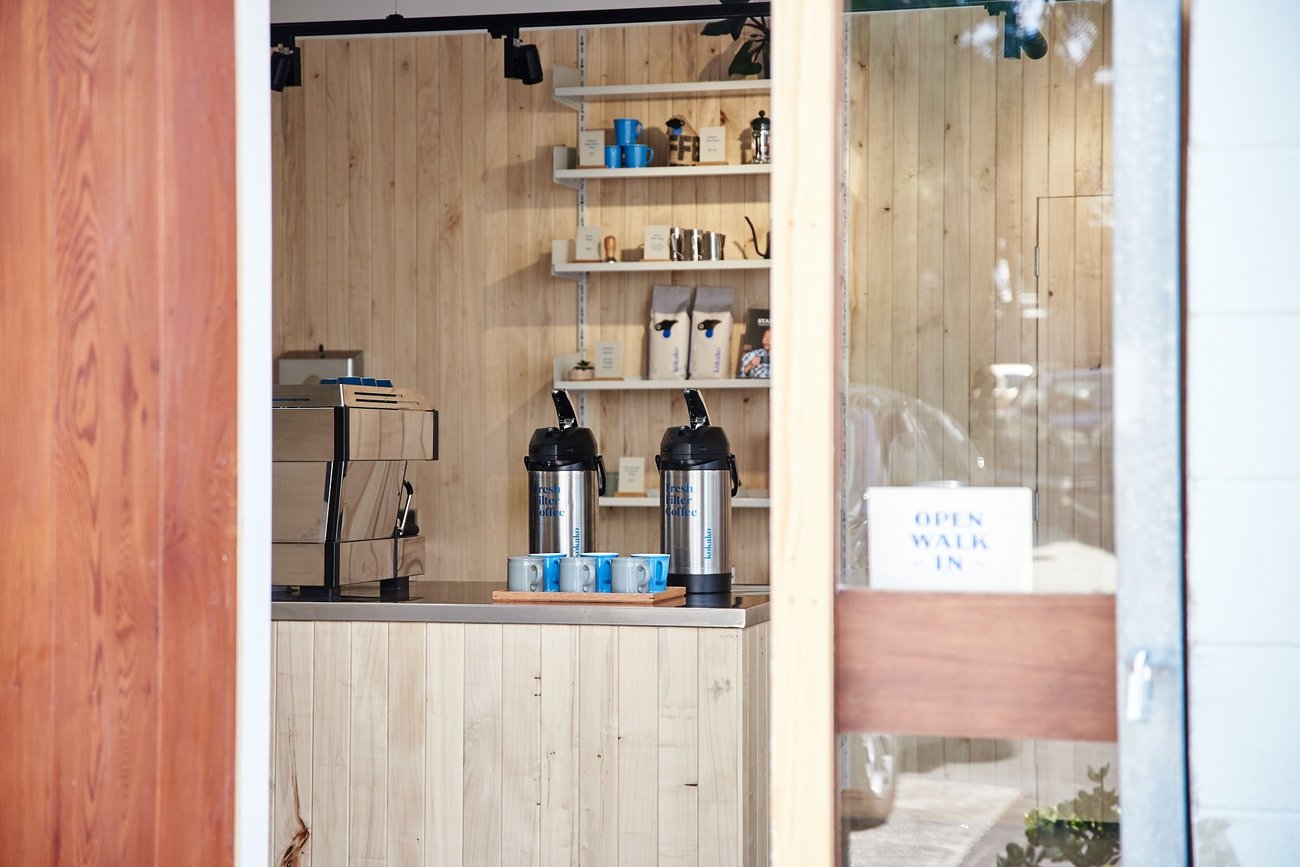
An old engineering warehouse built in the 1970s, design firm CTRL Space – who have also bought in to K?kako – helped transform it from a drab, run-of-the-mill warehouse into a coffee-lover’s and environmentally conscious citizen’s dream.


With goals of conveying a sense of openness, transparency and environmental consciousness, a number of steps were taken to help get those messages across – and also make it a place people would want to work. Natural light was emphasised. All the wooden door and window joinery was reused and/or came from salvage yards. The interior wood cladding was sourced from nearby Eden Terrace.


So… is this an example of the “circular economy,” the idea of reusing things and minimising waste and environmental harm? You bet. After all, consider this, too: the front door of the new HQ was salvaged from a home in West Auckland. A coat rack, bench seat and retail shelving were all already there, and simply reused. The double doors leading into the meeting room were repurposed from the same house as the front door. The reused wooden cladding is sustainable and fast-growing New Zealand poplar, specifically from Auckland timber company South Pacific Timber. Murphy says his company’s belief in the importance of the circular economy was something CTRL Space completely embraced, and was more than willing to assist with.


Murphy says there are valuable lessons to be learned as a result of the rebrand and move into the new building. “Understand your purpose and your values,” he says. “You need to be able to look in before you can look out.”


There’s another lesson he says other businesses can learn from, too. “The result isn’t just about having a good designer. It’s about having a good brief.”


For her part, Coote says the commitment to sustainability goes beyond even the fact many of the new HQ’s equipment was also bought secondhand, because “you don’t have to have the latest thing.” The rebrand is not yet complete, she says, because they didn’t want to have to throw out bags with the old name and logo because they’d already been printed.


Now that’s putting one’s money where their mouth is.


