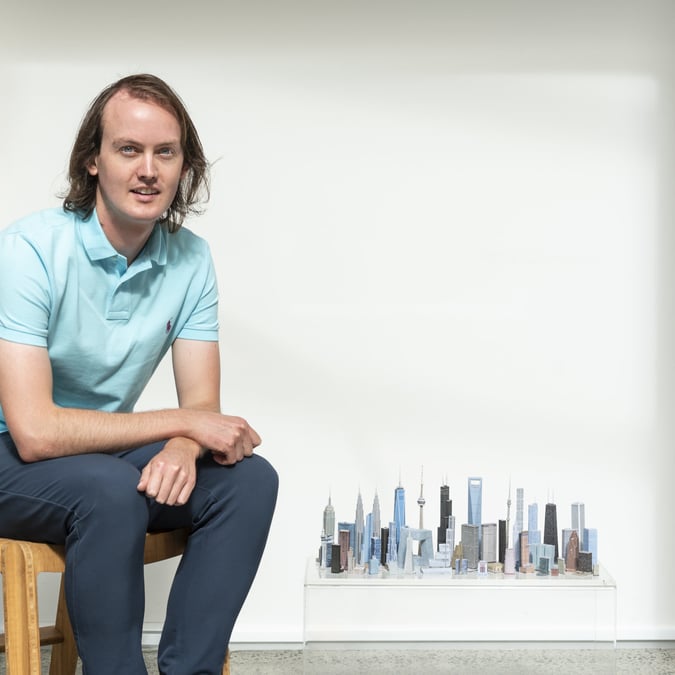

With fourteen years experience at some of Australia’s leading brand and design agencies, Christopher Doyle’s work has won a number of local and international awards. Featured in articles for Desktop, Creative Review, and Grafik Magazine, he’s been focusing on his own design studio – Christopher Doyle & Co. – since 2013.
He’s also sold a piece of nutri-grain for $1035 on eBay. True story.
==========


Christopher Doyle
You have a “what we don’t” section on your website. Is it a revolving door or are things being constantly added?
Ha! I should actually update it more often. The list that is on there covers the big issues though, like running in public and my struggles with exercise and the outdoors. These are the big ice breakers in new relationships.
Where, and when, did you start doing design?
I started in Canberra. I failed to get into fine art school which crushed me at the time but in hindsight was a blessing in disguise, both for me and any future audiences that would have seen my ‘art’. Everyone dodged a bullet that day. Graphic Design was my fall back. But once I started I fell in love with it.


You moved from Saatchi & Saatchi to start your own brand. What was that like, and what were the good and bad bits?
I was actually at two studios after Saatchis before setting up. I built up to setting up on my own for a number of years. I think most designers daydream about it at some point. Setting up on your own is a weird mix of fear and liberation. It’s hard work but I had been fortunate enough to learn from so many great designers and business folk that that I felt like I could have a crack.
The best part of working for yourself is the freedom to construct your own routine and pursue the type of work you want to do. It’s incredibly challenging not having a big team of people around you, but ultimately very satisfying.
The most important lesson you’ve learnt so far?
Every person you work with is a walking personal reference, whether you like it or not.
“Just copped my first ‘A five year old could’ve done that’.” How’d that go down?
As you can imagine, fairly annoyingly. It’s frustrating that as designers we work incredibly hard to achieve simplicity and balance only to have the results be perceived as basic and plain. Even more frustrating was that it came from the clients mother in law who had’t even sat in the presentation. I actually considered asking her to get her son to have a crack at it. If they prefer the result, they should go with it.


Where do you get your inspiration?
From everyone, everywhere, always. The amount of influence we have around us is overwhelming. It’s about editing it all and finding the best bits.
Name one project that has influenced or excited you more than any other.
I often come back to the Ministry of Stories organisation and in particular the Hoxton Street Monster Supply store. The idea behind the initiative is fantastic and the execution of it all is just amazing. It’s clever, beautiful and exists to help others.
Tools of the trade?
Pencil and sketchbook. Obviously I spend an enormous amount of time on the Mac but when I think about my process I see a pencil and a notebook.


One piece of advice for any designer, whether they’re just starting out or seeking new opportunities?
Design is about other people. Something designers often forget.
You once sold a piece of Nutri-Grain for $1035. What the hell?
I did, yes. It was about ten years ago. I spotted it in my cereal and thought I’d put it on E-Bay and see what happened. From there it just kind of blew up. A couple of radio stations picked it up and then it started popping up in newspapers around the world. I did radio interviews on the BBC and television interviews here in Australia. It was absurd and lots of fun.
E.T. appears in Nutrigrain from Ian Haigh on Vimeo.


