
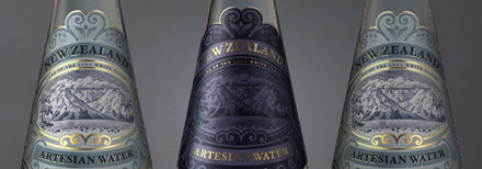
New Zealand’s premium bottle design has been pure minimalism of late, but NZ Beverages Limited went the polar opposite when choosing a design for the soon to be launched New Zealand Artesian Water.
The look of the still and sparkling waters had to speak to both Chinese and New Zealand markets, where it will be sold in exclusive restaurants of each country. Dealing with two completely different languages, the message couldn’t be relayed through words alone.
The packaging was tasked to Marx Design director Ryan Marx and team members Ali Irons, Amanda Clarke and Alan Hughes.
The result is a premium livery stamped with gold foil, curling around a picturesque Aotearoa setting. “People have said to me that it’s one of the most beautiful bottles they’ve ever seen,” says Ryan.


The team wanted to create something that was pure New Zealand, and designed the line-drawn logo off the inspiration of historical Kiwi stamps from the early 1900s.
The bottled water will launch in New Zealand later this year.
Photos courtesy of Marx Design