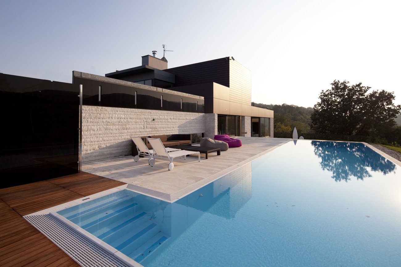

Over-design. It’s a phenomenon that tips architecture into the realm of art and occurs when we lose sight of the critical form/function balance. It’s bespoke for the sake of it and, while there’s a place for that, New Zealanders are in danger of overdosing. It happens too much and too often. And, like a high-class drug habit, only the top one percent can afford it. The rest of us die trying.
Celebrated US graphic designer Milton Glaser (responsible for the iconic I ? NY logo) said there are three responses to design: Yes. No. And Wow. But should ‘wow’ be our go-to architectural aspiration? It’s an irksome conundrum that bad design and ‘wow’ design gets noticed instantly, whereas good design flies under the radar. Homes that have the wow factor invariably fall into the over-design camp.
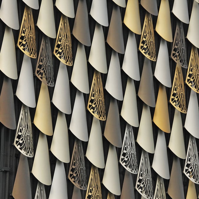
While architects designing such homes often pay lip-service to a search for simplicity and call their approach reductionism, the cost is quite the opposite. To produce something that looks simple requires complex detailing and fine workmanship. So it’s partially responsible for inflated building prices. When over-design (OD) kicks in, it is to the detriment of the client, both to their enjoyment of the object and to their bank account.
Are clients completely blameless? No. Inspired by articles in glossy magazines and modernist-style homes in TV adverts, expectations are ratcheted up. Insidiously, they become hooked on OD. Ask the Scandinavians what good design is and they’ll talk about the surroundings, sustainability, longevity, performance and return on investment. Ask a Kiwi and they’ll zero in on aesthetics. We are so addicted that we end up living in glorified barns we can’t afford to pay for. Arguably, we don’t really understand what ‘good design’ means.
In more mature markets, they see design differently. In the South of France, for instance, architects are constrained – the roof has to be terracotta tile sourced locally, the external walls are plastered. There are even dictates about what exterior walls and fences should be made of. This is not something planners dreamt up yesterday; guidelines have evolved over centuries. Such rules are based on ideas of permanence and produce landscapes with local identity. They have context.
Here we complain about the RMA and building-code compliance. Dare I suggest that we don’t need fewer rules; we need more that encourage good design for a greater number of people! To compound matters, New Zealanders are addicted to the polished and immaculate: products like ply panels, rectified tiles that are micro-millimetre perfect and shiny stuff that requires continual maintenance to look good and flies in the face of the entropic forces of nature. In France and the UK, buildings that are 100 years old are still beautiful; here houses more than 20 years old look shabby.
It’s clear, an intervention is required. But who will affect it? Don’t look at architects. Precious few are thought leaders in this respect. They are not the people at industry conferences such as those run by Prefab NZ who are trying to find a solution to the affordability problem. Instead the rooms are generally filled with builders, engineers and material suppliers.
Maintaining the form/function equilibrium is traditionally the domain of project co-ordinators who bring the strands together. This is the case in other industries (automotive, marine, aeronautical) where the designer is one of the skills coordinated by a main project hub. All parties contribute to the hub (the architect, interior designer, quantity surveyor, engineer, accountant and client) on a level playing field with no big egos involved. But in NZ, this skews towards a designer-driven process. So decisions naturally lean towards artful aesthetics.
We are not advocating Cold-War boxes with no regard to form. Design has to evoke some excitement. But if architects are to increase their influence in the built environment, they need to be part of the solution to produce houses that are nicely designed, perform well and are cost-efficient over the lifetime of the building.
Once clients understand the outcomes of OD they might very well drive this rehabilitation themselves, ditching design narcotics that for cost, performance and durability don’t stack up. Walls of glass are one hard habit to break. In NZ, we get our fix with an entire wall of glazing only to find that in winter it feels cold while in summer it’s too hot and the shades are drawn. Similarly, enough is never enough when it comes to the hallowed indoor/outdoor flow. In Europe, even high-end homes have limited sliders. The view is not hugely impeded and it’s easy to access the patio. Yes we should design for our temperate climate but not at the sacrifice of having $20K stacking sliders in economy-class homes.
Our love of exotic timbers – timber used for decking and detailing that is grown in a Patagonian forest and only be harvested in July beneath a blue moon – is equally inexhaustible. This has a huge carbon cost. Moreover, industry monopolies mean New Zealand only grows pine, not the many native timbers that could also work, and we’re not investing in a reliable supply of clay products. If designers started to demand these products, we might get them. Instead suppliers drive the market.
Kitchens too are regularly over-designed as massive rooms (chefs favour smaller spaces with everything within reach) and make it to the ‘must have’ list along with the ‘compulsory’ en suite. (Again, in Europe, this is the domain of the top few percent; the majority of families share a single bathroom and a separate toilet.)
Moving outdoors, garages, often located on the best part of the site, usually end up as big, ugly storage boxes. What’s wrong with a carport where the roof flows out and over the parking space?
Another architect-driven folly is the internal gutter – far riskier than exterior gutters in terms of water ingress and more maintenance hungry. The roof structure has to be adapted and extra trades involved for the installation. Plus the homeowner has to actually get up on the roof to check them. In a similar vein, the ‘flat’ roof (the minimum pitch is 3 degrees in New Zealand so no roof is actually flat) is a money pit. A fortune is spent surrounding them with parapets for the semblance of flatness. As a result there is redundant framing, flashings and extra detail needed to fake it. And we wonder why houses are so expensive to build.
One structurally ambitious project that flies in the face of the form/function balance has become a much-loved icon. Built in 1976, the Titirangi house for photographer Brian Brake is an undisputed example of ‘wow’ design. Its architect Ron Sang says it is, “without question, one of the best houses I have done” but also postulates that owning it must be akin to owning a vintage car – expensive to run, with leaks. Today the Brake house is a work of art and worthy of the deep-felt emotion it elicits. It no doubt fills its owners with pride, brings them joy – and an ongoing drip-feed of maintenance bills and running costs.
What will it take for us to give up our addiction to over-design, our yearning for the expensive, unreliable beauty of the Jensen Interceptor, and go cold turkey? The steadfast Toyota, a car that has never inspired poetry or song but doesn’t do anything badly, awaits its time in the sun. It is simply under-rated good design.


