
Different strokes: Inside the design of Auckland University’s Centre of Innovation and Entrepreneurship
How would you describe the look and feel of this space?
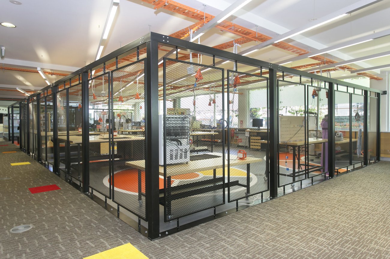
The space is fun and vibrant with an industrial feel. The Makerspace area is steel, mesh, hard surfaces, with bright orange cable tray. The idea is to provide a great functional space with that element of unpredictability.
What kind of research did you do to inform the design?
As the space needed to accommodate multiple uses – people making goods/products, hold collaborative workshops, allow for quiet space, host meetings and for people to hangout – we needed to pull on the knowledge we had gained from designing co-working spaces and multipurpose spaces. We also needed to interview the users that would engage with the space, and the university also informed us of what students they wanted to attract and how they wanted the space to be used in the short term and the long term.

There are three different spaces here. How do they differ from each other?
They differ based on functionality. Every space is designed with a particular user and function in mind. The colours and furniture simply enhance that function. If it is the collaborative areas, the furniture can move allowing larger or smaller groups to congregate.
Is there anything in particular that you think stands out about this space? What’s your favourite feature?
The Makerspace area stands out. It’s dynamic, industrial and colourful. It was a key part of the entire space utilisation, and the design fulfills that because its presence really does dominate the space visually. My favourite part in this area is the orange cable tray that goes overhead.
Often when you inherit a space there are some elements you need to maintain from a cost perspective. Sometimes they are not ideal and we do what we can to minimise. With this site we hit the jackpot: there was overhead linear lighting that was run on a diagonal, which is something we would have looked to do ourselves to make the collaborative areas dynamic as well, not the poor cousin of the makerspace. So this was a great win and another favourite element.

Flexibility is key theme in modern interior design. How did you integrate that into this design? And why is it important?
Everything can move – except the built walls. Flexibility in some places can be overdesigned and over utilised, endeavouring to factor for the ‘what ifs’ and maybes. Generally we find if it’s not easy to move then people won’t, and this can be because it may have some cabling attached to it, or it’s clunky and heavy (we find that with wind-up stand up desks, if it can’t be done quickly and easily then it won’t be done). So everything in this space was made to be light, user friendly and easy to move. With a space this size and the variety of people that use the space, we also can’t put user manuals everywhere, so it really has to be obvious and easy to change or move around. For a space like this, flexibility is important because it serves many people and is required to provide multiple solutions. Inflexible spaces are too restrictive for this type of environment.
Biophilia is big at the moment. How have you used plants to soften the industrial feel of some of the spaces?
Plants are such a great way to soften a space, especially if there are hard surfaces and industrial elements. It also adds another colour without it being a painted wall or other fabric material. Plants are a dynamic element in themselves as they change/grow etc. Plants can also add visual breaks to a space, minimising the long view across a space, creating nooks or more defined area. I’m a big fan of plants in spaces. It adds life and always a lift to any design.

It’s often the way a space works, rather than how it looks, that sticks in people’s minds and that’s certainly the case for a lab like this. What were some of the smaller, practical things you needed to consider?
Absolutely. The initial impression will be aesthetics, and shortly after its function. And the function is what is talked about long after we have left the space – that becomes your resume – if it’s being used to its full potential and working well then this is a big win. The smaller, more practical things in a space like this were ensuring good WiFi, ensuring plenty of power outlets for people charging their phones, and making sure acoustics were considered, especially with the maker space in the same area. Specific to the Makerspace area we had to get into the mind of a user, to figure out where would they put tools, how would they operate their bench, how we can protect them and others passing the space from any hazards, how to keep movability/flexibility (e.g. by having power come from above). A great design looks great, but works incredibly well and in this case, makes users want to engage with it and use all the available spaces.

How did this differ to other non-academic spaces you’ve designed?
We pulled on research and experience from the myriad of non-academic spaces – the large open area was largely set up how we would design a co-working space where there are to be multiple user groups and multiple functions. The Makerspace component is very unique, we have not done anything remotely similar to this. But I think experience is not always required, as long as you endeavor to understand the users and their requirements. Never assume.
- To see what Spaceworks can do for your business, visit spaceworks.co.nz.