The changing face of fast food: Inside the design of KFC’s new urban restaurant
KFC, the fast food chain prized by many Kiwis for its buckets of delicious fried chicken, has entered the fast-casual restaurant space. For those unfamiliar, a fast casual restaurant is defined as a dining joint that offers the ease and convenience of fast food, but with the sit-down, relaxed atmosphere of a restaurant.
This has been seen in the explosion of casual-yet-artisan burger franchises like Burger Burger, while fast food giants have made moves in this space in recent years, such as McDonald’s introducing self-service meal customisation kiosks and table service.
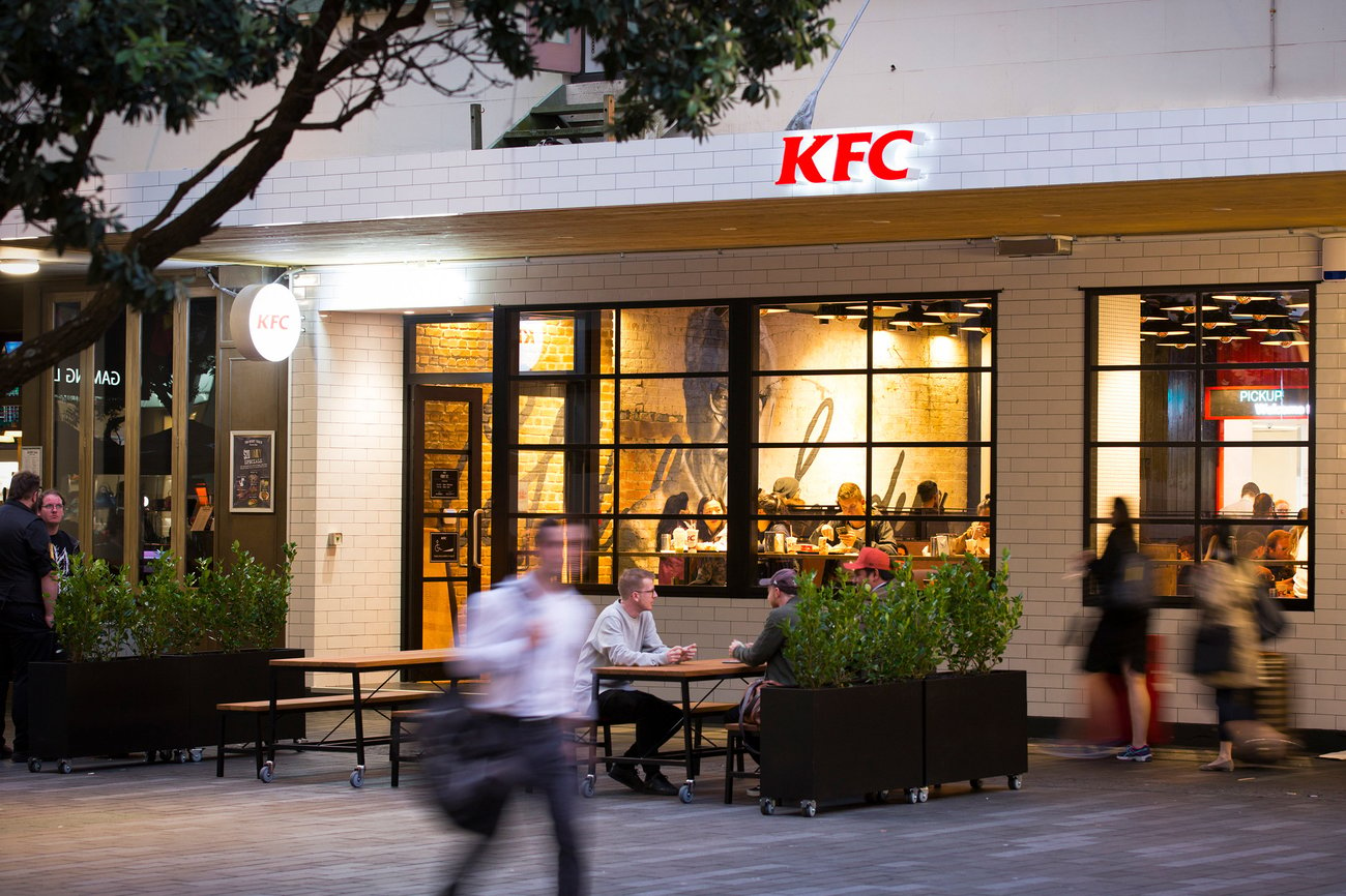
However, KFC’s new Fort St store is brand-new territory for the brand. Considering the restaurant’s urban, central city location, it isn’t the usual location the brand sets up shop in – usually, it can be found off a main highway or populated road where there’s ample space for a drive-thru.
In fact, driving in the Fort St area can prove to be very difficult, with the shared street spaces being dominated by walkers and the parking options slim.

It was these factors that led to KFC’s owner, Restaurant Brands, to come up with an entirely new concept that varied from its usual store and took inspiration from the rise of fast-casual dining.
Saturday director Guy Whateley, who did the concept design for the Fort St store, says consumers’ changing wants and needs made the ‘fast casual’ dining trend blossom in popularity in recent years.
“The pace of life is faster – more choice, more opportunities to achieve more in the same amount of time, and a greater desire for quality experiences over cosmetic material things,” Whateley says.
“As exciting as that is it can leave many of us quite breathless. So I think the ‘fast casual’ thing is a reflection of people’s desire to slow the pace down, not take things so seriously, enjoy the complete experience, appreciate the little things – imperfections even – and avoid being marketed at for a while.”
And what worked 10 to 15 years ago in hospitality might not be as effective today, Whateley says, which is why there’s been a rise in cool burger restaurants offering more artisan, holistic and even improvised experiences.

The Fort St restaurant marks the first time KFC has ventured into this area. Earlier this year, Restaurant Brands approached Saturday with the challenge of making a KFC ‘urban restaurant’ while retaining KFC’s distinctive branding.
“It had to be what they called ‘the very best of KFC.’ It had to be recognisable as KFC, yet different,” Whateley says. “Enough to arouse curiosity and invite light and lapsed users to look again and visit more often.”
With neighbours like Mad Mex and Velvet Burger, the Fort St surroundings provided the inspiration store’s look and feel, he says, with the Saturday team hanging out on Fort St people watching to get a sense of area’s vibe.
“We did that at different times of the day and night so we could get a feel for how CBD audience changes and the neighbourhood works,” Whateley says.
The raw, contemporary, urban grittiness of the area was taken into consideration for its design – in particular, the contrast between the heritage buildings and the urban restaurants surrounding it.

“We wanted to respect those layers of heritage and originality so KFC could fit in, play its part, and be culturally relevant to a younger CBD audience,” he says.
“We took care to consider the impression someone would get from 10 metres away, then to a few metres, through to the conversation we could have right up close at the table. We wanted to invite people in, on their terms, not shout at them.”
Interior design firm Material Creative came on board to translate the vision for the store into the physical fitout into the materials used, working with Mortlock McElroy Architects took care of the project detailing and management of the process construction.
I think the ‘fast casual’ thing is a reflection of people’s desire to slow the pace down, not take things so seriously, enjoy the complete experience, appreciate the little things – imperfections even – and avoid being marketed at for a while.
Material Creative director Toni Brandso said to make sure the space reflected the historic building it’s housed in, which is why original and raw materials and finishes were used instead of plastic.
“Tiles inside and out, brick, timber, concrete, long run colour steel and raw steel create the first layer and provide the base for the brand language and graphics. The lighting was also a major consideration, with strong street appeal while offering a warm, intimate dining experience inside,” Brandso says.

But with the use of these new urban, raw materials also came the need for modern references to familiar KFC concepts and branding. Considering the brand was first founded in 1930, there was ample material to draw on.
Saturday decided to ‘deconstruct’ some of the company’s traditional stories by reviewing the traditional memorabilia, and assessing how they could do a take on it in 2017.
Amping up Colonel Sanders’ personality – the founder and infamous celebrity chef behind the brand – proved to be a great way to create familiarity in a modern environment.
“As a brand, KFC celebrates originality – being true to and feeling good about yourself without the inhibitions and conventions of other people’s norms and agendas,” Whateley says.
“The Colonel epitomises that. He was a pretty eccentric guy and single-mindedly focused on what he was good at – making great fried chicken. We wanted to make that cool for today and tell a new story with personality and a bit of attitude, but not in a retro way. So we set out to create this homage to Colonel Harland Sanders himself.”
He says the outside of the store represents the Colonel’s white suit with black detailing, with the usual elements KFC puts on the exterior dialed back.
Instead, bold elements on the interior are visible from the outside through large windows to entice people in, like a large backlit bow tie wall feature.
{% gallery ‘kfc-fort-st’ %}
The Colonel Sanders mural by Mr. G
As well as this, mural artist Mr. G (Graham Hoete) was commissioned to do a mural of the Colonel across the back wall of the restaurant.
The wallpaper features unique photos of the man himself that the Saturday team sourced, while a red container around the counter creates a layering of space similar to the the restaurant’s dense city surroundings.

Whateley says some of his favourite features are the oversized bowtie and the large ‘attitude statements’ featured on the walls and etched into tables. However, he says the standout feature of the restaurant is the mural.
“It’s hard to get past that brick wall with the sensational mural of the Colonel. Mr G is an amazing talent,” he says.
Design features aside, the store provides table service or direct-order kiosks, while it’s opening hours extend until 2am from Thursday to Saturday to cater for those having a night out on the town.

As for how the restaurant’s been received by the public three or so months in, KFC’s marketing director Clark Wilson says the reaction has been “really positive”.
“Research has highlighted visitor comments around it being welcoming, clean, inviting, relaxed and cool,” Wilson says. “It’s also been described as offering a ‘grammable’ experience as people are taking selfies with the mural and the bowtie.”
“And if we go back to our objectives, it appears the store is attracting back those who might not visit a KFC that often or who might even have forgotten just how good KFC can be.”
With more stores potentially in the pipeline for elsewhere in New Zealand, it looks like customers find the urban restaurant concept finger-lickin’ good.