OPINION: Principals Mary Winter and Steve Main break down the brand codes and semiotics of New Zealand’s political parties.
In the run-up to the election, New Zealand’s political parties are putting themselves out there in a strong and consistent way.
This is most evident through the brand codes being employed, that is graphic elements such as icons, colours, fonts and shapes.
Political parties always manage to have simple and consistent graphics through websites and fliers. And while these brand images may look simple, they tell a complex story about who the parties are and what they stand for.
The power of colour
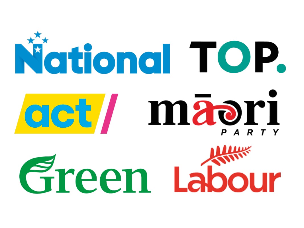
Take blue: a consistent colour used throughout politics.
Blue is the world’s most popular colour, especially for men.
The theory goes that we love blue because it is the colour humans see the most, particularly in the sky and the water. It brings us reassurance.
Blue is used by many brands to create trust and a feeling of safety and it represents the status quo. It’s no wonder it shows up in the corporate and finance world so often. Likewise with the National Party.
The shade of blue is significant. Navy blue, like the landing page of the New Zealand First party, is a most conservative blue. It is a strong way to say we are conventional and unchanging.
Lighter blues and teals, like that of The Opportunities Party, signal less conservative values. ‘Sky’ shades speak symbolically to the heavens and imagination. They signal brands that are trying to reinvent or do things differently.
Then there is red. Across the world, red is interpreted as ‘hot’, just as blue is universally understood to be ‘cold’.
Red, like that of the Labour Party and Te Pāti Māori, makes a strong counterpoint to the blue of the National Party.
Red is the colour of passion, romance, power and energy. It signals change and has been used by political movements throughout history to speak to revolution.
It is a warning colour that signals danger (red light for stop).

A political party that uses red is prepared to make changes. It is a great colour for any organisation that wants social progression.
And green. Green is now a convention in the sustainability and environmental category. No surprise that it should pop up for the Greens party. It speaks to calm and safety using the primary colour of the environment (after blue) to make brands friendly, approachable and a natural choice.
Then there’s the healthy dash of lipstick pink ACT has thrown into the mix. It is another way of saying, ‘We are trying to be different’. It is such a rare colour in the political world.
Pink is not well-liked throughout the world, especially by men. It has a narrow meaning tied to femininity and frivolousness. Because of this, it can be used by brands to highlight how they are above social trends and the need to fit in.
Read more: The AI tool helping Kiwis vote
The surprising impact of font
The way a word is written says so much. For example, a big uppercase, plain, simple or bold font with no flourishes or embellishments can be intimidating. It says we are aggressive, unchanging and masculine.
Semiotics, the science behind the analysis of signs and symbols, tells us that when we see something, we instantly compute it in our minds against a lifetime of experiences. This is how we make meaning and navigate our worlds, through re-enactments of previous encounters.
One of the things we connect a graphic element to is our bodies. For example, if we see a tall, thin, light font, it makes us think of a tall slim person and with that, something or someone more recessive, feminine and lightweight.
If we see a font that is large, fat, stocky and oversized, our brains will connect it to images such as a big man that muscles around.
We even connect fonts to sounds, for example, loud and soft.
Combine the font with colour and a brand begins to tell a powerful story.
Political parties use colour in font to reinforce their values.
Mostly the fonts are plain, simple and without reference to the past (flourishes and decoration). They are plain-speaking and straightforward, trying to earn trust and credibility.
Labour can bring in uppercase which enhances the passions and determination of the red.
The Greens font is sometimes lighter and more delicate and passive, a bit like the natural world.
Photography: a picture is worth a thousand words
How a person is photographed says so much, even in simple portraits.
Looking at people on the political party’s websites speaks to many values; corporate control (lots of suits, ties, conservative clothing and colours like blue), approachability (smiling faces shot close up), organised and work-ready (plain, office-like walls as backdrops).

The Greens, however, choose to present their candidates in ordinary, everyday clothing and have whole-body poses. They have a garden backdrop. It looks soft and friendly; more like a group of schoolteachers than politicians. In a sea of corporate, work-hard, change agents and management professionals, they look like creatures of the natural world.
The use of graphic devices
Political parties are often light on when it comes to icons and other graphic devices. They keep a plain-talking, simple, grassroots approach.
As a convention, politics isn’t pretty, arty or symbolic. The lack of graphic elements can make politicians look hard-working and focused.
The Greens, however, contradict this on their website in the policies focus section with a host of illustrations as headers. It is unconventional for a political website, even globally.
They are a magical, playful set of drawings depicting a blended social and natural world. The drawings were reminiscent of childhood and there are symbols of a perfect, happy world such as love hearts, stars and loving families.
This look embraces the garden archetype. The Garden of Eden is a classic example of this where all is perfect and harmonious both socially and naturally. Paradise is an attractive safe haven in a globalised, agile, modern world with all its troubles. It is a refreshingly challenging stance.
So next time you look at a political flier at a polling booth, you’ll realise you’re receiving more than simple information.
The choices that have been made in terms of graphic elements communicate values in an instant.
As they are thrust into your hand, chances are, you will instantly know which party is yours.