Looking at any business, the first thing you see is the design. It has become one of the most important aspects of any business. In order to nail that, we chat to seasoned designer, Kristy Campbell of Pink Pony Creative and pick her brain on what makes the perfect design.
With over 10 years’ design experience with clients from not just New Zealand but India and Saudi Arabia, Campbell has seen her fair share of design dos and don’ts.
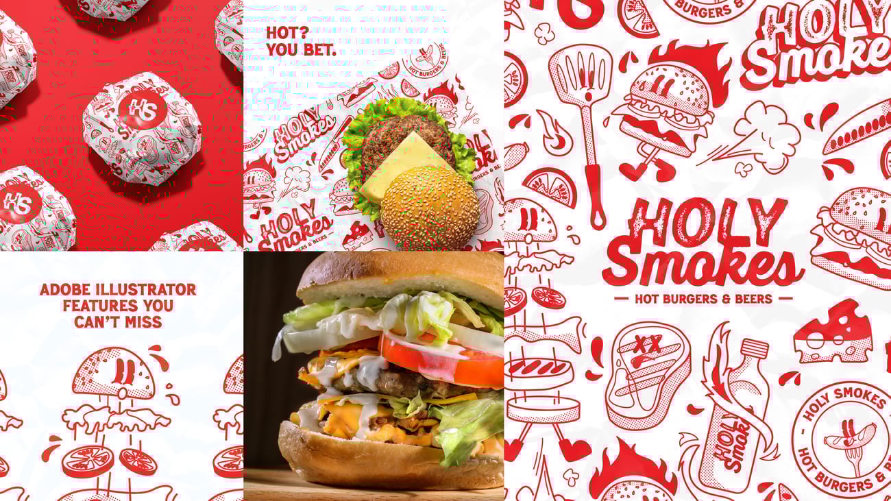
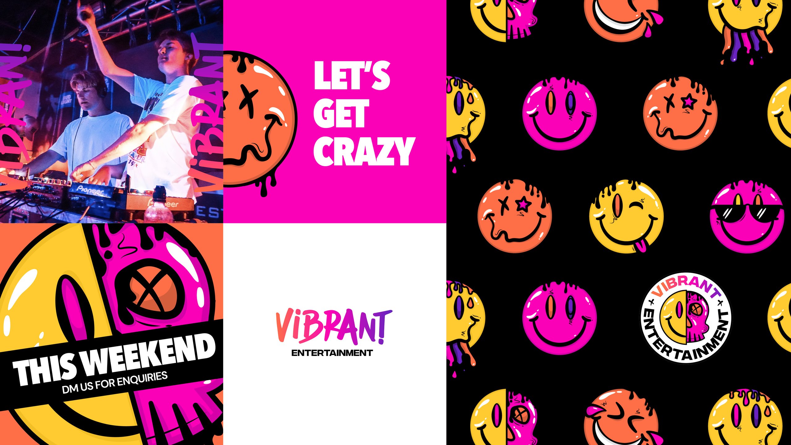
What makes Campbell and her work so different from the rest of the industry is she aims to be “different, bold, electric and vibrant”.
“So, I’m going against everything corporate,” she says.
A dilemma that is often seen in the industry is creating that perfect balance between wanting to look different, but also keeping up with trends to remain relevant.
Campbell says that though she goes against corporate, it is still “tricky” to reach that perfect balance because every business wants to be on trend, but they also want to be the first one to do things.
“At the end of the day, it can be really difficult to be that first person to make a trend, so I think it’s trying to find the balance of remembering, especially with branding and brands, you’ve got to be timeless over everything,” explains Campbell.
“You want your brand to stand the test of time and to not fade away.”
From a design perspective, if it is too trendy, a year later it’ll look “off” and not right. Consistency and timelessness trumps everything.
Campbell says that it is important to look at a brand as if it is a life form. Just like humans, they change and develop over time as the world changes.

“I actually really like to think of a brand as a person, and I try to get my clients to envision their brand as a person. We’re trying to figure out who their brand is, the way they walk, the way they talk, the way they intend to look, how are they presented to the world,” says Campbell.
And change and developing should be reflected in any brand design to reiterate a business’ “timelessness” and “cohesiveness”, because without change, your brand is inevitably going to fall back.
Read more: Studio Almond: The desirable e-commerce design studio
“We can’t be afraid to just stick in that lane for the rest of our lives,” she says.
“We’ve got to actually branch out and take some daring steps, try new things to keep up with the times and reflect what’s going on around the brand and even in the world, to be able to actually create timelessness.”
A good example of a company going through a design change is Pepsi, where their logo history has remained consistent with a few adjustments, with nothing too significant that changes the brand.
“It’s really trying to find a balance of how we can keep up with some trends and identify trends in the industry, but also turn them into something new and something really unique for the brand that can help them punch through the market and really stand out,” she adds.
Campbell says one brand design to look at is Lemme, a nutritional gummy brand by reality TV star Kourtney Kardashian, which uniquely focuses on a Y2K-inspired (Year 2000) aesthetic, which is vibrant and youthful.
“That will be interesting seeing how she stands the test of time with those visuals and the graphics,” says Campbell.
“She’s probably going to evolve it and develop it as the trends develop.”
For any new brand coming into the scene, though design may not fit the budget, it is important to have a cohesive brand so just pick a colour and basic font, says Campbell.
“Spit out a logo if you don’t have a budget for it, and then use that as a temporary face for your business.” Don’t let the budget stop you from building a brand. she adds.
Once that budget is built, invest in the branding because it has value and will be the face of the business.
“We underestimate how much we see logos and colours for brands, every single day of your life, you walk in the supermarket, you are seeing the faces of so many businesses,” Campbell explains.
Once you’ve got a design, stick to it. That means sticking to your colours and fonts, don’t go off on a whim, consistency with brand identity is key.
“Have fun with it, enjoy it and dare to be different. It is all about being creative when it comes to branding and just business in general.”
Quickfire tips with Kirsty
Red flags when it comes to design?
“It is important to remember that there’s a chance at every touch point for branding, even with something as simple as your email signature matching your branding.”
Hated font?
“Comic Sans – it is just a full meme and even non-designers know that Comic Sans is not the way to go.”
Hated colour?
“Don’t be afraid with colour. Colour is incredible and the things it can do to the mind is quite outstanding.”