Designing a better future: How DNA made Immigration New Zealand a new website – and enabled immigrants’ dreams


It’s hard to think of a more intense assignment: you’ve been tasked with redesigning the website for Immigration New Zealand (INZ) – meaning the lives of the people who use the website to apply for visas to come to New Zealand, and often leave behind literally everything and everyone to do so, will be forever impacted by even the smallest change. One mistake, and you’ve possibly shattered those people’s dreams and ruined their lives forever, leaving them with no direction and always wondering what could have been if they’d made it to the Land of the Long White Cloud. No pressure.


Let’s call a spade a spade: hardly anyone would want to deal with those kinds of sky-high stakes. But those people also aren’t DNA.
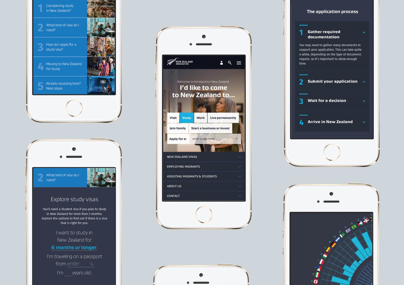
INZ wanted to create a website that would simplify the visa selection and application process, and support attracting the best talent to Aotearoa’s shores. The new build needed to drive self-service, improve documentation completion rates, and reduce call centre costs. And for all that, they enlisted the help of award-winning design outfit DNA.


Obviously, the work paid off, seeing as DNA won the User Experience Purple Pin at the 2017 Best Awards. But creative director Charlene Turei says the mission was far bigger. “It was such a large-scale project,” she explains. “It was figuring out where those stress and pressure points were and looking at things more holistically.”


Turei says there was a need to make the website engaging but also less “intimidating,” with easily searchable information that was also accessible to people who might not speak English as their first (or even second or third) language. “I think we applied a lot of pressure (as opposed to INZ),” says Turei. “We played quite a big role in the content and wording. [Before with the old site] people would essentially go down a rabbit hole.”


Including preliminary research and technical development, the entire project took about two-and-a-half years to complete. But Turei says the focus was on quality more than anything else. “It’s such a big risk not just to the migrants, but to New Zealand, to get it wrong.”


Thankfully, INZ was easy to work with as a client, Turei says. “When we talked to them and proposed a direction, they were really open to it.”


That strong relationship – and ability to collaborate – is a critical lesson for any designer, explains Turei. “Having a really close relationship with the client was really critical, especially for an evolving process,” she says. “We get emails forwarded on to us (from INZ about the website). It’s been some really positive feedback.”
Yet Turei also says there’s another lesson to be learned from DNA’s experience redoing INZ’s website. “Don’t be afraid of chaos,” she explains, emphasising the need to think about what problems need to be solved and at least moving in what feels like the right direction to solve them. “Don’t just fall back on existing paradigms. It’s worth it.”
It’s hard to think of anything more “worth it” than enabling the dreams of immigrants.


