
Visit spacejam.com and you’ll encounter the equivalent of a digital time capsule. The site, first launched in 1996, remains completely unchanged, still bearing the rudimentary illustrations that made the early internet such a multi-colour fiasco.
What’s most interesting about the site is not that it continues to occupy a stretch of cyberspace but rather that it provides a glimpse at how quickly online experiences have evolved. Placed alongside even the most basic WordPress template of today, the Space Jam site is more of a dinosaur than anything extraterrestrial.
The rapidity of this change is somewhat unique to digital. If you were to place a magazine, newspaper, billboard or even a TV show from 30 years ago alongside the modern equivalent, there would certainly be differences but nothing that quite captures the divide between Space Jam and modern websites produced by the likes of Resn.
While it hasn’t been quite as long since the Herald last underwent a major revamp, a decade is by no means a small gap in digital time. Aesthetic tastes have shifted, new functionality has been introduced and reader preferences have evolved while the Herald site remained largely the same (albeit with a few tweaks along the way).
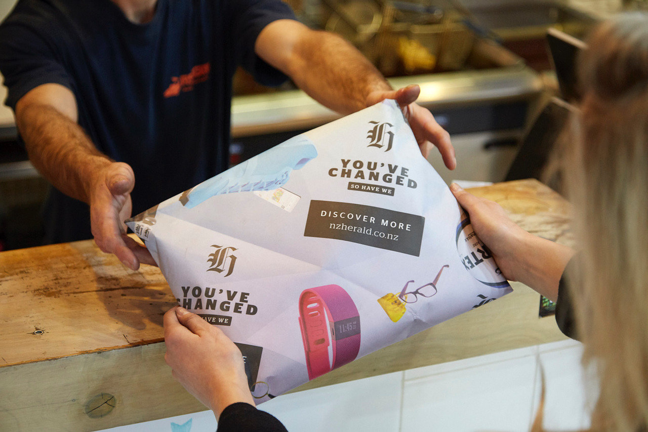
As aptly summarised in the launch campaign’s line ‘You’ve changed, so have we’, the aim of the redesign was largely to bring the site in line with the consumption habits and preferences of today’s web users.


The responsibility of achieving the objective was placed in the hands of NZME general manager of digital innovation Marcus Forbes, who has been working frantically behind the scenes with his project team to bring it all to life.
Sitting down with Forbes, it quickly becomes clear that the project was led by the needs of NZ Herald users rather than by aesthetic motivations.
“Ensuring that we do the right thing for readers and advertisers was absolutely at the heart of the project,” says Forbes.
He says from the outset, the team identified several areas where improvement was necessary and then set out to rectify those issues through the redesign.
On the move
Ten years ago when the previous site launched, the smartphone revolution was only starting to take shape. New Zealanders weren’t browsing their Facebook newsfeeds while waiting for their flat whites at Columbus. Instead, online browsing was generally reserved for desktops and laptops—and news sites were built to fit this habit.
However, now, with over 60 percent of the NZ Herald audience coming to the site via mobile, Forbes says the way users engage with the content has shifted enormously.
“The game is changing constantly and that we need to be able to deliver across as many platforms as possible,” he says.


To ensure the site met the required standards across every device, Forbes’ team worked closely with DDB head of digital design Jason Vertongen and the team at the Washington Post (which already has a partnership with the Herald).
“It’s very much a collaboration between all three of us,” he says.
In addition to this, NZME also brought in digital publishing design specialist Mario Garcia junior as a consultant to provide guidance along the way.
“Because we’ve gone for an evolving design, it was important for us to look for verification as we went along. Mario junior and Mario senior are both very well known in the design field, so it’s great for us to know that respected people in the industry think we’re doing the right thing.”
All about the content
One of the biggest problems with managing a site as big as the Herald is that content often isn’t allowed to stay on the homepage for long. The news cycle is a ceaseless beast, with frequently published new stories pushing down pieces that might deserve a bit more attention.
Forbes says the new site has been designed in a way that allows for those important stories to take centre stage for longer when the editors deem it necessary.
“The way we’ve structured the site is to enable the editorial team to utilise a modular layout,” he says. “The newsroom and homepage editors can change the layout of the site as they choose, depending on the events of the day. As things play out, content could stay in place for longer or cycle through faster.”
In a way, the design actually borrows from the daily print tradition, which has always employed templates as a means to quickly capture the essence of the most important story of the day. Whether the cover leads with a single powerful image, a collection of smaller stories or a combination of both, editors in traditional newsrooms have always had the ability to quickly decide on what would work best with the news being covered. What the Herald redesign does is simply give the editor that power every moment of the day.
“The media industry is still very much working on the same principles and foundations as we always have in terms of delivering fantastic quality content,” says Forbes.
It goes without saying that all these layouts are responsive across all devices—and Forbes adds that users won’t have to wait long to see their content, regardless of where they’re reading it because the redesign has also allowed for the reduction of loading times of pages on the site.
“The mobile audience doesn’t tolerate slow loads and this has been at the forefront of our design and technology build,” he says.
The Herald isn’t alone in its efforts to make its site as fast as possible. As far back as 2015, Slate (which is owned by the Washington Post) set out an objective to reduce its page load time by 75 percent. The reason being, that users have become less tolerant of slow-moving sites and quickly move on when they don’t get what they want, instantly. Nowhere is this issue more imperative than in news media, where consumers are spoiled for choice and could easily find the same story elsewhere.
Forbes says that keeping loading times down is an ongoing challenge for web hosts that requires consistent fine-tuning as the site evolves.
Not only is loading time important for readers, but also for advertisers who expect their creative to work appear as planned, preferably before the reader has completed the article.


The viewability issue
On the topic of keeping advertisers happy, the new Herald site has essentially been flung directly into the viewability debate waging across the industry at the moment.
One source in marketing recently told StopPress he had seen viewability rates as low as 40 percent on supposedly reputable local sites. With better measurement technology hitting the market through the services of Moat and Integral Ad Science, marketers are no longer investing in this type of inventory, which obviously creates a problem for publishers looking to increase digital revenue.
Forbes says the redesign not only placed emphasis on ensuring ad zones were always viewable but also aimed to introduce a few new opportunities for sales teams to present to advertisers.
“We need to deliver for our commercial team the opportunity to sell as many different formats as possible,” he says.
The overall number of ad zones hasn’t changed, but some locations have been shifted and new branded and sponsored zones have been introduced.
Forbes says these changes now offer a wider range of opportunities for creative agencies to experiment with their messaging.
“One of the big opportunities with the new site is how we work with those creative agencies to get our messaging across,” Forbes says.
This plays to NZME’s strength as a local publisher that’s willing to collaborate with advertisers and agencies to do something different. While Google and Facebook offer effective means by which to reach consumers online, several industry sources have told StopPress that it’s quite difficult to innovate on these channels because they are controlled in the US. So by opening the door for greater collaboration, NZME is essentially inviting creatives to bring their ideas to the NZ Herald, where they could potentially come to fruition.
NZME will hope this leads to an increase in digital revenue, which according to ASA ad spend figures remains only a small sliver of total revenue in the newspaper category. The pressure to increase digital revenue will be even greater now, given the hefty investment NZME has put into revamping the site.
Forbes wouldn’t confirm exactly how much was spent on the redesign, but international consultants and award-winning agencies don’t come cheap. And the executives will no doubt be expecting to see a return on their investment.
An unfinished project
Before the official launch this week, the site was tested through a beta version that was shared with only certain readers, who were prompted to share feedback on the new site.
“They’ve told us that they enjoy the site, but they’ve also told us that there are some things they don’t like, and we will iterate on some of that feedback,” says Forbes.
The Twitter response has been less complimentary, but this is always to be expected when something people have become accustomed to undergoes a major facelift.
Forbes says the aim is to now keep tinkering away at the site, introducing changes where necessary and evolving the offering over time. The job in digital is never truly done. Sites start to age the moment they’ve been unveiled in cyberspace.
That said, there are sites that seemingly manage to avoid the ageing process; one such example being Craigslist, which despite not having been updated since 1995 earned upwards of US$690 million last year.
This is, however, an exception to the general rule. And even now, Forbes and his team will be aware that the new NZ Herald site is one week closer to the obsolescence that will one day make it look like this generation’s Space Jam.


