
Retail design is not just about creating stunning spaces for high-end retailers. One of the most successful relaunches in recent years has been by Kmart.
Cotton On is another Australian brand doing a “fabulous” job, says The Retail Collective’s Lisa Donaldson. Despite being an “entry-level price point, merchandise in bulk” retailer, Cotton On’s fit-outs are fun and engaging, particularly for its target customers who visit regularly and demand newness.
“They present wonderful inspiration tables where new products and trends are curated and they dress the store really well, with cost-effective signage and display elements that change out regularly.”
Cotton On’s “solid” store tiering strategy ensures prime locations are maximised to showcase the entire range in flagship stores like Sylvia Park, while single category stores, such as Cotton On Kids can stand alone in locations where there is demand.
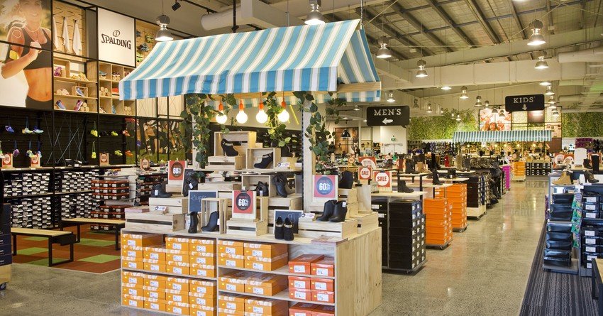
In 2014, Number One Shoes wanted a makeover to reflect its move towards higher-quality and more fashionable products. However its brief and budget only allowed for an affordable, partial refit consisting of little or no building work. These also had to be installed while stores remained open for business.
Studio Gascoigne designed a “bang for your buck type fit-out” which resulted in a “significant” sales increase, says Mark Gascoigne. The pop-up style fit-outs were suitable for mass production off-site and could be easily rolled out.
A simple ‘kit of parts’ comprised new graphics, signage, visual merchandising, modular steel frame systems and stylish but reasonably priced plywood display units. Swapping utilitarian grey carpet for a polished concrete floor also added a more current look while front-of-store checkouts were replaced with large counters in the middle to indicate a more service-oriented approach.
Graphics stuck on with magnets, allowing staff to change from the ‘summer sales’ season to ‘back to school’ without having to hire sign writers or use scaffolding. Graphics were also used to soften the white walls above the wall units and create a more “on-trend” ambience.
Shop fronts were simplified “dramatically”, says Gascoigne, by creating a display system framed in orange circles. Not only are these eye-catching, they also fit just two or three pairs of shoes – preventing staff from cluttering up the windows with merchandise.
To date, the concept has been rolled out to about two-thirds of Number One Shoes stores.


