
The design team behind the global design for R.M.Williams’ new stores is e2. Its Melbourne-based project manager Julian Marocchini had primary responsibility for overseeing the design and delivery.
He says his intent was to forge a connection with the modern, global consumer while respecting R.M.Williams’ rich heritage. The fit-out design also needed to be flexible enough to be appropriate for many different R.M.Williams stores as it was developed to be rolled out worldwide.
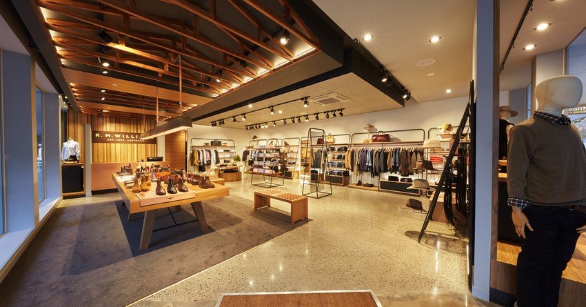
Inspiration was drawn from the brand founder’s relationship with the Australian outback. Iconic elements such as the red weathered earth, rusted roofs and the wooden trusses of shearing sheds were referenced in the design.
The Wellington outlet, which opened in June, won the Fashion + Health Award at this year’s Red Awards. The shopfitter for this project was Dimension Shopfitters.
R.M.Williams has a very distinct brand identity. How did you interpret this to suit Wellington?
We watched, listened and drew on the many sources of inspiration of the brand and the landscape from where it evolved. E2[has] worked closely with RM Williams since 2014 to develop a new brand identity for the physical environment that was true to the heritage of the brand but invited a modern spin to their retail footprint and closely aligned with the new direction set by the business and the adventure to follow.
Every store we have designed represents the Australian theme and has adapted the same design principles to ensure a consistent design theme and approach throughout. The consumer must know they’ve stepped in to an R.M.Williams store without having to look at the sign on the shop front. I think we’ve achieved that.
Were there any significant challenges involved in the project?
The Wellington site had a very awkward ceiling with large steel beams running through the store. So the space really evolved around the positioning of our truss ceiling feature, which we had to position adjacent to the structural beams in order to conceal them.
This is why we have a store that is split in two as opposed to our central ceiling feature as seen at the first store of the new design at other new store locations.
The corner site at Wellington also posed a design problem, as our design principles have the R.M.Williams boot table as the centrepiece of the store, then flanked by apparel on either side. In this store instead, we see apparel running along the rear and side walls, so the intent here is that passers-by focus on the boots through the shop front window while walking past.


