
Form semantics have been tools available to designers for as long as we’ve been making useful objects. However, it was only comparatively recently that the term ‘form semantics’ appeared in design vernacular. When a designer creates a product he or she uses form semantics to establish a visual language; to allow a product to speak to the user. At the most basic level, form semantics is what tells a user to pick up an item by the rubbery bit with the grip marks, open it where the small indentation is, or press that bit to make something happen. Form semantics can guide a user’s interaction with a product negating the need for labels and stickers. Poor form semantics does just the opposite; it confuses and frustrates the user. The 2002 Power Macintosh frequently had a dented and damaged front speaker because the speaker itself looked like a button and was positioned where a button might be expected. The speaker said ‘push me’ and then promptly broke when the user obeyed.


Power Macintosh
It wasn’t until 1984 that the term “form semantics” found its way into vogue and industrial designers had a term to help them explain why a product looked the way it did. It probably wasn’t by coincidence that the term came into existence in the early 80’s. The term ‘styling’ had become a dirty word thanks to Bauhaus and their quest for form follows function. Ettore Sottsass’ Memphis movement was yet to get underway in earnest and designers needed some justification for creating something more interesting than a beige box – although the 80’s still saw plenty of those.
In some cases, product semantics became an excuse to use more playful forms (such as Memphis and Alessi) or to apply graphics or branding. Remember the fad of branding everything ‘Turbo’ in the early 90’s?
Despite some misuse, product semantics is an incredibly powerful way to enhance a user’s experience of a product, to make it more intuitive, more appealing and safer. According to Oya Demirbilek and Bahar Sener, product semantics is; concerned with the relationship between the user and the product on one hand, and the importance that objects assume in an operational and social context on the other hand. So Demirbilek and Sener are saying that product semantics is about both the users’ relationship to the product and also the way a product interacts with its context. Take, for example, a modern Ducati Monster motorbike. Its fuel tank looks like a slab of muscle and the design appears to hunch over its front wheel. Its general appearance resembles a bull getting ready to charge. Ducati has used zoomorphic semantics to suggest power, strength, and aggression – all good things to the typical consumer interested in a $30K Italian sports bike.


So what about context? The second half of Demirbilek and Sener’s statement says that a product should assume an operational and social context. This means that a product should look like it belongs, or that it is suited to its environment, or that it makes a deliberate statement about itself within that environment. For example; grooming products are typically more successful in the female market than the male one. When Phillips created the Philishave razor they wanted to make a grooming product for men, something that would stand out in its context of hairdryers, hairbrushes, and cosmetics – as being distinctly masculine. The Philishave’s angled head makes for good ergonomics but when the razor is inverted its shape takes on a new meaning.
Good product design is not just about styling. A well-designed product should communicate with the user and suit the context in which it’s used, either by blending in or perhaps by standing out.
Achieving this today is becoming increasingly more challenging – even in a domestic context. In previous decades products for the laundry were white and boxy. Thanks to Dyson they are now silver with exciting metallic flashes of pink, purple and yellow. The kitchen used to contain stainless steel, copper and china and the stove was the focal point. This worked well if your stove was an Aga which easily dominated the space, but today’s sleek black induction tops don’t have the same presence. Thusly modern kitchens may have elaborate taps or lighting as their focus point instead. The living room has traditionally been full of wood or upholstered furniture. Even early televisions were finished in faux-wood because that was what was expected of a product used in the living room. Old technology also required that products be of a certain size in order to fit a cathode ray tube or set of valves.


Dyson washing machine
Today much of our historical visual language is redundant. How does a designer design a modern smartphone which has no functional or aesthetic requirements except a screen?
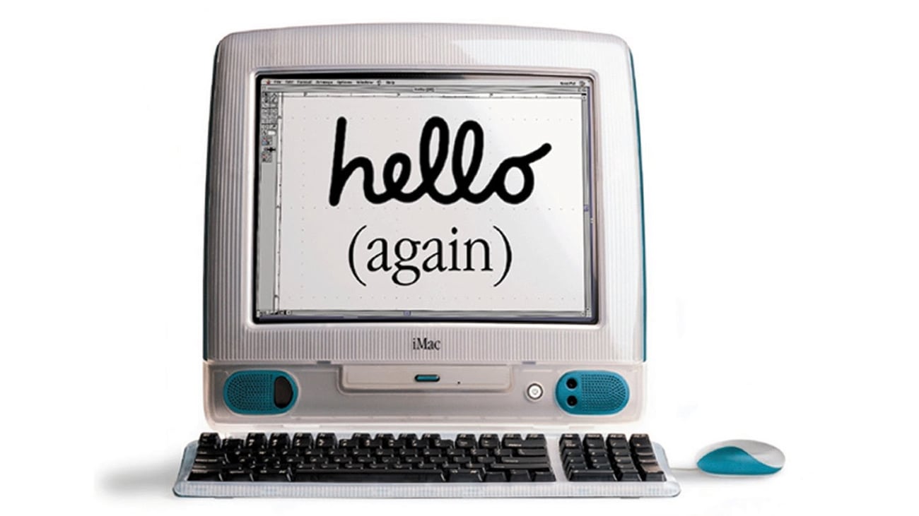
Semantics can be used to demystify complex technology. For example, the 1998 iMac’s translucent plastic (main image) showed the cathode ray tube and other internal components ‘exposing’ them and thereby making the product more friendly and likable – all its secrets were exposed. Conversely, the latest few generations of iPhone demystify nothing; their sleek black glass looks more reminiscent of Arthur C Clarke’s menacing Monolith in Space Odyssey than a banal consumer item – but perhaps that’s the idea.
As technology changes and becomes more and more ethereal (such as uploading precious documents to the cloud instead of safely tucking them away in a draw) manufacturers and designers need to be far more aware of visual language and the statement a product makes to users and to the surrounding environment. At Motovated Design we work with clients to understand their requirements, the products context and the needs of the end user. Creating a successful product takes far more than just making something look good – and understating powerful tools like product semantics is essential in allowing us to do this.


