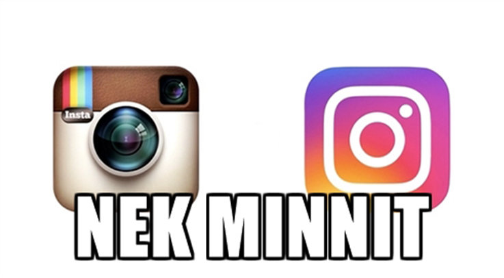
Is Instagram’s logo change a nail in skeuomorphism’s coffin or just late to the flat design party? (And what the hell do those words mean?)


This week, Instagram users around the world woke up to surprise when they checked their phones mere moments after rousing from their sleep. Instagram, the much-loved photo-sharing app, had changed its icon and logo from a ‘skeuomorphic’ polaroid-esque camera to a flat abstract camera icon with a bright gradient of colour.
Reaction was swift and, like all reactions to redesigns these days, harsh:
Best thing I’ve seen today. How the new Instagram icon was made. [via Reddit] pic.twitter.com/Ax33Zk11Uc
— Katherine McCoy (@katherinemccoy) May 11, 2016
The new #Instagram logo reminds of this. #90skid pic.twitter.com/Gw6Wzo76Tf
— Erick Endres (@erickend) May 11, 2016
Really impressed with all the time and effort that went into redesigning the Instagram logo. pic.twitter.com/E0uTdT66uh
— Madison M. K. (@4evrmalone) May 11, 2016
But, whether you like the design or not (you probably don’t like it right now but will quickly forget about the old one and will accept the new one as just how Instagram has always looked), it represents the end of one of the last major apps to holdout on skeuomorphic design since Apple largely took skeuomorphism out of its iOS and app icons in 2013.


Okay, maybe we’re getting ahead of ourselves. What is ‘skeuomorphism’ and ‘skeuomorphic design’ you may understandably ask.
Well, I’m glad you did. A ‘skeuomorph’ is a derivative object that takes aspects of the design of the object it is copying, including aspects that are no longer necessary or functional. So ‘skeuomorphism’ or ‘skeuomorphic design’ is an aesthetic based on a redundant function. In graphic interfaces, this usually means representational, three-dimensional graphics as opposed to flat, more abstract graphics.


One of the biggest proponents of skeuomorphism was Apple, particularly during its second Jobs era. Jobs loved skeuomorphism because he thought it made software easier to use. If software looks like things you already know how to use – a folder, a camera, a bookshelf – you’ll instinctively know how to use the software version of it. You put the ‘document’ you want to keep in a ‘folder’ and the one you no longer need in the ‘trash’.
You can see it as far back as the first Apple Mac:


And when Jobs returned in 1999, he took Apple right back to its skeuomorphic roots. According to Business Insider, when Apple was designing Quicktime 4, Jobs became annoyed by the design team’s initial work. He wanted Quicktime to “look like a real stereo” and took the designers an ad for a Breitling watch with a brushed finish and threw it at them.


This is what they came up with:


But since 2013, Apple have continued to drop skeuomorphism from most of its design. Jony Ive, Apple’s head designer, was largely responsible for the change, apparently freed to do so after Jobs’ death.
“When we sat down last November (to work on iOS 7), we understood that people had already become comfortable with touching glass, they didn’t need physical buttons, they understood the benefits,” Ive told USA Today. “So there was an incredible liberty in not having to reference the physical world so literally. We were trying to create an environment that was less specific. It got design out of the way.”
Quicktime now looks like this:


You can see it clearly in iPhone apps.
This Apple classic 


This 


The ‘this’ that now leads most of Apple’s design thinking gets called ‘flat design’, a more minimal and unapologetically digital aesthetic. While it still nods to real world things, it is more abstract but also simpler. Once you start looking of it you’ll see it everywhere. Your phone used to look like a screen full of cameras and notepads, now it looks like a phone and the app icons look like icons rather than the physical versions of the things they replaced.


But, despite many reports of its death, skeuomorphism seems live on whenever designers need to bridge the gap between a ye olde real world object and its shiny new digital replacement, the latest of which is the smartwatch.


Despite calculator watches being available for decades, wrapping tiny computers to our wrists isn’t necessarily an intuitive thing to do, so to make it a little easier for us to get used to (and easier for the kinds of people that buy watches when we all have clocks in our pockets), Apple has let added a little skeuomorphism back into the recipe. So the Apple Watch looks like a watch rather than a computer with an app open. And that’s not a bad thing.


People hated Apple’s iOS 7 redesigns when they happened, but its version of flat design became the standard for mobile design. So whether Instagram is finally joining the present or is so late to the flat design party that they’re missing a return to skeuomorphism remains to be seen. But while we can’t know the future, we’re pretty sure you’ll stop caring about the Instagram redesign in three… two.. one…
ahhhhh…


