
It’s no secret that MediaWorks had a tough year in 2015, with major changes in its current affairs lineup provoking ire among both industry commentators and viewers and declining ratings for some of its big reality TV shows making things tough commercially. But it’s hoping a new year signals new beginnings, and the media company is kicking off 2016 with a new logo and a revamped website.
MediaWorks’ group head of comms Charlotte McLauchlan says that the process was “collaborative” and “took place across the business”.


Image: Previous logo
However, a MediaWorks source told StopPress late last year that the internal announcement of the new logo surprised staff. The source said most of those working at the organisation weren’t even aware that the company was working on brand update (the creative team didn’t have any input into the design).
This is somewhat unusual as far as design processes go. In fact, it’s the exact opposite of what Sky did when it launched its new brand back in 2013.
Before putting pen to paper, Sky first talked to its staff and only then proceeded to develop the new logo.
At the time, Sky’s head of communications Kirsty Way said the process initially started off as an internal statement aimed at its staff before being worked into a bigger idea and brand identity with the help of Interbrand Sydney.
The involvement of staff in this way helps to ensure that a brand (and the logo) is representative of the company’s culture rather than simply being lipstick on a pig. But this also poses the question: why would MediaWorks revamp its logo at this stage?
“The old logo visually represented us as being made up of three siloes – TV, radio and digital – and presented a face to the world that we are leaving quickly behind,” says McLauchlan.
She says that shows such as Paul Henry and Jono and Ben are now native across TV, radio and digital, and the company is also taking a fully integrated approach in terms of what offers clients on the commercial side.
“…We need a symbol for our company when we deal with customers that shows us as we want to be seen,” she says.
To produce this symbol, MediaWorks called in design agency OneDesign, which has previously also developed branding for Terra Sancta winery owned by MediaWorks chief executive Mark Weldon.
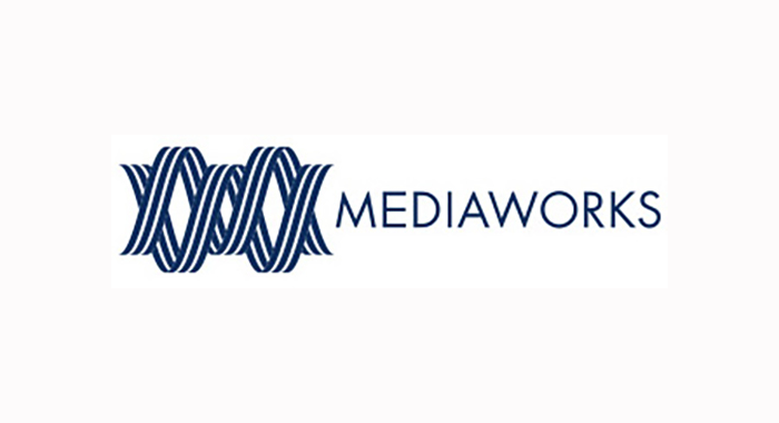
The logo that emerged from the process looks similar to that of the Australian Broadcasting Corporation, which also features an interlinking graphic in its design. But despite the similarities, McLauchlan explained that the motivations behind the design decisions were very specifically related to MediaWorks.
“It is a double helix representing the intertwining of multiple brands which share the same DNA. It embodies this idea of working collaboratively – across an integrated business. Visually it represents an abstracted ‘M’ and ‘W’ from the word MediaWorks.”


