
For sometime now the general consensus behind website design (and many other kinds of design) is that less is more. Web designers aim to make sites as easy to navigate as possible, rather than assaulting visitors with flashing green neon and trillions of different icons like early websites did in the ’90s. But like many things in life with a cyclical nature (fashion, music and food trends to name a few), perhaps websites are no different. And while we’re not sure if we can call it a trend, we have noticed a few more web designers and developers cramming more into their website designs, creating a retinal overload which is surprisingly pleasing. Digital agency Resn is one of them, making a name for itself by thinking a bit differently and capturing our attention through its creative, animated website designs.
We’re so used to visiting websites and seeing the same old layout. A similar template for each webpage complete with their ‘Home’ and ‘About’ icons. So it can be refreshing to visit a website, hover your mouse over an icon and see some strange image jumping out at you. It somehow breaks through the rather mindless website-navigation process, making it a more interesting and fun visitor experience.
There are limits, however, we don’t want every site looking like ‘The world’s worst website ever’, where shielding your eyes upon visiting the site happens involuntarily (epileptics steer clear).
We think Resn has got the right technique – crazy, funny, colourful, in-your-face but not overly so, somewhat reminiscent of Terry Gilliam’s animation in the Python era.
We thought we’d check out its latest projects, which at the moment appear to be mainly food based.
In January Resn partnered with Droga5 New York to create a website about the most important meal of the day, breakfast, for belVita Morning Win’s Breakfast Bites.
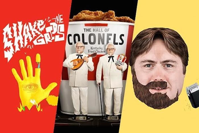
The site features fifteen mini-games where players can throw food into a hat, protect their coffee from caffeine-zombies or even shave off a variety of beards. The games take centre stage while an image of the product sits at the bottom left-hand site of the screen, almost as an endorsement of Resn’s great work.


“A lot of people told us we couldn’t turn these ideas into games. Or maybe they said we shouldn’t. Regardless, we ignored them. We think the results speak for themselves,” Resn managing director Rik Campbell says.
In June, Resn tackled another website design, ‘The Hall of Colonels’ for Wieden+Kennedy Portland’s rebranding of KFC in June. The site is designed to look like an audio-animatronic museum and features music, theatre and old-school video games, all based on the stranger-than-fiction life of Colonel Sanders.


Resn also recently created a Tumblr experience for Heineken’s Desperados, a tequila-beer hybrid. The site, made with Wieden+Kennedy Amsterdam is heavily laden with surreal animations and sounds. “Probably the strangest thing we’ve done – for a month or two at least,” Campbell says.


And as we have mentioned in a previous story, Resn’s site own site is a digital wonderland of paint splatters, creatures and interesting sounds.
While we’re at it, Satchel’s Pizza’s website is another example of a full on website that works, which goes to show a little creativity and a bit of bad (good?) taste can go a long way.


And as another aside, did anyone realise that the original Space Jam website still exists? Paving the way for great website design since 1996. Respect.
This story first appeared on our sister site StopPress.


