Telling a story through fast food packaging: the rise of the gourmet burger joint


Better Burger aims to be “convenient and affordable, but with super fresh, high quality, locally sourced ingredients”. With a menu boasting only four burgers for simplicity, and prices starting from $5, it’s easy to see how Better Burger has established itself as a customer favourite, allowing it to set up a second store in Vulcan Lane.
Whilst the cheap prices set Better Burger apart from its pricier counterparts, in such a competitive market they needed a competitive edge. And here’s where branding and design firm 485Design came in.


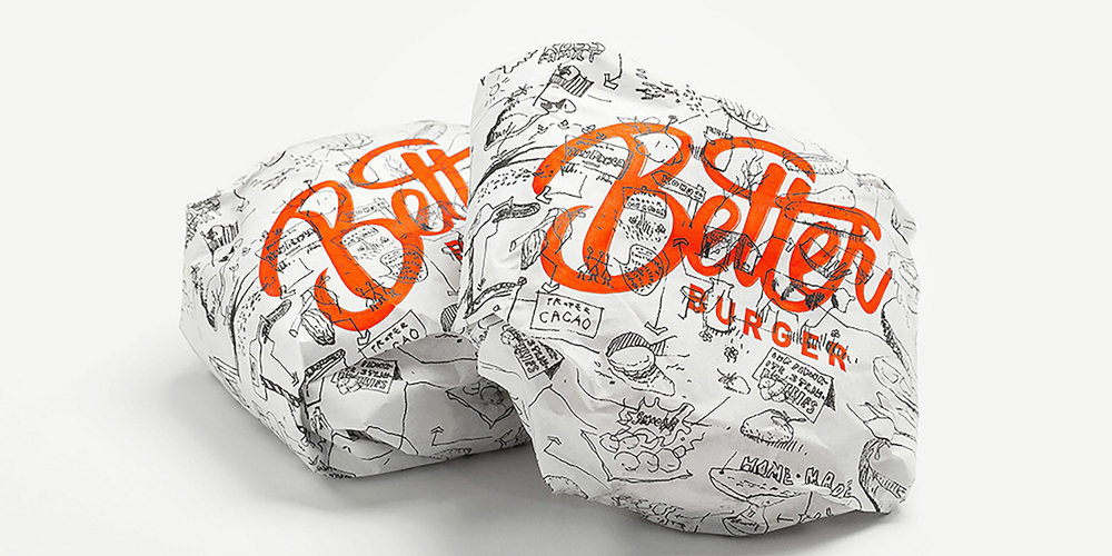
The main challenge presented in the design was to convey the feel of fast food, but to also ensure customers were aware that their burgers contain only top quality ingredients. Reflecting the ethos of the Better Burger brand was integral to the design team’s creation of the packaging.
“The hand drawn type and illustrations emphasise the journey of the ingredients and reinforce the philosophy of making things better by hand,” the firm wrote in a blog post.


Sketches on the packaging show customers how the ingredients are sourced, and made into the food they consume. The design allows customers to interact with the packaging whilst enjoying their burger, adding to the experience, whilst separating itself from traditional fast food.


The design was purposely made to be simple with the hand-sketched drawings, allowing the food to speak for itself, whilst reflecting the uncomplicated menu. Simplicity is at the heart of what separates Better Burger from the others. Its no frills menu takes a step away from what has historically defined a gourmet burger joint, yet still delivers on taste and customer experience.


==========
All images in this article were sourced from thedieline.com


