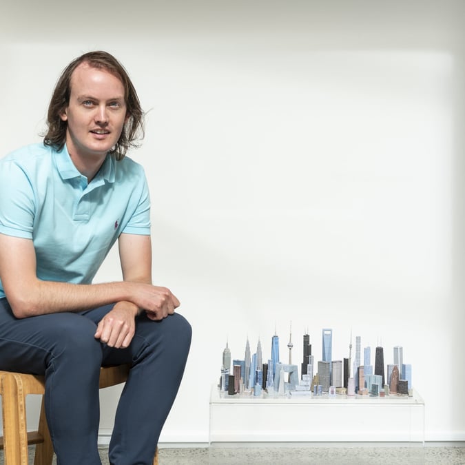
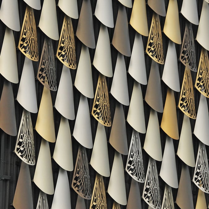
Graphic
Studio One Toi T?
Graphic – Purple Pin winner, Environmental Graphics (Gold), Small Brand Identity (Gold)
Dripping paint made out of steel falls from the windows of No.1 Ponsonby Road, the home to Auckland arts organisation Studio One Toi T? (formerly Artstation). The simple motif modernises the Victorian brick building while also showing a shift from art gallery to diverse creative studio. “This entry rescued the building,” said the judges. “It doesn’t overpower the work that’s going on inside it, but will positively contribute to the artistic endeavours that the building provides a backdrop for.” The design by Alt Group has also been realised into custom furniture, uniforms, posters and signage.

Tip Top: Back to Nature
Graphic – Colour Award, and Visual Communication (Gold)
Vibrant posters, designed by Colenso BBDO, announce Tip Top’s promise to use only natural flavours and colours in its ice-cream. But it’s not just words – the pledge was reinforced by printing the artwork using the remaining artificial food colouring from the factories.

New Zealand Opera La Traviata
Graphic – Graphic Design Arts: Photography (Gold)
Show-stopping posters and other material worthy of the world’s most performed opera. Alt Group’s art direction for the NZO promotion of La Traviata is simple and brilliant. In the series of photographs, a camellia headdress slowly deteriorates in an otherwise starkly white backdrop, symbolising the plight of Verdi’s beautiful and fragile heroine.

New Zealand Artesian Water, NZ Beverages
Graphic – Packaging (Gold)
The bottled water market is filled to the brim with minimalist design, but NZ Beverages wanted a little more sparkle for its new range of premium water. In addition, the still and sparkling waters had to speak to exclusive restaurant customers in two very different markets: China and New Zealand. Given the completely different languages, the message couldn’t be relayed through words alone. Marx Design delivered a premium livery, stamped with gold foil curled around the picturesque imagery. The team wanted to create something that was pure New Zealand, and designed the line-drawn logo using inspiration from historical Kiwi stamps from the early 1900s. And the judges responded favourably. “It’s equal to a beautiful bottle of wine on a table.”

Akitu
Graphic – Packaging (Gold)
Indesign took a glorious mountain scape that backs onto South Island vineyard Akitu (meaning summit or success), and shaped it into their logo. “Purity in a piece of typography,” said the judges.

Bathurst Annual Report
Graphic – Corporate Communication (Gold)
For the 2013 report of New Zealand coal producer Bathurst Resources, Saatchi & Saatchi ditched the stuffy stock photos and out-of-touch jargon. In its place is design that reflects Bathurst’s call to be a transparent Kiwi business, and focus on its people and attitude. The glossy black cover (to echo coal) opens to key statements from the company, and documentary-style portraits of employees, from CEO to mining crew, and working landscape. Judges described the report as an “exquisitely daring piece of corporate communications.”


All Good & Sparkling
Graphic – Packaging (Gold)
You’ll often see ‘naked’ and ‘raw’ buzzing around organic products, but rarely does that translate into the packaging. Here it does. A bottle nude except for its moniker, designed by renowned typographer Luke Lucas, gives full attention to what’s inside – the dazzling colours of fruit juice.

Rogue Society Gin
Graphic – Packaging (Gold)
What’s special about this sleek black glass bottle is so much more than gin made from a 300-year-old recipe (although that’s good, too, apparently). Details of the One Design creation include a 1920s silhouette, minimal embellishments, embossed secret messages, and a seal stamped with the batch number. “Full of surprises,” said the judges. “The sheer gutsy daring of using a black bottle for a clear liquid is admirable.”

Product
IRIS Hunter Safety Detection System
Product – Purple Pin winner, and Consumer (Gold)
A couple of product designers who love hunting have come up with a way to reduce New Zealand’s alarmingly high rate of hunting accidents – a hunter is killed here every nine months; 67% of them by a member of their own party. The IRIS system, designed by Wellington-based Hunter Safety Lab, has two parts: a laser sensor that clamps to your rifle, and a vest and cap with corresponding, IRIS-detectable reflective patches. The sensor on the rifle can detect the patches on the vest and cap up to 90 metres away, and gives an audio-visual warning to hunters that they’re pointing to a mate, not a prized piece of meat. The judges described the project as “an outstanding design solution to a deadly, emotionally-charged problem for game hunters world-wide”.

Wishbone Bike Recycled Edition
Product – Consumer (Gold), Sustainable Product Design (Gold)
Music to the ears of parents everywhere – a child’s toy that grows as they do. Wishbone Design Studio’s bikes adjust from tricycle to two sizes of bicycle, in a 3-in-1 design. And the frame is made out of old carpet – 100% recycled nylon carpet to be precise, strengthened with glass fibre, giving it two ticks for sustainable design.

Blunt Golf G1
Product – Consumer (Gold)
Forget Wellington’s famously windy weather, Blunt’s golf umbrella has been tested against paint ball guns, leaf blowers, and wind speeds of over 100km per hour. It even has a fiberglass rod to protect against lightning, for those golfing enthusiasts who insist on swinging their clubs on a stormy day.

Gallagher Ring Top Post
Product – Non-consumer (Gold)
In a strong field of entries that judges said “demonstrates the value great design can bring to otherwise anonymous and unglamorous product categories”, this tool for livestock farmers came out on top. The posts are used to string up a portable electric fence, and replace traditional posts, which tend to tangle wires and cause electrical shorting. A tough head of glass-filled nylon guides the string, and there’s plenty of insulated handle to avoid a nasty shock. It’s sturdy as hell, too. The moulded foot at the base can take up to 200kg of pressure – protection from the biggest of farmer’s boots.

Interactive
Home Hunter app
Interactive – Purple Pin winner, and Applications (Gold)
Kiwibank worked with realestate.co.nz and web designers Springload to develop an app which brought together property listings and the sort of bank information people need when they are buying a house (instant loan pre-approval, mortgage calculators etc). Home Hunter was New Zealand’s most-downloaded property app in May this year and has had 72,000 web users since launch. By automating loan applications and standardising credit risk assessment it has also reduced Kiwibank’s operating costs and improved workflow.


NZI Insurance: Devil’s Chair
Interactive – Time Based Graphics (Gold)
A bit of dark humour never harmed anyone, and it seems to have worked in this advertisement for NZI Insurance. In the 3D animated story by Assembly, we’re introduced to a chair in a second-hand shop, which is snapped up by a businessman. What follows is bad luck to every owner of the chair, from a dramatically flooded office to an exploding petrol station. Moral of the story? Bad isn’t going anywhere, but neither is NZI. Check idealog.co.nz for the video.

Spatial
IMO Group HQ
Spatial – Purple Pin winner, and Offices & Workplace Environments (Gold)
The new Auckland headquarters of product design company IMO Group houses the showroom, office, assembly, and dispatch areas in a flat 865m2 space. The design needed to delineate between the distinct areas (some of which were clean, some messy, some formal, some casual, some quiet, some shared), but maintain connection and movement. Inspired by the building’s Wool Store heritage, the solution used an industrial colour palette and minimal finishings. Where the bright white walls finish, large glass panels and darkly-stained wood take their place. Neatly separating the showroom and the assembly and warehouse areas is the office – a steel and glass block.


Fisher & Paykel Product Development Centre
Spatial – Colour Award, and Office and Workplace Environments (Gold)
A former electronics factory in East Tamaki has been transformed into one of the largest single office floors in New Zealand. Fisher & Paykel Appliances’ new product development centre started as a huge, blank, 5000m2 canvas, which Custance Architects broke up using clean lines of black and white with spots of colour – from potted greenery basking under the skylights to bright yellow stools waiting at the kitchen benches. The centre circles around a social kitchen with F&P’s latest range of induction cooktops, ovens, fridge drawers and accessories. A timbre louvre ceiling and light filtering from two large funnels in the ceiling aimed to reproduce a (large and expensive) residential feel.

Charlie & George
Spatial – Hospitality (Gold)
The new Stonefields suburb in Auckland opened a space for a community hub, and café. Ctrl Space’s interior design for Charlie & George (named after the café owners’ kids) has created that sense of community: think open kitchen for chefs to casually chat with customers, a white and orange colour palette, and a wall for kids’ art and scribbles.

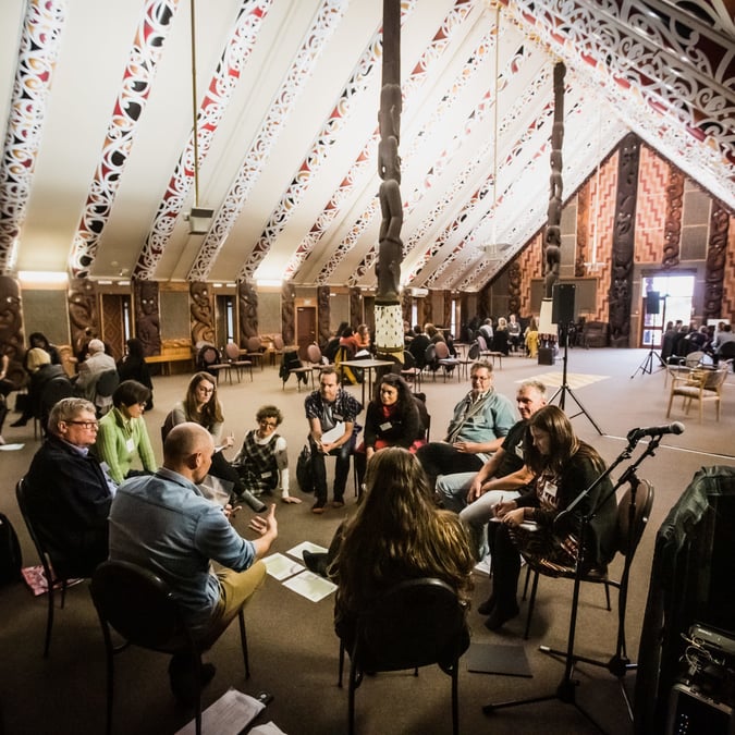
Ng? Aho
Te Uru Taumatua
Ng? Aho – Purple Pin winner
Te Uru Taumatua was constructed to house the new tribal authority for Te Iwi o T?hoe, reflecting T?hoe in both its physical design and impact on T?hoe as a nation. Jasmax used materials native to the iwi’s surroundings, including native timber from nearby Te Urewera parks and pine from T?hoe forestry. Trade packages were broken down to allow small, local businesses to tender for work competitively. For example, a local T?hoe-based scaffold business was born as a result of the project and a carpentry subcontractor grew his team by 300%. A team of 10 T?hoe people were trained to lead 150 volunteers producing 5000 earth bricks dug from T?hoe whenua to form insulating walls, and art by T?hoe artists hangs on the walls.

Taka Ki Ro Wai
Ng? Aho (Gold)
A children’s book set around the birthday of author Keri Kaa, Taka Ki Ro Wai (Fell in the water) is interwoven with illustrations of earthy watercolour and ambient photography, created by designer-publishers Tania&Martin. The book is written entirely in te reo o Waiapu, a Maori dialect of the North Island’s east coast. Part of its role as inspiration and educational resource to Kiwi kids, it visually allows for Maori formalities, such as a written pepeha (introduction) and the use of kowhaiwhai patterns.


Last, Loneliest, Loveliest
Ng? Aho (Bronze)
A team of M?ori and P?keh? architects and academics – led by David Mitchell of Mitchell & Stouts Architects – worked to a tight deadline to complete New Zealand’s first national exhibition at the Venice Biennale. Titled Last, Loneliest, Loveliest (the first line of Rudyard Kipling’s poem about Auckland), it explores the Pacific and Aotearoa nature in our architecture, and identity in global design. Visitors are met with a bespoke-carved p?taka (storehouse) standing high on a pole, guiding them to a whare-like structure showing off New Zealand’s architecture, from the award-winning Auckland Art Gallery to Shigeru Ban’s Cardboard Cathedral. The close involvement of a design company, which developed the exhibition branding and collateral material (catalogue, website, postcards and a tote bag) was important to the success of the project, and earned Inhouse Design a bronze in the Graphic – Editorial and Books category.


Effect
Fisher & Paykel Simplus
Best Effect – Purple Pin winner
Not content with taking out the Purple Pin in the product category at last year’s Best of the Best design awards, the Simplus face mask for patients undergoing CPAP (continuous positive airway pressure) therapy has taken the same award in the effect category this year. The mask is the result of thousands of design hours, with F&P Healthcare looking for a sleep apnoea treatment that was comfortable, well-sealed, as unobtrusive as possible, and didn’t fall off during the night. Released towards the end of 2013, it has had significant impact in terms of sales revenue and the growth of the business. So much so that the company has had to substantially expand production facilities to cope with demand.

Home New Zealand magazine
Best Effect (Bronze)
Since publishing company Bauer took the decision to contract out the design and layout of Home New Zealand magazine to print and digital company Inhouse Design in 2011, readership has increased 56% to almost 100,000. The bi-monthly is now the fastest-growing magazine in the country in readership terms.