
Anna Taylor, designer for Liam Finn’s The Nihilist

Tell us, what’s the inspiration behind the design of the album cover?
New York. Also, Liam wanted the photography to speak for itself, so design-wise I felt ‘less was more’. The photography is amazing; I think Liam looks like a ghost.
What’s your favourite track from the album, and why?
Ocean Emmanuelle. It’s sexy, moody and emotional.
Who will you thank in your speech if you win?
Ken Clark (the photographer), Liam, James (my boyfriend).
What kind of music do you listen to?
I like music made by scumbags.
Ken Clark, photographer for Liam Finn’s The Nihilist
What’s your favourite track from the album? Why?
Snug as a Fuck. I think the title sums it up.
How much freedom did you have with the brief?
Liam was a collaborator rather than a subject. I was just the charascuro, providing shadow and light to expose his vision. Really unique experience for me.
Was there input from the artist for the brief?
It was all Liam. He had a clear vision for what he wanted.
What else?
Cover art was originally shot using the ambrotype process first developed in 1852. It’s pre-film – the emulsion chemistry is home-made in batches and then poured onto a 20×25 cm glass plate to sensitize the glass to light. Once it dries it doesn’t work, so each plate is prepared one at a time.
Liam was holding a pose in a head brace for 10 seconds for every shot and we shot dozens. I would prepare and process a plate every 10 minutes or so. Liam and I would then discuss and plan the next few exposures. A slow photography that reveals the soul.
Who will you thank in your speech if you win?
My Mom. I miss her.
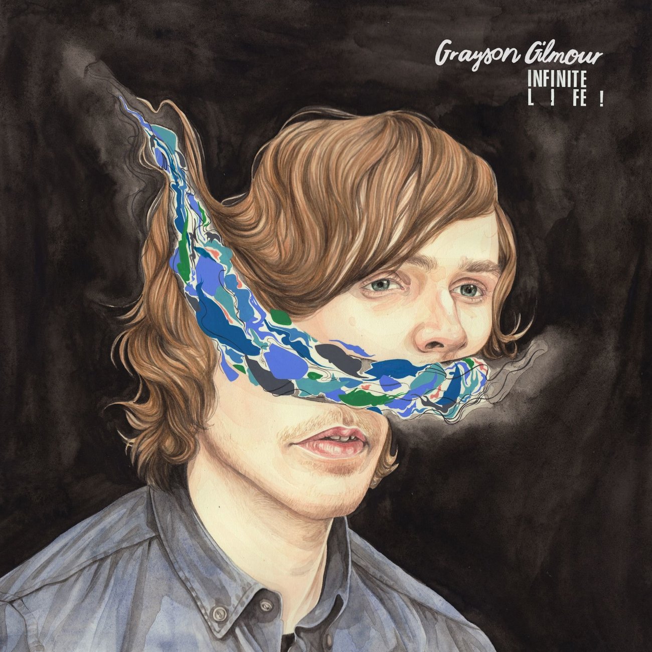
Henrietta Harris, designer for Grayson Gilmour’s Infinite Life!
_sml_large.jpg)
What three words describe your design style?
Photoshop for beginners.
What’s the inspiration behind the design of the album cover?
Grayson had seen and liked a series of portraits I’d done and wanted something similar – but in a colour scheme he thought suited his ideas and feelings when making the record. It was very collaborative.
What’s your favourite track from the album? Why?
My probably all-time fave is Pareidolia, but I also love Lemon Brain – it came on shuffle when I was in the perfect frame of mind to listen to a song like it, and I GOT it.
How much freedom did you have with the brief?
The perfect amount. Grayson knew my work and trusted what I would be able to come up with but he gave me enough information to ensure that what I came up with would have specific meaning and aesthetics to merge with the sounds.
Was there much input from Grayson?
Yes, we shared pretty involved emails together for a few weeks before I started anything at all. He sent me amazing mood boards and scrapbook scans and lyrics and the like which all helped a great deal. This all made it very easy to create the artwork in one go.
What’s the best album cover ever created?
David Bowie’s Low.
Robert Wallace, designer for Ladi6’s Automatic

What’s the inspiration behind the design of the album cover?
The main inspiration comes from the album’s running theme of love, coupled with the old sci-fi samples dotted throughout the music.
I used retro science fiction movie posters as reference, specifically their minimal colours, hand-drawn illustrations and slightly awkward sans-serif fonts. From there, the songs on the album were used as inspiration to push the visuals in a new direction.
Did you listen to the whole album before designing the cover?
Yes. On repeat. Constantly. It helped shape the design, colour palette and overall tone. The spacey synths that appear throughout the album inspired the minimal, atmospheric illustration used for the backdrop, while the faceted heart creates a graphic anchor and reflects the upbeat mood of the album.
What’s your favourite track from the album? Why?
I’ve directed music videos for two songs off this album, Shine On and Hold Tight. The process of making them involved listening to both tracks on repeat for a long time. For that reason I have a deep appreciation of the song structures and subtleties found in both of them.
However, from the very first listen to the album, Ikarus has always stood out as a memorable piece with its strong hook and cosmic flourishes. It works really well as the first song, introducing listeners to the themes and sounds of the rest of the album.
How much freedom did you have with the brief?
Ladi, her partner Parks and manager Becs are some of the nicest people to work with. They have positive and relaxed attitudes, making all of our joint projects great to work on. This project was no different. The album went through a number of working titles, but the themes of love and space were constant. Visually, they were open to anything.
What’s the best album cover ever created?
That’s a pretty hard question. One cover that has always stood out to me for being visually striking while also perfectly capturing the sound of the record is Lightning Bolt’s “Earthly Delights”. They are a loud, experimental, noise-rock duo consisting of drums, bass guitar and occasional distorted vocals.
Brian Chippendale, the band’s drummer and vocalist, is also a pretty accomplished comic-book artist. He has illustrated all of Lightning Bolt’s releases in his loose yet complex style, however “Earthly Delights” standouts out for its use of collage. Consisting of his drawings, found prints and scrawled typography, the colourful and energetic artwork is a great visual depiction of what audio treats sit inside the package, especially on the gatefold record.