
Talking life insurance is a sobering enough task, so why not lift the mood with splashes of bright yellow and peaceful blue hues? It’s this and other inviting elements that make up AMI’s new Auckland retail store.
AMI and Auckland property, architecture, design and research company RCG have collaborated on a new retail store model for the insurance company, figuring a layout with much more of a people focus. The companies pinpointed AMI’s ambition to provide cover for people’s life achievements – their first car, first job, first child, and protecting the things people hold dear throughout their life’s stages – and used this as a key design feature.


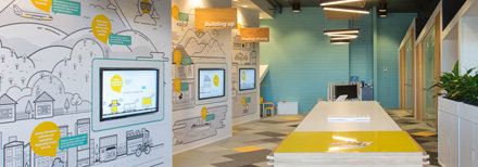
For their first concept store in Auckland’s Takinini, a “Life Stage Customer Wall” was realised, with embedded touch screens and quirky infographics, with speech bubbled-insurance facts. This is meant to spark discussion and give staff an opportunity to discuss individual customer needs. “Customer demographics and retail requirements are vastly different across customers,” says John Lenihan, director of RCG. “[The wall] allows customers to access insurance information that is relevant to them, and form an understanding about how their insurance can move with their needs as they evolve. It is inclusive and tactile, supporting AMI’s intention to be social and helpful. Eventually the screens will integrate with AMI’s online channels.”


Taking the lead from the latest, and successful, rollouts in the banking retail sector, the AMI store has a welcome counter at the store entrance, and docking stations for iPads and laptops are placed throughout the store allowing flexibility with staff’s movements. For more sensitive claims, there are two acoustically-private meeting rooms, each guarded by a floor-to-ceiling glass wall and thin panels of timber.


And what really tickles our fancy are the tables beautifully endowed with thick rolls of paper, allowing customers to illustrate their insurance query or conundrum, such as the cause of their car crash.?


A lighter tone of the AMI-associated yellow used on timber fins at the entranceway beams out onto the pavement. “The shopfront was designed to look valuable but not expensive, with warm basalt that feels permanent and reassuring,” says John.


Warren Tippet, Head of the Retail Network at AMI, is pleased with the result. “The response has been extremely positive. Staff are able to sit alongside customers and have a different sort of conversation from the past about insurance,” he says.
The success of the store has led to another opening, this time in Hamilton’s Te Rapa. It’s also been named as a finalist in the Retail Environment category of the Best Design Awards.


