
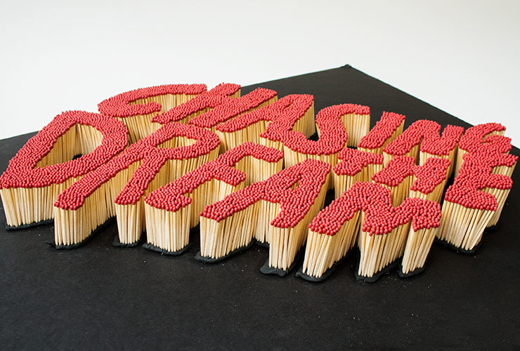
 Take 12,210 matches, one design agency, a worthy art exhibition and what do you get?
For the second year running, Amnesty International called on Transformer Design to create the identity for its ‘Strike’ exhibition – an art project celebrating freedom of expression on Beehive matchboxes measuring just 7cm x 5cm.
In 2013 they played with fire and wrote the word ‘hope’ out of burning matches. This year, they took those leftover matches and used them to spell out ‘Chasing the Dream’, the theme of the 2014 exhibition.
Transformer Design also shaped the letters to resemble the flame of the Amnesty candle. This eye-catching image formed the key element of the exhibition’s brand identity and was then used across all collateral, from brochures to posters and web content.


As well as the studio work, Nigel Smith (creative director) and Caitlin MacDonald (designer) also took on the challenge of creating a tiny piece of matchbox art, to be auctioned at the end of the exhibition.
MacDonald says her box is a dreamcatcher while Smith says his box shows a mythical bird rising from the ashes, representing the hope Amnesty provides.

 ?
?