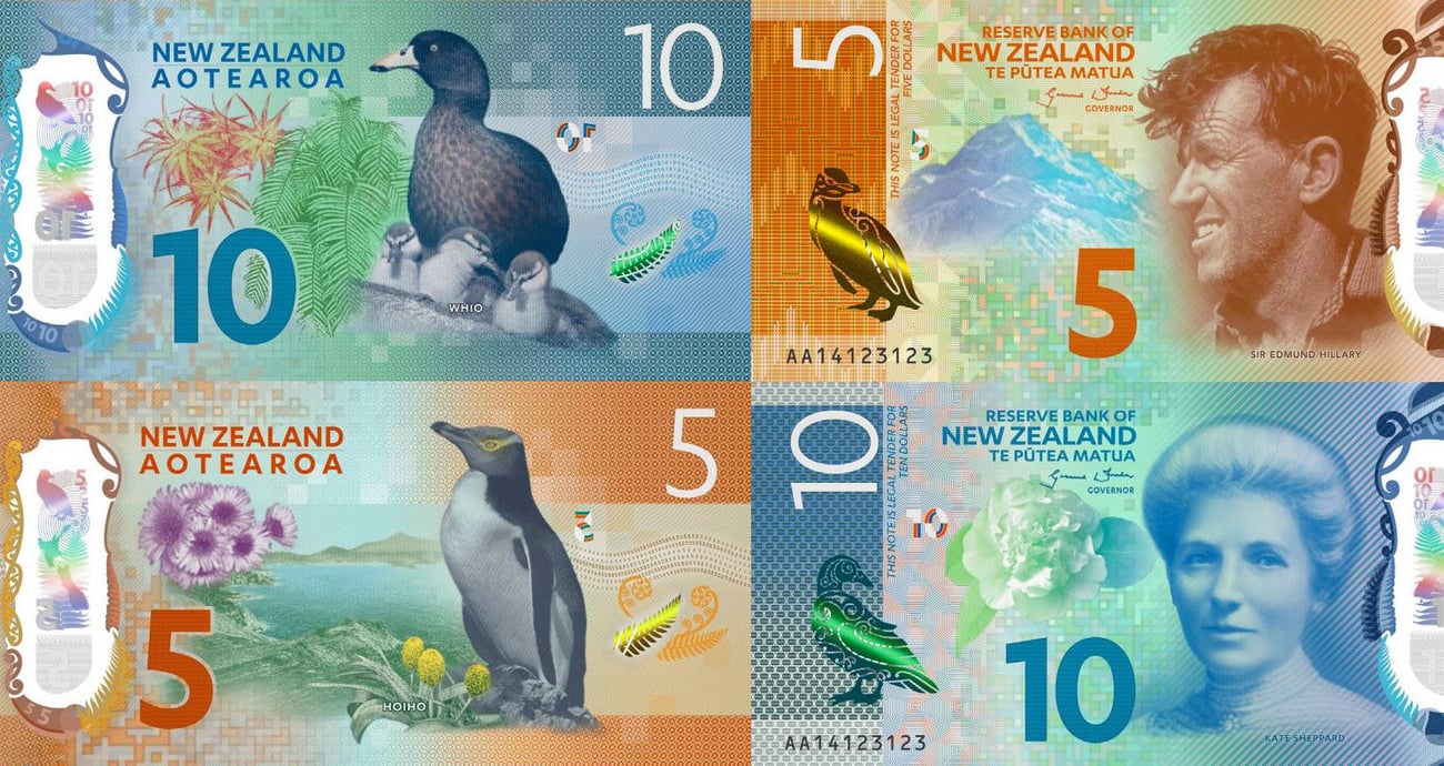

The $5 and $10 banknotes were revealed at an event in Wellington last week, with Governor Graeme Wheeler calling their security measures “a world first”.
While that may be a bit of a stretch, the new notes are a security upgrade of sorts. Central banks generally upgrade their banknotes once every ten years and the current series has been in circulation for 16. With counterfeiters growing more sophisticated by the day, and as the tools to create workable fakes becoming cheaper, it was time to upgrade the notes to make them harder to copy.
The notes remain the same size, and, like the old notes, the substrate (that’s the material the design is printed on) on the new ones is made of polypropylene. Polypropylene is a hard-wearing plastic that’s grime-resistant, difficult to tear and even washing machine safe (seriously).
The new security elements of the notes are designed to serve two functions. They’re designed to be difficult to copy and to be readily identifiable by the general public.
There’s a large transparent window on the new notes featuring an intricate border and containing several hard-to-copy details. Included in the window are metallic elements: a bird’s silhouette, a map of New Zealand, the denomination number in several different font sizes, a detailed outline of a fern and a 3D version of the denomination number. Also included in the window is an intricate, embossed version of the denomination number.


Both the numbers and the bird are holographic, as is the embossed denomination number.
The notes have been printed with raised ink. On the front, the bird, the words ‘New Zealand Aotearoa’ and the denomination number are pressure printed (30 tonnes of pressure, that is), and on the back, the words ‘Reserve Bank of New Zealand Te P?tea Matua’, the portrait and the denomination number are also raised.
The front and the back of the note has a three piece ‘puzzle number’. When held up to the light, the pieces align exactly to form the complete denomination number.
The note features a colour-changing bird motif on one side and fern motif on the other. The metallic images change colour as they move in the light revealing a green shining bar which moves back and forth depending on the angle at which it’s viewed.


The new notes have been rejigged to accommodate people with sight issues. The Reserve Bank consulted with the Blind Foundation, Blind Citizens NZ and Retina New Zealand on the new designs. There’s now greater contrast between notes, larger, bold numerals and clearer backgrounds. There’s no braille on the new notes, which was considered but was deemed too problematic in regards to production, processing and durability.
The notes were designed and are printed at the Canadian Bank Note Company and the whole process will cost the Reserve Bank an estimated $80 million.
Check out the interactive site, Brighter Money, which offers a modest interactive tour of the new notes. For Idealog’s breakdown of the design elements of the new notes, click here.


