Infographic: What the universe would look like if the moon was the size of one pixel
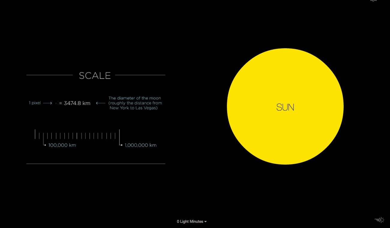
That is why designer Josh Worth created an infographic titled If the Moon Were 1 Pixel. The interactive infographic uses pixels to accurately measure out our solar system and allows users to scroll through outer space as if you are a spaceship traveling to its limits.
Worth explains his motivation behind the project.
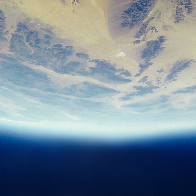
I was talking about the planets with my 5-year-old daughter the other day. I was trying to explain how taking a summer vacation to Mars in the future will be a much bigger undertaking than a trip to Palm Springs (though equally as hot). I kept trying to describe the distance using metaphors like “if the earth was the size of a golf ball, then Mars would be across the soccer field” etc., but I realized I didn’t really know much about these distances, besides the fact that they were really large and hard to understand. Pictures in books, planetarium models, even telescopes are pretty misleading when it comes to judging just how big the universe can be. Are we doing ourselves a disservice by ignoring all the emptiness?
So I thought I would see if a computer screen could help make a map of a solar system that’s a bit more accurate (while teaching myself a few things about javascript, SVGs and viewports along the way).
Not that pixels are any better at representing scale than golfballs, but they’re our main way of interpreting most information these days, so why not the solar system?