
OPPO has unveiled the Reno13 Series, bringing flagship-level design, performance and durability to the mid-range phone market.
To mark its release in New Zealand, the company partnered with local advertising agency YoungShand and seven local artists for an eye-catching collaboration. The artists include Stephen Templer, Margarita Vovna, Robbi Carvalho, Gwilym Devey, Guy Ellis, Pepper Raccoon and Marcus Watson.
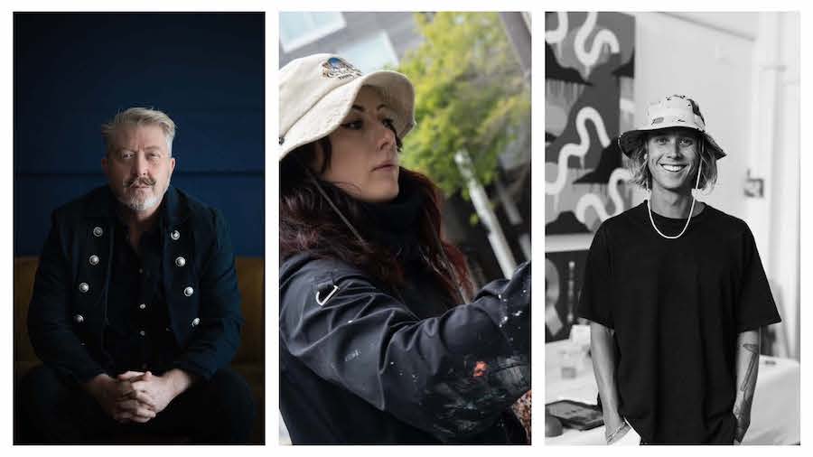
The following features creative insights from Stephen Templer, Margarita Vovna and Marcus Watson (pictured above). Templer’s work spans children’s book illustration, animation, street art and more. Vovna specialises in both commercial work and personal passion projects. Watson brings together illustration and graphic design in his art.
Together, they share how their artistry reflects the power and freedom of creativity, highlighting how the Reno13 Series places design and creative freedom at the forefront.
Tell me more about the elements you used in your design
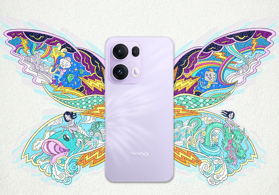
“I’m a visual storyteller, so the elements used are characters and landscape. I wanted to show energy and movement. With the underlying composition of butterfly wings, some symmetry was important, but also breaking out with individual characters,” says Templer.
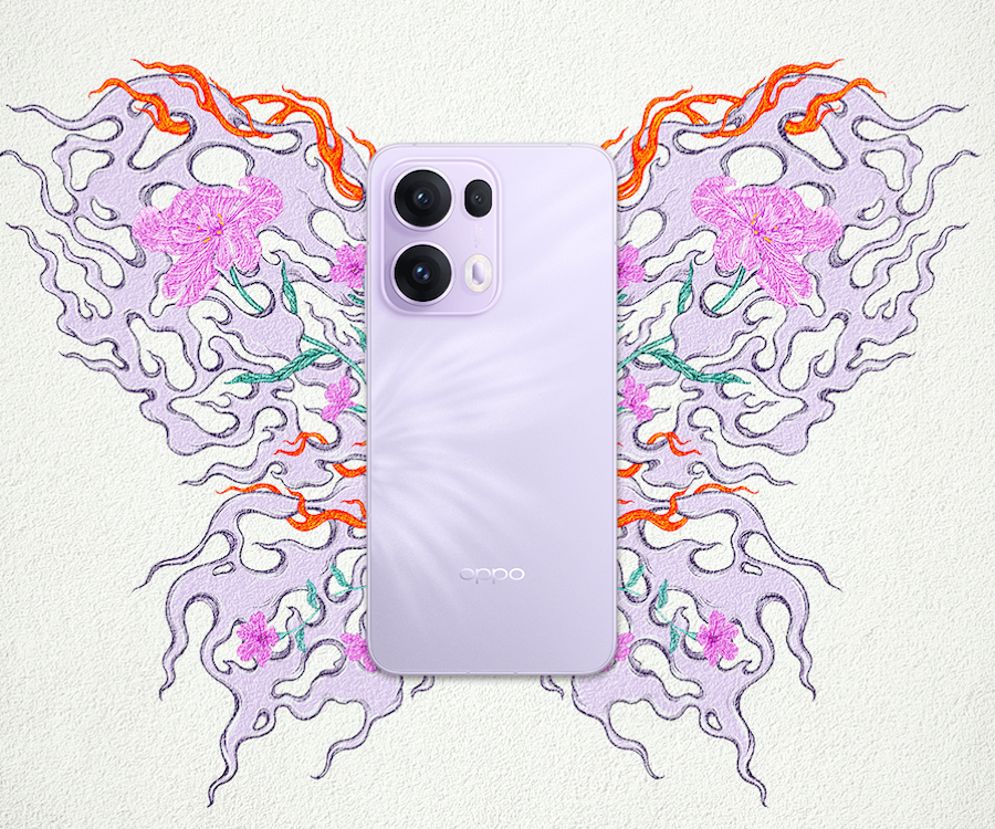
For Vovna, the theme is quite literally ‘elemental’. “The main shapes are influenced by flowing water or maybe mist with flames and blooms intertwining throughout the smoky butterfly wings.”
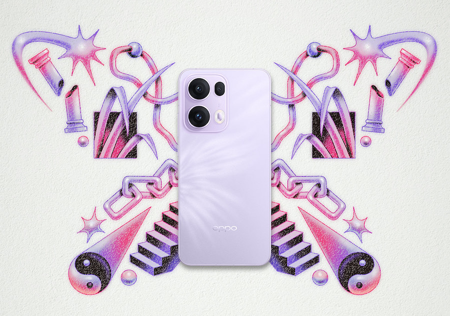
Whereas Watson says he used “a combination of surreal, organic and symbolic elements that collectively form the shape of the butterfly motif.
“The aim is to convey a sense of balance and duality (hence the yin and yang symbol) so naturally I went with a symmetrical composition. I also wanted the artwork to feel dreamlike yet futuristic, so I rendered the elements using soft gradients and neon glows.”
What message or emotions do you want customers to feel?
“I want the customer to see an exciting and dynamic piece of art. Also a glimpse into some underlying stories and characters,” says Templer. “I want them to feel like they are witness to a moment in an adventure. I would like them to see themselves in this story.”
Vovna says, she aimed for a core feeling of harmony, infused with the energy and vitality of fire and blooms. “I think there’s a sense of balance and motion in this design that suggests embracing the dynamic nature of things and life. I like seeing these different elements co-existing with ease.”
Meanwhile, Watson hopes his artwork will make people feel “curious, empowered and inspired!”
How does the butterfly shape convey the power and freedom of creativity?
“The movement and transformation of butterflies is a symbol of rebirth and creativity,” says Templer. “The shape feels like an embodiment of dynamic beauty.”
Vovna, who has incorporated butterfly imagery in much of her earlier work, highlights their visual variety and fleeting presence. “It’s easy to admire the many shapes and forms butterflies come in,” she says. “Much like creative ideas, they float in and out, can be fleeting and hard to catch but add so much beauty and diversity to our visual world.”
For Watson, the butterfly carries a deeper symbolic meaning. “The butterfly is the archetypal symbol of transformation and growth,” he explains. “Its ability to undergo metamorphosis reflects how through creativity, ideas and concepts evolve through a series of limitations and boundaries to ultimately take flight and break free – mirroring how creative freedom transforms limitations into liberation.”