
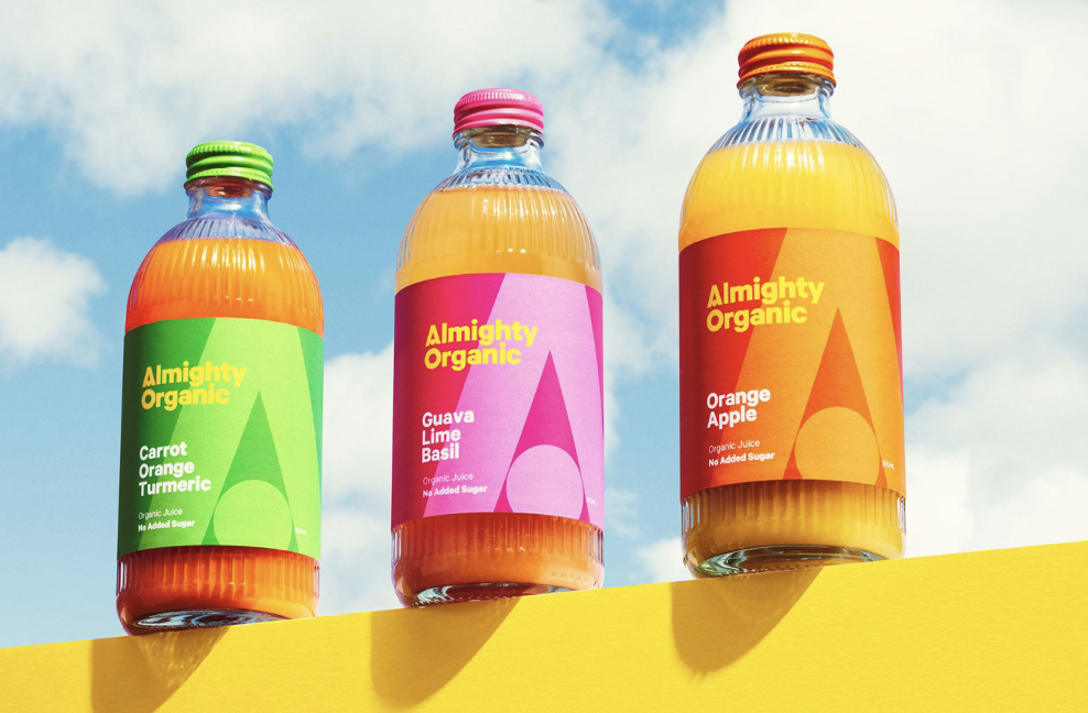
Almighty Beverages first arrived on the scene as an organic juice company, but now the brand has decided to evolve and rebrand, becoming known for its low-calorie beverages.
First launched in 2015, Almighty Beverages was founded in Wellington as a brand that created healthy and organic alternatives to juice.
Fast forward to 2022, Almighty Beverages rebranded its juice line and launched two new product lines – Almighty Waters and Almighty Active.
The brand’s products have seen immense success and Almighty Beverages wanted to rebrand from an organic company into a ‘contemporary brand’ as it has found its way across a number of supermarkets and restaurants.
For the brand, Almighty Beverages wanted its redesign to encapsulate the company’s beginnings as an organic juice company, but also represent its new product lines.
In order for the brand to successfully rebrand, Almighty Beverages went to the Pitchblack Partners and Marx Desgin to relook at its design.
“The team at Pitchblack could really see the potential of the brand to become bigger than our original organic juice product. They helped us spot the consumer needs, find the weaknesses in our competitors and the opportunities for the healthy new alternative products,” says Ben Lenart, Co-Founder of Almighty Beverages.

“They could see the big picture and the potential power of the Almighty brand.”
Read more: The story behind the rebrand of Ārepa.
Working alongside Marx Design, Lenart adds that their design skills paired well with the strategic and creative skills of Pitchblack Partners to create a fun and new Almighty Beverages.
“Marx has exceptional product design skills. They really understood the brief to create a brand that would evolve from one product to the next, creating clear product differentiation but retaining the collective power of a single core master brand,” says Lenart.
Design-wise, Pitchblack Partners Head of Design James Wendelborn says the approach for the redesign needed to stand out from the previous design but prevented consumers to know what they were purchasing.
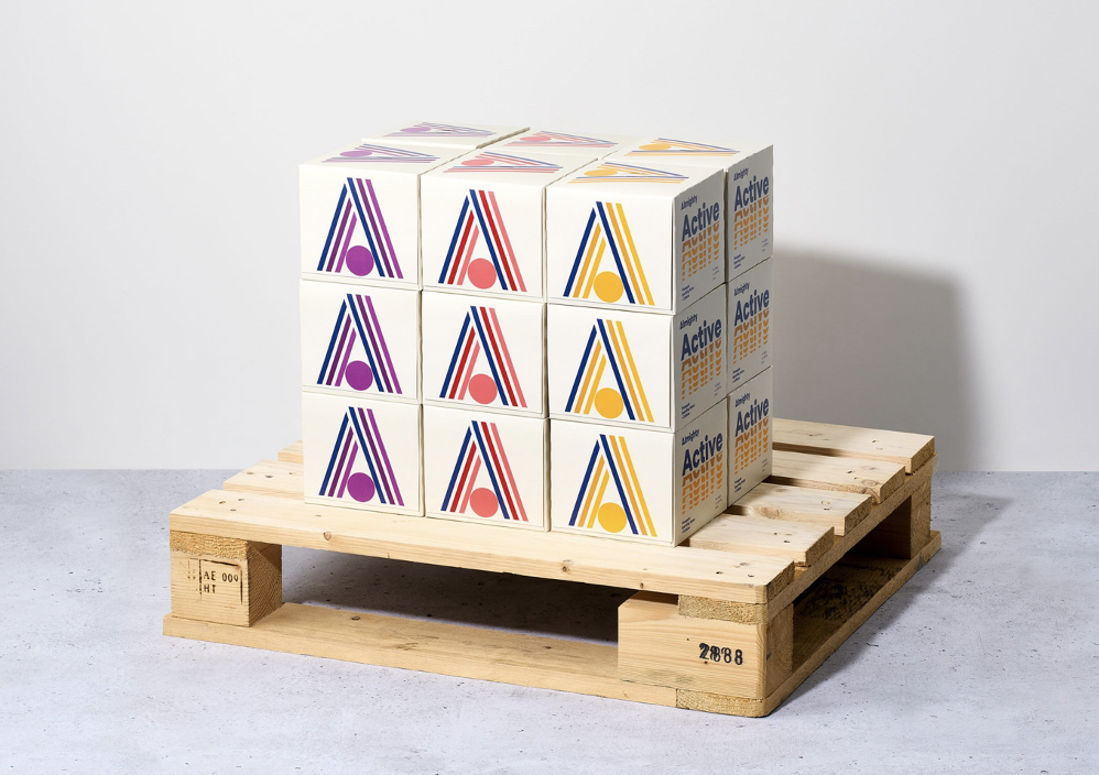
“We shifted the focus to the ‘Almighty A’, building a powerful master brand rather than being recognised as a collection of ingredients,” says Wendelborn.
Wendelborn and Pitchblack Partners worked towards making the ‘A’ the prime focus of the brand in order to change them into a contemporary brand.
“We tried a lot of different variations on the letter ‘A’, but ultimately it came down to what was bold, punchy and flexible enough to carry a broader product line,” he says.
“That flexibility has allowed Almighty Beverages to expand beyond organic juice into low calorie and functional drinks.”