Kris Ericksen shares tips on putting together a stunning piece of visual merchandising


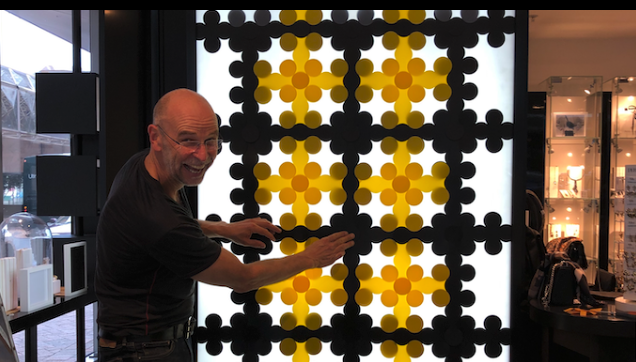
To create the winning window display for Dyrberg/Kern, Ericksen transformed 12 metres of window frontage on the corner of Grey and Featherston Sts into a glowing landscape of bespoke pendant lights, giant wall panels and sculptures, all fashioned from yellow, black and white in varying shapes and sizes. The installation is inspired by the notion of spring and the exploration of patterns and textures.
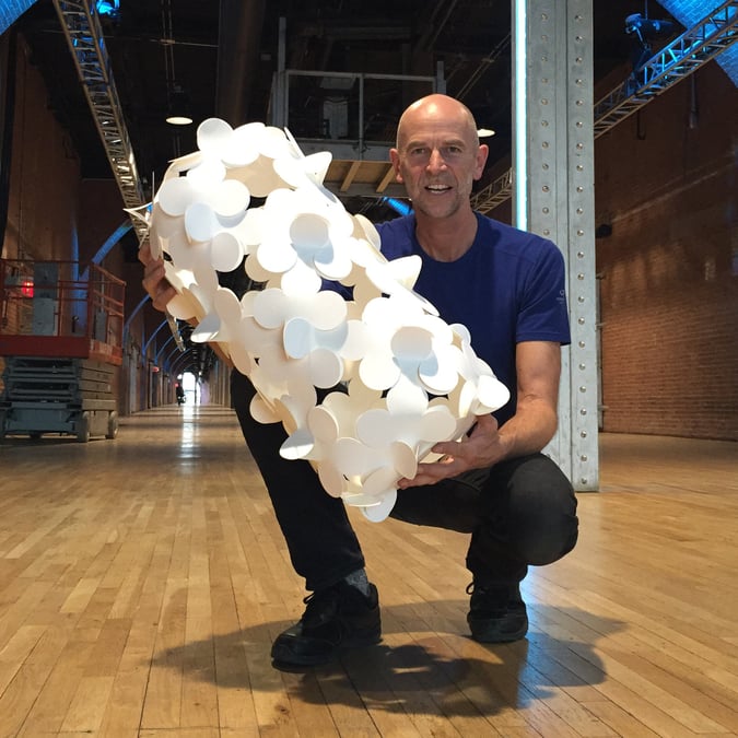
The sculptures are made with Ericksen’s registered modular design concept, the Plato System, which consists of two dimensional interlocking pieces that can be fastened together and over-locked in a multitude of ways.
Tell us more about your winning window display
This window display was created for luxury jewellers, Dyrberg/Kern’s flagship store in the heart of Wellington’s CBD. They wanted something ‘exceptional’ that would win them this year’s Welly Loves WOW retail competition.
The theme for the WOW competition was ‘Inspired by Yellow’. I took this colour and boldly applied it with blacks and whites to create my overall theme of Honikoma – which means ‘honeycomb’ in M?ori . Using my design invention, the Plato System, which comprises flexible, interlocking 2D pieces, I created 12 metres of display for Dyrberg/Kern, drawing ideas from my own WOW entry in 2014 – Phoenix Transformer*, which came second in the South Pacific section of the competition.
I created a visual mix of geometric patterned panels. For the corner feature I created a form of rhombus, very similar to the centre panel of Phoenix Transformer. I then created three ‘light panels’ which each explore the many possible ways of interconnecting the Plato pieces and exposing the light through the gaps in the joins. One is a simple ‘tartan’ pattern in yellow and black that uses perpendicular interlocks. Another consists of 18 panels that each have different combinations of colours, orientations and textures. The final panel uses ‘triangular’ Plato pieces that demonstrate the emergent patterns resultant from the overlaps.
In your opinion, what makes a great window display?
Something that looks visually bold and simple from a distance, but which has intricacy and complexity when viewed close-up. This technique catches the eye, then captures the imagination.
Can you name some other retailers with inspiring window displays?
For this competition, I agree with the Welly Loves WOW Window Dressing Competition judges who gave honourable mentions to Abstract Design for going beyond a well-designed window and painting their storefront sunshine yellow, and Deryn Schmidt Lombard Lane’s gorgeous waterfall of paper cranes.
What concepts should aspiring visual merchandisers be thinking about?
While I’m not much of a shopper myself, I do appreciate a captivating retail display. For me, bold and simple works every time. That’s what draws me in. But then when I get there, I expect something more and that’s where I believe intricacy and complexity play their part. Visual merchandisers would do well to think about aesthetically pleasing the consumer as the first phase and then going beyond that and delivering something more than what they at first see.


