
Best of the Best: Our picks from the 2018 Best Awards Public Good award finalists
Project: Starship Animal Check Ups & Magical Forest

Studio: Rush Digital, Watermark Creative
Discipline: Public Good Award
Creative director: Terry Williams-Willcock
Design director: Stephen Horner
?
Every year 34,000 children come to the Starship children’s emergency department. The assessment area and waiting room is where the patient journey starts for many of these children. The designers were tasked with creating new ways to enhance the emergency department experience for children, parents and the staff. The expectation was to calm children and prepare them for treatment while creating a more accommodating space for patient comfort and flow.
There are two very different experiences:
‘The Starship Animal Check-ups’ space is a picture wall, like one you might have in your home, but this one comes to life with different animal nurse/doctor characters to take children through check-up experiences. The characters familiarise the children and parents with the processes they will soon undertake with the clinical team. The interactive animal characters, such as lions, teach children to open their mouths wide, meerkats read your heart rate and our blowfish help to coach different breathing rhythms. All experiences are controlled by proprietary sensors and interactive computer vision-based tracking system.
‘The Magic Forest’ is a window to an enchanting, tranquil world creating a calming space to relax and enjoy quiet time. The calmer you are the more the environment rewards you. In this space, virtual birds and flowers react to the child’s movements; move slowly to see flowers blossom and birds pollinate them, move too quickly and they will be scared off. A human-centred design approach was used to empathise. This involved behaviour observation of the space, talking to play specialist and nurses, and understanding the different coping strategies that reduce anxiety in order to create a calm, fun environment.
Project: Re:scam

Studio: DDB New Zealand
Discipline: Public Good Award
Creative directors: Damon Stapleton, Shane Bradnick, Brett Colliver, Mike Felix, Haydn Kerr
Design director: Jason Vertongen
Re:scam is an AI chatbot designed to do the one thing you should never do: reply to scams. When you forward any suspicious emails to Re:scam, it identifies scam emails and then begins a never-ending conversation with the scammer so they waste their time talking to a chatbot instead of real targets.
Creating chatbots to fool scammers presented a unique design challenge to the studio’s user experience and development teams. Re:scam was developed using IBM Watson to analyse emails and add to its ever growing vocabulary. Multiple bot personalities were tghen created, based on the most vulnerable internet users. And the bots were given the ability to generate false account information (including credit card numbers, email addresses, bank account information and postal addresses) so there’s no way for scammers to know they’re talking to computer.
When the studio developed the art direction of Re:Scam, they wanted to give a face to what is otherwise faceless technology. So they produced 3D renderings of each of their bot personalities, which formed the basis of the website, videos and all communications.
Users can check up on and share the conversations they initiate, fuelling an important global conversation. This constant flow of emails from scammers provides entertaining content but also up to the minute data on trending scams. Re:scam uses this to educate people through social media, and shares all scammer information with cybercrime agencies.
Project: Allay

Discipline: Student Public Good Award
Student: Mona Gabr
Lecturers: Simon Nicholls, Jim Murray, Don Chooi?
Allay is a social media app aimed at supporting mental wellbeing through the art-making process. Inspired by art therapy methods, Allay provides its users with a safe platform to share expressive art and design work. The app also supports the creation of these works by providing simple activities and mindfulness exercises.
The idea was developed following initial research into millennials and mental health-related issues in New Zealand. According to the Ministry of Health report released in 2017 around 79,000 Kiwi youths are affected by psychological distress. The growing number of young New Zealanders that are battling anxiety or depressive disorders find little support through existing social media platforms. Allay however seeks to build a support network of young creatives brought together through individual expression and shared experience.
The approach to the target audience age 17-20 is human centred, using social media platform as a way to resolve the stigma for getting help from art therapy and express their feelings.
In the home screen, after login users would be able to navigate and comment on others’ artwork before commencing work on their own. The concept of Allay is that each expressive method will encourage the users to create artwork through time based simple activities. These activities are supported by relaxation and visualisation techniques inspired by art therapy methods. After the activities are completed, users are encouraged to share their artwork inside Allay social media community, encouraging others to comment and support their artwork.
The Allay user interface is based on minimalist design with clear and simple visual elements that allow users to navigate through the app quickly. The UI has been designed to increase the chance of engagement by minimising distractions. The brand tone of voice was inspired by expressionist artists who often employed swirling, swaying, and exaggeratedly executed brushstrokes in the depiction of their subjects. These techniques are meant to convey the turgid emotional state of the artist reacting to the anxieties of the modern world.
Project: Clean Cheeks

Discipline: Student Public Good Award
Students: Sophie Watts, Ivy Wallis
Lecturer: Dr Caroline Campbell
Clean Cheeks Nappy Service is a convenient and affordable nappy option, designed to compete with disposables, massively reducing the amount of costly environmentally harmful waste. The additional toilet training support to have earlier self-toileting outcomes is a key aim to benefit both parent and child, in time saving, cost saving and pollution reduction.
Clean Cheeks supplies and delivers, exchanging soiled with clean items on a continual cycle. The aim to allow a continuation of current nappy changing practices with informed environmental benefits. There are options to buy outright, self-launder or subscribe with all the work carried out by Clean Cheeks.
Nappies are a basic healthcare need and a lack of sufficient nappies can lead to an array of problems for disadvantaged families. Clean Cheeks will be supporting the national charity ‘Pregnancy Help’, who’s new nappy banks will enable families who might not otherwise be able to, to have access to free reusable nappies. This is facilitated through a donation system where members of Clean Cheeks can donate their nappies once their child/children have become toilet trained.
Project: Plastic Oceans

Discipline: Student Public Good Award
Student: Sophie Miya-Smith
Lecturer: Johnson Witehira?
Plastic Oceans targets the issue of plastic pollution in our oceans. The brief required a design response that demonstrates sensitivity to the topic and the intended audience. Student Sophie Miya-Smith delivered this through a three-part poster series.
Initial research revealed that existing campaigns around plastic pollution often use imagery that depicts the suffocation of animals. This included physical entanglement in plastic, or a collection of plastic particles found inside dead sea creature. While these kinds of images are often effective, as they are both visually striking and hit emotional triggers in the viewer, this strategy is often overused.
Humans may often feel removed from the issue of plastic pollution, due to its large global scale. Yet it is we as individuals, who are causing ourselves harm. The poster-series worked to specifically highlight the significance of each human’s contribution to the plastic pollution, instilling a sense of responsibility in the public. By directly involving people in the scene, it creates a humanized attachment and awareness of the issue.
The imagery was executed photographically, in-studio, capturing a series of people drowning due to plastic suffocation. The subjects brought in personal plastic waste recently accumulated in their daily lives. Using their plastic waste, an outfit was created for them to wear to capture the idea of drowning in personal plastic suffocation.
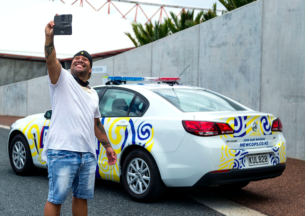
Project: Pirihimana Car

Studio: four eight five, Ogilvy
Discipline: Public Good Award
Creative directors: Regan Grafton, Lisa Fedyszyn, Jonathan McMahon
Design directors: Nathan Chambers, Danny Carlsen
The car that’s speaking our language.
New Zealand Police are always looking to build better relationships within the M?ori community but have sometimes struggled to do so in a public-facing manner. They wanted to enhance their relationship in a more proactive and positive way.
So when the country celebrated M?ori language week, the design team – for the first time in history – changed the official Police carlivery to be in line with this mandate.
The Police car is a such a strong, tangible presence within our community, they wanted to surprise and delight the public with the design by making sure they did a double take.
Using the iconically recognisable, striking yellow and blue colours – but integrating the koru- ‘turning of the tide’ motif – provided that. Even the angle, typeface and structure of the Police word-mark was replicated to display the M?ori word for police – ‘Pirihimana’.
The Pirihimana car’s purpose is to be used as a starting point to symbolise a commitment to working in a positive way with the key communities in which the cars operate. The ‘turning of the tide’ koru motif was devised specifically by the M?ori Iwi Liaison Team.
The cars are so popular with the public that they are constantly at community events as well hitting the roads. It’s evoking positive reactions out in the community, breaking down walls, starting conversations and getting noticed by the public. And while a simple word won’t change everything, the Pirihimana cars helped New Zealand Police create a stronger connection with the community.
Project: Freyburg Place and Ellen Melville Centre

Studio: four eight five, Ogilvy
Discipline: Public Good Award
Creative directors: David Irwin (Isthmus Group), Nicholas Stevens (Stevens Lawson Architects), John Reynolds (Artist)
Design directors: Sarah Bishop (Lead Landscape Architect), Yvette Overdyck (Lead Architect)
In the last 25 years, the Auckland ‘CBD’ has changed considerably and has become a true city centre with a growing and diverse resident population. The Waitemat? Local Board advocated for the historic Ellen Melville Centre and Freyberg Place to be transformed into a welcoming, not for profit community hub for city centre residents and the wider community.
The restoration of the Ellen Melville Centre has revealed a rich history. It tells the story of mana wahine, the pioneer women both Maori and Pakeha who made a considerable contribution to the foundation of Auckland: the women who fought for equality and the right to vote.
Freyberg Place (the adjacent public square) offered an opportunity to integrate a publically owned community centre with a much loved, but tired looking public square. The revitalised square, with its terraced stairs and seating, recognises the sites location at the edge of a lava flow. The project sought to deliver a community hub with greater user flexibility, a pedestrian priority destination, an inclusive, child friendly public realm and an event space integrated with the Ellen Melville Centre.
The approach to this project was one of collaboration and inclusiveness. The team that designed and constructed this upgrade was multi-disciplinary in every sense. It was artist led, with the vision created by one of New Zealand’s top artists John Reynolds. John worked closely with Landscape Architects, Architects and Engineers, to design a place that is both beautiful and functional; a place that truly embraces city life.
This renovation has breathed life back into the building and civic space with art and culture at the heart. It includes new works such as ‘Justice’ by Lisa Reihana, a water-feature etching by iwi artist Graham Tipene and restoration of tukutuku panels.
Innovative approaches to site interpretation include the naming of rooms by the National Council of Women of NZ to commemorate several significant NZ women.
The upgrade has successfully fostered a sense of community within the central city. Waitemat? now has a shining jewel in the city centre that is inclusive, accessible and welcoming for everyone.
Project: Niho Taniwha: Communicating Tsunami risk

Discipline: Student Public Good Award
Student: Harmony Repia
Lecturers: Jo Bailey, Tristam Sparks
Niho taniwha is a site and community-specific case study that explores how M?tauranga M?ori can produce a meaningful and relevant narrative to enhance community conversations that raise awareness of tsunami risk and inform new tsunami communications for T?ranganui-a-Kiwa.
Through the narrativised knowledge of Papat??nuku, R?aumoko and Tangaroa, an indigenous understanding of atua tells people about the different forms, shapes and nature of an energy and expressions that could be communicated as a Ma?ori understanding of tsunami risk. Tangata whenua can interact and visualise the energy and mauri of these atua in the final pouwhenua communicating that an earthquake can trigger a tsunami and the shake is the warning to evacuate. Papa’s relationship with the earth moving may refer to the Hikurangi Subduction Zone where the two plates are currently locked.
When the energy and pressure is built up over time the release of that energy may be seen in large subduction earthquakes that could trigger a local tsunami for T?ranga. Therefore, Papat??nuku is represented in the pressure plate that activates this pouwhenua. Once triggered, R?aumoko’s domain represented by a red light and adorned with the pattern ‘niho taniwha’ will begin to animate. The upper half of the pou is Tangaroa’s domain, which uses a wave pattern and blue light to signify the water carving into the land, simulating the effects of tsunami. The animation of light and atua cycles through three times reflecting that a tsunami can inundate in a series of waves not just one.
The aim of the design is to entice people to interact with the narrative of the pou, raise awareness and enhance conversation around tsunami risk by embedding a narrative that responds to traditional knowledge of place may transmit knowledge in memorable ways, describing the relationship, situations and events of a tsunami warning.