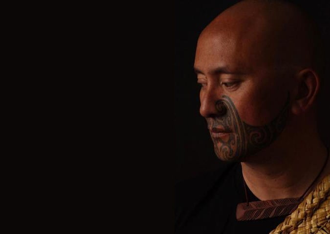
Design can reflect our identity and our unique corner of the world by highlighting our indigenous culture, heritage and sense of place. In celebration of Māori Language week, here are some of our favourite picks from the Best Awards Ngā Aho category finalists, which celebrates Māori design.
Auckland Virtual Tours
Studio: Method
Discipline: Nga Aho Award
Creative directors: Eugene Eastlake, Sam Ramlu
Design directors: Nick Peek, Royce Reeves


See our story we did earlier this year here.
See ancient Māori carve waka on the shores of Kohimarama, Rangitoto erupting in a ball of fire, or a pukeko pecking at the ground in front of you. Look up and you’ll see the beautiful, obsidian waters of the Waitematā Harbour from your viewpoint at Takaparawhau (Bastion Point).
The historically significant spot has far more stories to tell than what its surroundings let on, stories hidden from the naked eye.
The designers collaborated with Ngāti Whātua Ōrākei to launch a groundbreaking augmented reality walking tour that takes the visitor on an immersive and enriching journey. They created an app that combines augmented reality, geo-tracking, 360 video, narrative audio (strewn with little-known gems), historical photos, and information on native birds and plants in the area, giving visitors a unique glimpse into the history of the land, its people, and their culture.
Ngāti Whātua Ōrākei wanted to push the boundaries of traditional tourism and tell their unique tribal stories in an exciting way, bringing them to life and sharing knowledge that might otherwise be lost over time. They wanted to connect people to the treasures of the natural environment, and the cultural and historical significance of the site.
The app is available in English, Māori, and Chinese and starts at the entrance of Michael Savage Memorial. A map and visual wayfinder points you in the right direction.
At each destination (four in total), visitors are rewarded with a guide from the iwi family narrating a story from that area – everything from a slice of history to identifying geographical elements, showcasing the local flora and fauna, and an introduction to the iwi’s marae. Visitors can explore each area further through a gallery of images as well as finding out about the local birdlife.
“We set out to create an immersive experience with the ‘wow’ factor. An experience that’s talked about long after people have left the area. One that enriches their knowledge of Tāmaki Makaurau and the Māori connection and heritage. And we believe we’ve done just that.”
Māori Television Giphy Channel
Studio: Fly
Discipline: Nga Aho Award
Creative director: Johnson McKay
Design director: Jason Fantonial


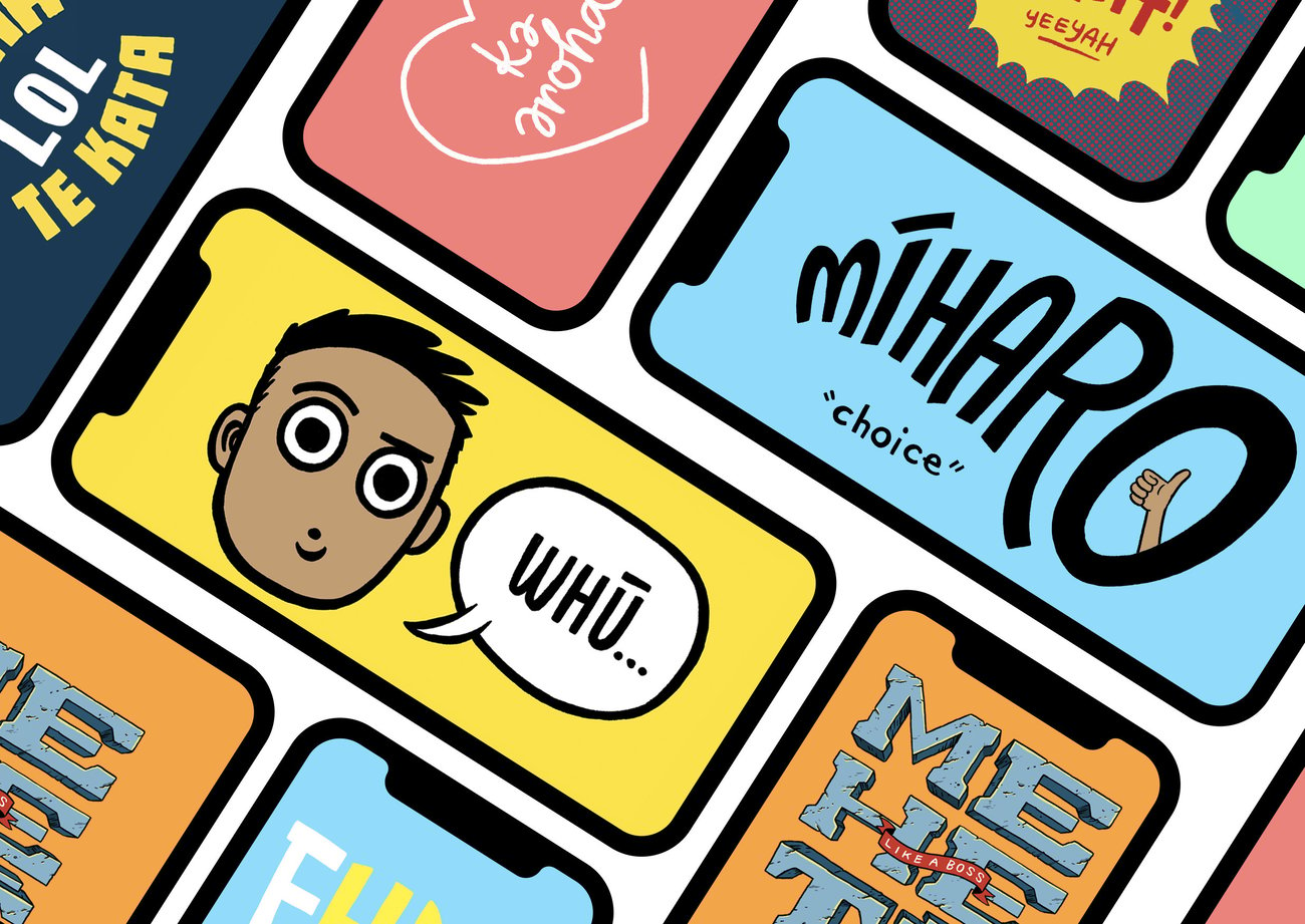
Māori Television has a mandate to normalise and revitalise te reo Māori. The solution is encouraging more people to use te reo Māori in their everyday lives. They gave us the task of connecting them with the next generation of te reo Māori speakers, rangatahi (young Māori). This audience is challenging to reach with traditional media, requiring an inventive solutionto excite them and bring them into orbit with Māori Television and new TV content that had been created to engage this audience.
Through a series of focus groups, they discovered that rangatahi see themselves as proud to be Māori AND global citizens.
They wanted to rep being Māori, but not if it felt old fashioned, stale, serious or poltical. They wanted to kōrero Māori, but only if it fit into their everyday lifestyles. Māori Television was presented with a language strategy, based on the principles of language expert, Ruakere Hond (nō Parihaka). The strategy is based on creating Rumaki Reo (immersive language situations) in every day contexts. Further, that the context enhances tuakiri (positive identity) and elevates the mana of te reo Māori.
The strategy was to create a Rumaki Reo within the space that rangatahi naturally conversate – their phones. Research conducted concluded that young people communicate through animated content, using gifs to express thoughts, feeling and share ideas. giphy.com makes millions of .gifs available to people in 500+ applications, including Facebook, Twitter and Instagram. With over 33,000 .gifs of cats, but zero .gifs that used te reo Māori, the designers created a partnership channel between giphy.com and Māori Television.
The first release of te reo Māori .gifs were released for Te Wiki O Te Reo Māori 2017. As at June 2018, they’ve had over 3.5 million views.
Focusing on illustration and typography that mirrored what rangatahi consume on a daily basis allowed te reo Māori to feel perfectly contextual and relevant. Bright colour palettes, hand drawn fonts and quicky Kiwaha (short, pithy statements) were designed to convey a wide variety of genuine expressions used by the rangatahi focus group. The style was cool enough to become t-shirt graphics, posters and social content.
The animated .gifs were designed to capture the interests of the broadest audiences. While te reo Māori is boldly used, English translations help people of varying levels of te reo Māori competence feel empowered to use them.
Maori TV building
Studio: RCG Ltd
Discipline: Nga Aho Award
Creative director: Andy Florkowski

Check out our story on the Maori Television building last year here.
te tere haere o te waka reo i roto i te wa me te waahi
The endless journey of the television marae through time and space
The Māori Television fit out in East Tamaki is an architectural expression, and a vehicle, to capture the Mauri and DNA of Māori Television at this point in time, while also curating its past journey and paving a path to the future.
Te haerenga, the story and journey of Māori Television, is a story inextricably bound up with a claim made to the Waitangi Tribunal in 1985, Ko te reo te mauri o te mana Māori, that the language is the life force of mana Māori, and that there must be a recognised place for the language of one of the partners to the Treaty.
The 2017 journey across Tamaki Makaurau for Māori Television, was one more stage in an odyssey that has eventually seen a nation embrace official recognition of the language, a Maori presence and voice in broadcasting, new editorial freedoms, and a programming style and presentation that is happily and respectfully Māori.
The overarching design intent was for the space to embody Te Aho Tapu (the sacred thread). It speaks to architecture being a series of weaving, a conversation of multiple threads that embraces a physical and spiritual connection between people and place.
The space planning was defined using the steps of a Powhiri, which informed the inhabitation by applying the wider unique cultural identity of these traditional spaces. The ‘reception’ acts as a Marae Atea to greet guests. All people are then welcomed right into the centre of the building where the Wharenui and Wharekai form the heart of the space. It is truly open-door access to the television marae, which invites participation and celebrates inclusion. It brings a profile to Māori language, culture, custom and history that is unprecedented in television.
A variety of iwi and cultural consultants were engaged to assist in the transposition of an existing Whakatauki; the pieces are navigational and speak to specific parts of the building.
Te Ara Wai
Studio: Manaaki, White Landscape + Urbanism
Discipline: Nga Aho Award
Creative directors: Johnson Witehira, Clynt White
Design director: Gansen Govendor


Check out our interview with Johnson Witehira about the design of these noise walls here.
Installed as part of a programme to help reduce motorway noise for residents living near State Highway 1 in Ellerslie, the Te Ara Wai project involved the installation of nearly three kilometres of concrete sound barriers next to the motorway between the South Eastern Highway and the Greenlane East interchange.
A conceptual framework and series of cultural narratives was developed to inform the design of the noise wall panels. Here a key challenge was ensuring that the large group of mana whenua stakeholders including; Ngai Tai ki Tamaki, Te Ahiwaru, Ngati Paoa, Ngati Maru, Te Akitai Waiohua, Ngati Tamaoho, Ngati Te Ata and Ngati Whanaunga, were part of the on-going conceptual and design process.
The primary theme draws comparisons between historic river transportation corridors used by Maori, and the motorway corridor as modern day equivalent. This idea is explored through a reimagining of the motorway corridor as an awa (river), and expressed using a bold kahurangi/kakariki colour scheme representing the depth, movement, and reflectivity of water. This theme was further reinforced through reference to waka, and the incorporation of taurapa (sternpost) and tauihu (prow) elements at each end of the project.
Individual panels within each wall section include reference to the scales of tuatara to communicate a message of danger, warning travellers to display caution at motorway exits and onramps. These panels are complemented by tiki figures, acting as kaitiaki and providing a symbol of guardianship and protection.
The design and construction of the project lead innovations in stakeholder engagement processes, prototyping using 3D printing and special mould design to replicate the panel design. The Te Ara Wai project is part of larger shift in New Zealand design and architecture in which Māori values and approaches to design are inherent. The designers hope the work, in its boldness and use of Māori forms and content, provides a vision for how Auckland and New Zealand might look in the future.

Nga Whāriki Manaaki
Studio: LANDLAB, Matapopore, Wayne Youle, Neil Pardington Design
Discipline: Nga Aho Award
Creative director: Henry Crothers
Design directors: Reihana Parata, Morehu Flutey-Henare, Wayne Youle, Ethan Reid

Christchurch was originally defined by the imposition of a gridded organisational system upon the sprawling lowlands of Ōtautahi. With minimal levels of topographic excitement, the swampy flatlands disappeared beneath the grid; with exception to the course of the Ōtākaro/Avon River, where fluvial margins meandered an insistent route across the heart of the new geometry.
In the aftermath of the earthquakes of 2010 and 2011, recovery efforts looked to the edges between city and river as locations for catalytic urbanism. A new river promenade and riparian landscape would redefine what had essentially been asphaltic streets atop the riverbank. A conversation between city and river.
Part of the vocabulary in this conversation is a sequence of ‘Nga Whāriki Manaaki, Woven Mats of Welcome’ manifesting along the course of the river. Defined by Ngāi Tahu principles; “Kia atawhai ki te iwi, be kind to your people” welcomes citizens back into the recreated city, and; “Unu tai, which waters are you from?” embraces the river as a way to articulate place and identity.
The project comprises the creation of thirteen Ngā Whāriki; allegorical weaving mats, translated into durable stone and settled within the new river’s edge promenade. Each location intersects with specific stories, narratives and points of interest. Their position upon the bank varies, as if deposited by the Ōtākaro in flood. In sequence, they reference the whakamanuhiri process of welcome for all peoples visiting Christchurch. The sequence reads simultaneously as a potential journey, and as a series of distinct stand-alone spaces. They are exacerbations of moments along the river, which magnify Māori values and bicultural aspirations for the future. Simply put, the design seeks to express kaupapa Māori and a shared cultural history with greater dexterity than previous iterations of the city.
The integration of Nga Whāriki Manaaki with the ‘Avon River Precinct’ ensures that the creation of new spaces for all people are held up in parallel with the vision of Ngāi Tahu to set tikanga in stone, whilst exploring the indigenous identity of the future.
‘Kia tau tonu rā ngā manaakitanga i ngā wā katoa. May manaaki form the basis of all that we do all of the time.’ – Morehu Flutey-Henare and Reihana Parata.
Pā Rongorongo
Studio: Auckland Council
Discipline: Nga Aho Award
Creative director: Angus Muir
Design director: Brogen Averill

The name Pā Rongorongo stems from the interplay and multiplicity of meanings achieved by combining the words Pā and Rongo:
Pā – To touch; Fortified village
Rongo – To hear, smell, feel, touch, taste etc.
Rongorongo – News, report
Pārongo – information
Weaving together all of the above, Pā Rongorongo provides a safe and welcoming space within the Heart of the City, underpinned by our reo mātua, our taonga tuku iho nā ngā tūpuna Māori.
Written reo Māori is strongly present in the space and reo Māori can be heard through interactive elements. Most importantly, Pā Rongorongo is staffed by our kaimanaaki who is able to converse with other reo Māori speakers who visit.
To emphasise the primacy of the reo, a graphic identity based on the name Pā Rongorongo was developed, blending traditional iconography and colour palette. This strong graphic identity focussing on the reo is emphasised by the use of clear simple form and clean materiality otherwise within Pā Rongorongo.
A range of Māori-specific content is under development as part of Tomokanga ā-Mahere o Tāmaki Mahora Noa (the
Emerging Auckland mapping portal) housed in Pā Rongorongo. Layers of data will be available for visitors to Pā Rongorongo to design and download maps, which will feature recognised Māori sites of importance and Māori artworks within the City Centre.
The Kaimahi Toi-ā-Whare (Artist in Residence) programme will target Māori and Pasifika artists to promote toi Māori. Pā Rongorongo’s interactive digital wall is a way of engaging with community, by inviting groups to programme their artworks and messages on this feature.
Pā Rongorongo is available for public groups to use, and has been adopted by reo Māori speaking groups as their wāhi parakatihi within the City Centre. It has also been chosen as the base for the July 2018 Māori Film Week – He Wiki Kiriata Māori.
Oti te Nanekoti
Studio: FCB New Zealand, Assembly
Discipline: Nga Aho Award
Creative directors: James Mok, Tony Clewett, Matt Barne


NZ has the second highest rate of school bullying in the developed world. Māori children in particular are more likely to be both victims and offenders, often leading to social development issues and poor self-esteem.
The Ministry of Education acknowledged their current method of telling victims to say “stop it, I don’t like it” wasn’t working for this at-risk group.
Oti te Nanekoti’ (Oat the Goat) is an immersive online story, available entirely in te reo Māori, that teaches Māori children what to do when they see bullying. Storytelling is blended with interactivity to turn the bedtime story moment into an engaging lesson.
The story follows Oti’s journey to the top of a mountain. Along the way, he encounters different bullying scenarios. It’s here the reader must decide how Oti should act. Should he join in the fun? Yell at the bullies? Or, ask the victim if they’re okay? By giving children the ability to make mistakes in the story, they could learn to make the right choice in real life.
Each chapter was illustrated to represent a New Zealand environment – from Kauri forests to Waitomo-esque caves. The Maunga (mountain) that Oti climbs was designed to look non-specific so children could view it as their own Maunga. The locations were enhanced using the birdsong of native tui and kererū.
The designers also worked with the New Zealand Symphony Orchestra and Alistair Fraser, an expert in Taonga Puoro (traditional Māori instruments) to develop a uniquely Kiwi score.