Bringing calm to a restless world: how colour choices can influence our mood
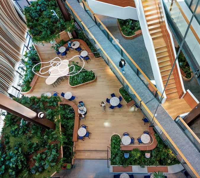
Top image: RResene Total Colour Awards: Waiariki Institute of Technology Health + Science Building, by Lifetime Achievement Award winner Darryl Church. This project is finished in Resene Tint Of Black, Resene Blackout, Resene Impromptu and clear Resene Aquaclear.
It would seem the more today’s pace of life keeps us working long hours or commuting further, the more spaces are evolving to help us find that homely atmosphere beyond our own homes, providing us with a sense of calm amongst the madness of modern routines.
Statistics show the colours we choose to place around us can influence how we think and feel. Researchers at Wellesley College in the US have linked neural processes to colour. Another study by the University of British Columbia found the presence of red colours increased accuracy in participants’ work, while blue boosted their creativity.

 ?
?
 ?
?

Resene Total Colour Commercial Interior Retail + Public Colour Maestro Award: Shanghai Street Dumplings, by Element 17. This project is finished in Resene Barometer, Resene Reservoir, Resene Jalapeno, Resene Gold and Resene White.
These influences from colour are being recognised more and more, and not just in the office environment, but many different commercial spaces, such as retail outlets, cafes and restaurants, factories, hospitals, hotels, malls and more.
“The trends are quite different across the different interior spaces,” says Resene marketing manager Karen Warman, noting places like cafes typically exemplify trendier colours, in contrast to hospitals and public waiting areas that opt for longer-lasting colour schemes.
“For example, hospital waiting rooms often embrace the new blues and the new greens, but they are the more timeless colours that will still be fresh and clean in a few years’ time,” she says. “They tend to go for ‘evergreen’ options – the options that are new today but in five years’ time they will still look current, and they tend to avoid anything that’s overly trend-driven because they know that it won’t last.”
Colour contrast is the biggest thing they’ve seen in colour for some time, she says. “If you think back to the old days, hospitals or doctors’ clinics were typically white, white and more white. It feels clean, but it also feels very sterile, and you don’t know where to look and it’s quite glary on the eyes and not particularly calming.”
Another notable trend is embracing dark colours. “Dark greys, dark blues are popular and very on-trend and are easy to pair with anything,” Warman says. “You can take a dark-grey, dress it up or dress it down, make it cool or make it warm, depending on what you put with it. Both are really versatile dark colours and being used in place of black.”
Blurring boundaries
Elements traditionally found in a home environment appear to be expanding into public spaces – such as waiting rooms – and places that are usually quite sterile are incorporating colours that bring a sense of peace and tranquility.
“What we’ve really seen over the last few years is more calming colours come in, like the watery blues and watery greens – the kind of things you might find in your lounge room at home,” says Warman.
“It’s very soothing, so if you have to sit in a waiting room it gives you something nice to look at, but you feel like you’re waiting at somebody’s home rather than waiting in the doctor’s office.”
Comparing present-day offices and homes to those 20 years ago, Warman says they are looking more and more alike. And by using similar materials to those found in a home, such as the increasing use of timber finishes, they’re achieving a similar feel.
It would seem in a business’ interest to make its environment feel like an extension of the home to its customers, as there are benefits for both parties.
“With the ageing population, people are visiting medical spaces more often than they ever had to in the past,” says Warman. “Because of that, these places are becoming more like spa retreats, the natural timbers, the blues and washed greens – because they want you to feel relaxed and comfortable and they want you to stay.”
Bringing the outdoors indoors
As we spend more time indoors, the rise of biophilic design in commercial interiors would seem a logical step in creating a sense of calm and connection with nature. Think touches like natural materials, greenery, art showing nature and natural light. “Bringing the outdoors indoors” satiates the human need to connect with nature, while studies have shown it can deliver many health benefits.
Warman says bringing the environment indoors is a widespread theme, not just through plants, but through colour ways, too. “If you can bring the nature in, people start to feel like they’ve got a bit of fresh air, and it’s less stressful because they are in the outdoors.”
Materials used naturally impact the colour scheme, too. Even the warm, inviting effect of timber interiors is being taken a step further. “The wooden surfaces have probably been one of the biggest changes in recent years,” says Warman, adding there’s been a shift from natural stain to a whitewashed look.

Resene Total Colour Commercial Interior Office Colour Maestro Award: Call Centre Fitout by Mary Jowett and Carolin Friese of Mary Jowett Architects Ltd. This project uses Resene Paris Daisy, Resene Double Alabaster and a Resene custom mixed grey.
“It’s a soft off-white look and you can see the timber grain through it. It’s not about covering up the timber, it’s about bringing out the beauty of the timber. It’s quite a weathered look, almost like what you’d find at the beach if you go and pick up a piece of driftwood. It’s very popular and it goes particularly well with white walls, while giving you a little bit of relief from an all-white interior.”

Resene Total Colour Commercial Interior Retail + Public Colour Maestro Award: Jucy Snooze by Archaus. This project is finished in Resene Lima, Resene Belladonna, Resene Quarter Black White and Resene Concrete.
Warman says there are two ways that colour tends to be treated: “One is colour is a key part of the design and it actually helps the design. And the other is colour is just a pretty thing that you choose at the end.
“There are a lot of clever architects and designers that have been using colour in this amazing way for many years – their designs are amazing anyway, and then when they put the colours in the right place it just enhances what’s so good about their design.”
She says the general public has become more aware of how colour can enhance a space, and are applying it in their own homes. “As their colour knowledge grows they expect to see colour used well when they are out and about as well.”
Shanghai Street Dumplings by Element 17 won the 2017 Resene Total Colour Commercial Interior Retail and Public Colour Maestro Award, and it illustrates Warman’s point. Although the colour scheme is clashy and energetic, the judges noted that “the blue ombre effect is cleverly placed to provide a serene zone in amongst the hustle and bustle”.
Noted architect Darryl Church is another who has recognised the importance of colour, and won a Resene Total Colour Lifetime Achievement award in 2017. The Waiariki Institute of Technology Health + Science Building shows how his innovative placement of green Resene Impromptu impacts the timber batten walls.
“Darryl doesn’t just apply colour to a project, he interweaves it into the design, so that the design and the colour become inseparable. His placement of colour is always so precise, so carefully crafted,” the panel noted.