
The function of colour: How Jen Sievers and Yon Kavvas inject design into lives in surprising ways
Lots of people paint things made of fibreglass, of course. But life-sized horses? Now that’s a horse of a different colour – in this case, quite literally.

That’s just par for the course for Jen Sievers. The Auckland-based artist knows a thing or two about painting interesting things – after all, she specialises in painting on Perspex, layering so much paint on the acrylic sheets that her work looks three-dimensional (or, at the very least, quite – dare we say – trippy).

Jen Sievers.
“I’ve always been interested in transparency, looking through things and layering things,” she explains. “You paint on one side, but then you turn it around that’s when you see some really interesting stuff.”
With a background of 15 years in graphic design, Sievers says when doing something like a portrait on Perspex, she paints “backwards,” starting with eyelashes and eyes and then later painting things like skin. “It all comes down to planning,” she says, explaining that it requires her to think about composition and beyond just what her brush is doing in that moment.

“La Vie en Rose”

“La Vie en Rose”

“La Vie en Rose”
Sievers did a solo show last year, called “A Life Exotic,” at Endemic World in Auckland’s hip Ponsonby neighbourhood. The show featured birds, flowers, abstracts and more. Something to stir up flights of fancy, no?
“I’m always fiercely trying to find new ways to be creative,” she says with a laugh.
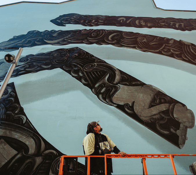
Sievers also recently painted the entire top section of the Bailey Nelson eyeglasses shop on High Street in Auckland’s city centre. “It was my first mural.”
But back to the horse. Named Patrick, “he” was originally white – until Sievers got hold of him. “He’s just an explosion of colour.”


Patrick was originally created for this year’s Land Rover NZ Polo Open, and specifically for Veuve Clicquot’s “Colourama” Marquee, which would debut a colourful fusion of art, interactive elements, food and – of course – champagne, all brought to life by creative New Zealand women. Unfortunately, inclement weather meant the entire event was cancelled – but Patrick (who is somewhat reminiscent of Berlin’s famous “Buddy Bears” fibreglass bear sculpture project or the “CowParade” travelling fibreglass cow exhibition that has visited such places as Perth and Portland, Oregon) still survives. In fact, he reappeared at a Veuve Clicquot tasting with winemaker Stephanie Roposte in Auckland on March 7.

“La Vie en Rose”
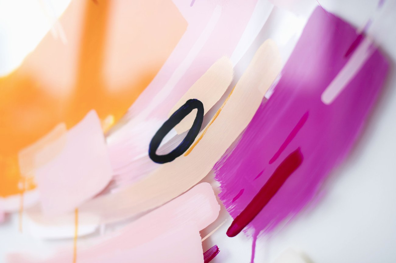
But Perspex painting. Since that’s Sievers’ specialty, she also created a special one metre by 80-centimetre abstract work for Veuve Clicquot, inspired by the brand’s distinctive Clicquot rosé. “I love pink and orange,” she explains. “The colours just work perfectly with what I like to do. When you look close, you can see how the layers almost separate more than a regular painting.”

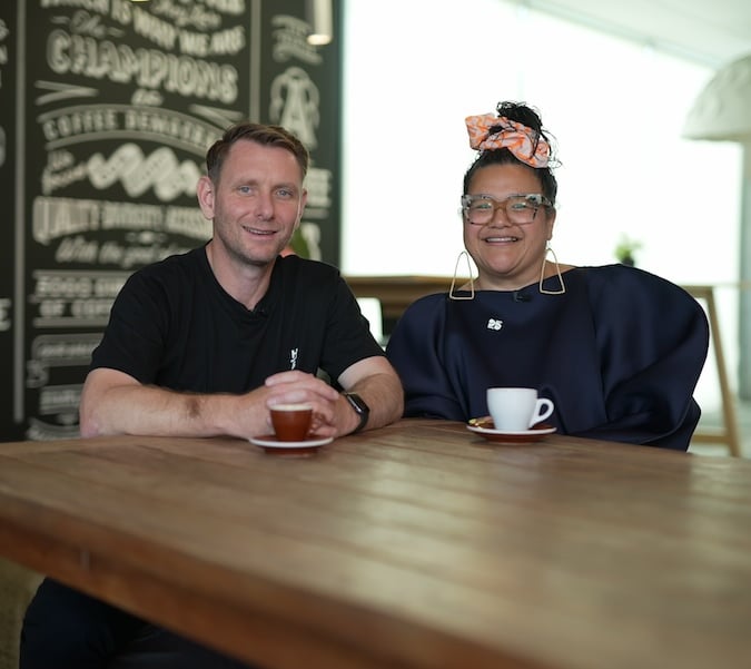
Another innovative woman who helped bring to life the Colourama marquee is clay artisan Yon Kavvas. Kavvas created a bespoke pottery series inspired by the colours and bold nature of Veuve Clicquot.

Yon Kavvas.
With a background in archaeology, and having taken part in digs in places like Turkey, Kavvas says she has always had an intrinsic love and interest in mud and pottery. “I’m a slip caster,” she explains. “So I developed my own range.”
Kavvas, who also makes functional ceramics for retailers and businesses, has been making ceramics for about 14 years. She founded her own brand, Clay Bird, in 2014. ‘people are buying more handmade,” she explains. “They want to know the story of where things come from.”

Speaking of where things come from, the clay Kavvas uses comes from the Waikato. She uses New Zealand glazes, and gets her sand from Waihi Beach on the east coast of the Bay of Plenty. And she doesn’t just want her pieces to look nice – she also wants people to use them. “I want someone to use it until it breaks.”
Proof, once again, that functionality and aesthetics don’t have to be mutually exclusive. And even the most seemingly abstract design can have a use – even if that use requires a bit of patience and perseverance.