How Inhouse blended New Zealand with Japan and brought Steinlager’s Tokyo Dry to life


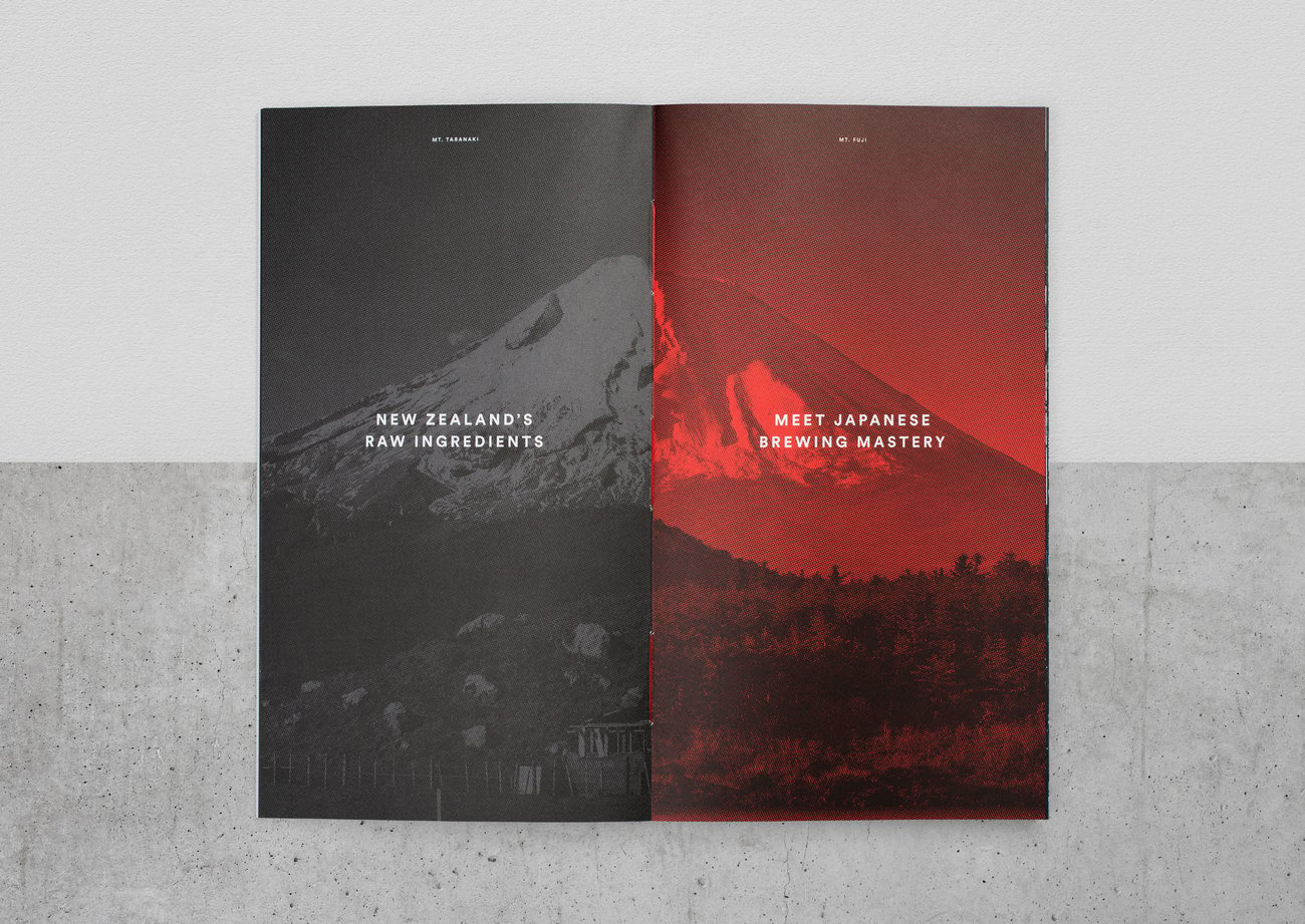
Responsible for the naming, branding, and packaging, Inhouse aimed to communicate Japanese elegance and sophistication for Tokyo Dry. The result? Lion Breweries’ most successful new product launch to date. Oh, and heaps of awards, too – including the Graphics Purple Pin at the Best Awards.


Inhouse design director Toby Curnow describes the process. “Before we were briefed, Lion had already done significant work with partner agencies TRA and DDB to identify the opportunity and the DDB creative team developed the ‘NZ meets Japan’ concept. This created a fantastic platform to launch the design process.”
Steinlager Tokyo Dry campaign video from DDB.
Creative director Arch MacDonnell expands. “They wanted something that would appeal to Millennials,” he says. “One of the core ideas was the coming together of two worlds. It’s some of the best parts of New Zealand with some of the best parts of Japan.”
Enter the “Tokyo Dry” name Inhouse came up with.


“We needed to explain what the concept was in the name,” says MacDonnell. “Everyone has an image of Tokyo, and it (the product) is a dry, sessionable lager.”
Two Japanese design principles strongly influenced Inhouse’s design process: Kanso (??, a simplicity or elimination of clutter, with things expressed in a plain, simple, natural manner that reminds us to think not in terms of decoration but in terms of clarity, a kind of clarity that may be achieved through omission or exclusion of the non-essential) and Shizen (??, naturalness. An absence of pretense or artificiality, full creative intent unforced. This is a reminder that design is not an accident, even when we are trying to create a natural-feeling environment. It is not a raw nature as such but one with purpose and intention). Curnow says they were instrumental in creating the Tokyo Dry image. “We wanted to create something that had simplicity and elegance.”


Strong red and silver colours help differentiate Tokyo Dry’s visual identity compared to other beers, as well as the move to a brown bottle– something MacDonnell says it’s a bold move considering that consumers expectation for a high quality lager and particularly Steinlager is for green glass.
Curnow adds that red was used because it is strongly associated with Japan and was already a Steinlager colour. “We also liked how silver had a slightly technological connotation, especially with Japanese brewing.”


MacDonnell says the biggest challenge was “not making it feel like a pastiche of Japanese culture.” The gamble has certainly paid off, with Best Awards judges saying the design is “An exemplary piece of work across various mediums from packaging to brand standards with a clear idea executed to the highest standard.”


MacDonnell says conducting lots of testing helped make the difference, as did having a strong relationship with Lion Breweries as a client. “We had a great relationship with the client,” he says. “They were on board with everything we were doing. It really was a partnership. There was a tremendous amount of trust. Having a great client can lead you to a great result.”


Curnow expands on that. “Beer is a quite conservative market,” he says. “It’s a difficult category to innovate in.
“We’ve learnt quite a bit about research. It’s good not to fear research and take it on as part of the process.”
Given Inhouse’s success, it’s a process other designers might do well to emulate.


