
Human beings are imperfect creatures and we can be slow to grasp innovative design. Skeuomorphs appear everywhere to make things easier to grasp. And it was ever so. The car was such an unfamiliar and scary contraption when it was first released that someone had the bright idea of plonking a horse’s head on the front.
Until recently, making things look familiar was the route to making them easier, but now we’ve got science to inform us. So design can actually make things easier by understanding our hardwired behavioural traits and designing for them.
The core tenets of behavioural science have become embedded in design. There’s a catch though.
Design has opted to use only one set of principles – those that are concerned with habitual behaviour and cognitive biases. For example, we’ve become very good at designing websites with defaults that increase spend or take-up and we have shaped up product or service ranges and pricing through an understanding of choice architecture. We’ve learned that when you disrupt people’s habitual behaviour by changing what is familiar there are gains (if you are trying to wean customers from your competitor) and potential losses if it causes your customers to re-evaluate their brand choices. Therefore redesigning packaging is as likely to lose you customers as gain them, so design takes that into account.
The result has been a progressive move toward human-centered design. And we all know that humans just want an easy life, minimising effort.
But there is another consequence: sameness. And that’s equally true for products, services, website design or smartphones when the goal is easy, seamless user experience.
Although important principles for designers, these habitual and cognitive bias-based behavioural tenets are only one slice of the whole picture. Both neuroscience and behavioural economic theory also give us insight into some other residual behaviour that our primitive past has bequeathed us. For example, we have an inbuilt curiosity for what is new and unfamiliar.
Seeking new and unfamiliar experiences is a fundamental behavioural tendency in humans – we balance safety and risk-taking as a primitive strategy to optimise survival – or in our somewhat more advanced societies as a way of optimising our lives.
A study by neuroscientists at Baylor College of Medicine used fMRI scans on people as they squirted into their mouths either fruit juice or water in either predictable or in unpredictable patterns. The scans showed that the people who got the unpredictable sequence had more activity in the area of the brain that processes pleasure.
Yet all design around customer and user experience is currently hell-bent on providing an easy, seamless, predictable and therefore anodyne and frictionless experience. And there is no argument that anyone could string together suggesting we should make things hard or disconnected that would have any credibility.
Unless of course the reward people get is inbuilt into things being hard. The whole concept of premium/luxury is often built on being hard. If it was easy, poor people could have it too. Take the handmade Hermes Birkin Bag. There’s no doubt it’s a nice, if rather plain, looking bag, but it can cost anywhere from US$11,550 to US$150,000, and there’s generally a big waiting list to get one. Make it into that exclusive club, however, and you not only feel very special, you also feel very clever.
Back to the pleasure of friction through unfamiliar and unpredictable experiences, another experiment, this time by University College London, had robots work with people to make an omelette. One robot performed the role perfectly whereas the other robot was programmed to drop one of the eggs and to apologise using facial expressions to convey regret and sadness. Guess which robot was preferred and got the highest satisfaction scores? A bit of friction enhanced the experience.
Look at the huge rise in analogue stationery, which results in messy handwriting and crossing out, when digital is so much easier. Or things like Hipstamatic, where you shake the camera to randomly select a different lens, film and flash. We can easily take professional looking snaps with our phones and digital cameras with no requirement to change the lens and with instantresult, yet Hipstamatic has built in a wait time. That’s not a technical requirement of the software. It’s deliberately built in. By comparison the ‘good design’ principles of ease and simplicity in one click to purchase can equally be derided for not allowing pause for thought and may account for high levels of returns. How about building in ‘get a second opinion from a friend’? It may reduce initial sales/sign ups, but maybe not – and maybe there are compensatory longer term benefits.
Artists, as compared to designers, have always understood how to run counter to making things easy for people. Picasso was quite capable of painting a realistic face, but he didn’t, and as a result got our attention like no conventional portrait would have. People are drawn to the unfamiliar and enjoy the brain fizz it causes. They connect more with things that are imperfect or that trigger a cognitive response. Think about the Ikea effect where we attach more value to an outcome that we have expended effort to accomplish.
Building in friction may seem like bad design, but, in many cases, it creates more meaningful and engaging interactions. At last year’s South by South West festival in Texas, Steve Selzer, experience design manager at Airbnb, spoke about the importance of bringing back ‘friction’ in a world of increasingly seamless service delivery. What Airbnb found is if the hirer and the renter of a house never met, there was a much greater level of dissatisfaction. So they made it mandatory for the two to meet to pick up the keys and, voila, friction by design.
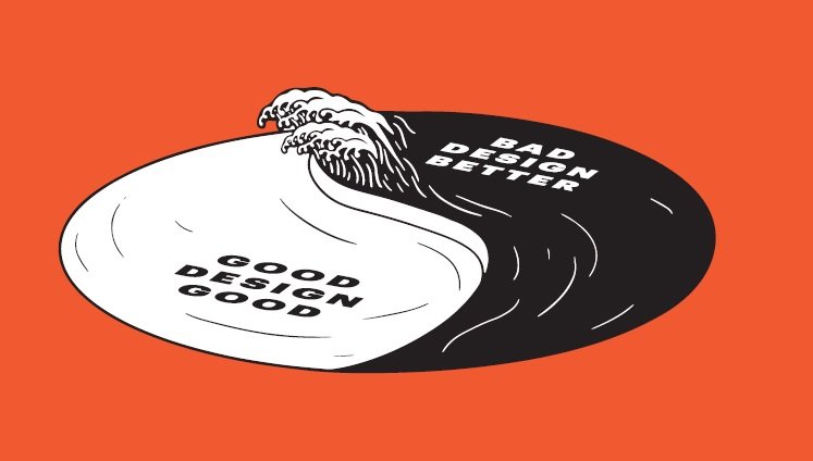
Steve Jobs described computers as ‘bicycles for the mind’, but is today’s good design – digital and physical – making us mindless instead? Design might be getting too good for its own good.