

Plant and Food’s Mount Albert Research Centre underwent a restoration project on its Cunningham Buildling, which was first built in 1939. Marketing manager Johanna John says the company wanted to both respect the heritage of the building, as well as create a fresh, new, innovative space.
“Creative Spaces crafted a palette that drew on Resene’s heritage range,” she said. “Firstly, the palette was used to highlight the unique architectural features of the building, emphasising its history. Secondly, colour was used to define the range of working spaces that were created within the building. The result is a unique space, with a great energy that we all love to use.”

Spaceworks worked with Woods to develop a colour palette that related to the company’s work in infrastructure, land development and urban design.
“The Resene Mexican Wave orange is a nod to clay/dirt and road cones, the yellow is reflective of big CAT earth moving trucks, the Resene Roadster red is both a brand colour but also reminds us of street signage,” says Spaceworks CEO and creative director Lizzi Whaley. “Likewise, the black is a brand colour and points to roading and infrastructure. The intensity of these colour are balance with the use of natural materials found in their working environment – timber, concrete, rust, glass and a lot of natural light.”

Interior design company The Buchan Group helped bring Toyota’s Auckland offices out of a dated, individualised structure into an open plan layout. Associate and head of interiors Charlotte Cochrane says a contrasting black and white colour palette was used so that featured artwork and bespoke furniture could stand out within the space.
“The contrasting colour palette for the design pushes the boundaries of standard office design by using Resene Black White as the colour for the walls and floor whilst a black suspended ceiling and Resene Black painted doors was used to contrast as well as allowing the eye to focus on the fabulous raised framed north facing view of the harbour.”

Design Federation recently moved into Oamaru’s old precinct. Creative director Annabel Berry said the company wanted to blend in to its location, but also liven things up with its colour scheme.
“We painted the main concrete wall black in Resene Foundry to complement the warehouse style space and bring a level of sophistication to the space. As designers, our aim with the space was to show a range of colours and inspire clients with how to
use them in different settings. Our meeting space is painted in dark teal in Resene Barometer, our office space in a pop of yellow with Resene Cream Can, and display walls are changed out regularly to show colour combinations with our headboard range different furniture settings. Colour is the spice of an interior and a life lived with colour is a better one!”

Susie Evans, office manager at law firm Mayne Wetherell, says the company wanted to create an office that expressed comfort and quality without being too formal, as well as a refined residential aesthetic rather than a traditional corporate approach.
“The colour palette was inspired by luxurious natural elements such as timber, water and stone-like finishes,” Evans said. “The materials and textures were taken from finishes used in both high-end residential and corporate environments. As you enter the space the combined use of light and materials creates a warm, moody atmosphere. The bespoke timber panelling is a repeat feature and is seen throughout, on the walls and in the joinery. Warm off whites, were used to lighten the highly detailed interior. Neutral blue-grey tones and warm charcoals used on the floor are grounding elements reflecting the exterior views of the harbour waters and concrete silos. The use of gradient carpet tiles accentuates the colour palette on the floor through the use of texture, light and shadows. The overall look is timeless and sophisticated, where the environment captures and enhances the Mayne Wetherell culture.”
![]()
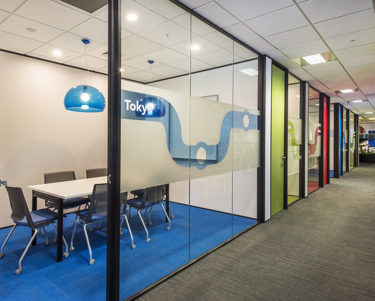
Kevin Russ, the director of architecture firm Creative Spaces, says Auckland Transport wanted to create a vibrant, colourful new fit-out for its customer services, parking services and HOP Card teams.
The company took inspiration from its use of colour wayfinding at its public transport stations and incorporated vibrant reds, blues and greens throughout the office.
“Inspiration for the colour scheme not only came from the Auckland Transport branding colours but also from the Auckland Rail Network map graphic. The reds from the Southern Line, the blues from the Onehunga Line and the greens from the Western Line,” Russ says. “The colours chosen helped reinforce the branding identity of Auckland Transport and also provided a note of visual cohesion as you move through the space.”

When Phil Redmond had the task of fitting out his own Christchurch office, he didn’t shy away from trying something bold.
Redmond says the company decided to use a Dazzle Camouflage pattern from World War 2 battleships to create a dynamic, exciting entrance to its offices.
Resene’s Primetime colour was used as a historical reference to the battleships. Street artists Andrew Steel and D-Side were also commissioned to create a custom backdrop in the main office.
“The wall, which is often mistaken as wallpaper, lifts the space and you are constantly seeing characters within it that you have not noticed before,” he says.

Creative Spaces worked with Tower insurance to future proof the design of its new office, as it wanted it to remain relevant if the branding changed.
“A colour palette was established which assisted with way-finding, and gave each floor its own identity,” interior design associate Alice Dalton says. “Resene Alabaster was chosen as a fresh neutral base for all floors, this was contrasted with strong bright colours on the ceilings in each lift lobby that reflected the theme of the floor.”