
It’s long been known that different environments can have significant effects on our moods. Gazing at the ocean often has a calming effect, as does being surrounded by nature in the forest or bush.
But many might not connect those feelings to the colour of those surroundings, such as the blue ocean, or green forest. Psychological research has found certain colours can evoke different moods, emotions and feelings, be it conscious or unconscious.
The Institute For Color Research has found people make a subconscious judgement about a person, environment or product within 90 seconds of their initial viewing of it, and between 62 to 90 percent of that assessment is based on colour alone.
Each colour’s influence over a person varies: blue colours have been found to calm the mind, yellow colours can excite the emotions, red colours can stimulate the body and green colours can affect the balance between all three. Therefore, Resene’s marketing manager Karen Warman says the colour scheme of your office should be a conscious, strategic decision.
Warman says depending on the company and the roles within it, employers can use colour to directly have an impact on workers’ productivity.
“Who’s going to be in this space and what do you want to do in this space? It depends who you’re talking to and how they have to be productive,” she says.
“Green or blue can be quite relaxing, but sometimes in an office you actually need higher energy. It’s more common to see employers starting to look at what colour suits which department.”
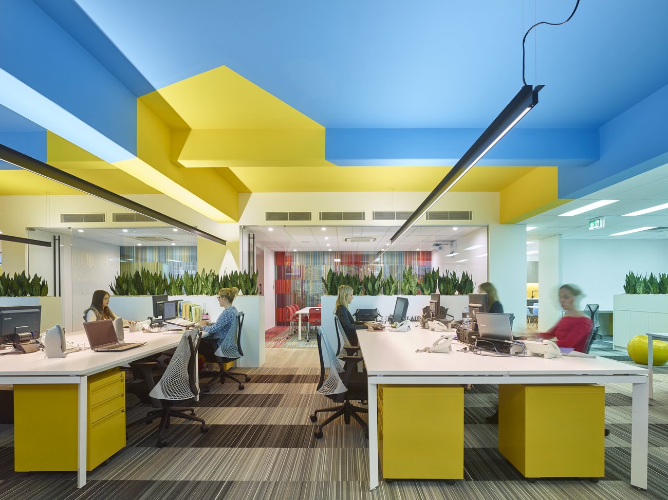
Warman says with a sales team that needs to be high energy and extroverted, it would be better to incorporate a bright-coloured theme or interactive walls they can write all over.
In contrast, she says an accounting or data entry team that needs to be highly focused on their computers would be better off with a more subdued shade, like a soft green.
Picking winners
Many offices tend to veer towards the neutral side of the colour palette and a workplace with lashings of purple or pink is a rare sight, unless you’re Cadbury. But Warman says that though muted shades are a popular choice, they’re not necessarily the wisest choice for a workplace.
“The most commonly used colours in an office are blue, green or neutral shades. That doesn’t make it right or wrong, they’re just safer,” she says.
And despite the crisp, clean appearance of a muted colour palette, research has found a sterile environment may not be conducive to work.
A study by the University of Texas gave workers a task to do in three rooms each painted a different colour: red, white and aqua. Some people were able to block out the “noise” of the bolder red and aqua colours, while others were distracted by it.
Green or blue can be quite relaxing, but sometimes in an office you actually need higher energy. It’s more common to see employers starting to look at what colour suits which department.
However, both groups of people made errors when placed in the all-white room.
“White doesn’t help us be productive, and most work environments are white, off-white, or grey,” the researcher behind the study, Nancy Kwallek, told Fast Company.
Instead, the aqua room elicited the best reaction. “There have been studies that asked worker preference about environment and colour, and the majority felt they liked to work in a blue or blue-green environment,” Kwallek said.
Warman says neutral shades like white can actually be quite tiring for the eyes when used in excess.
“I think for most people, all-white walls aren’t particularly inspiring,” she says. “You need some colour. Varied colours make for a more productive office.”
How to incorporate colour


It can be a daunting task for a business to know where to begin when picking a colour scheme. Many err on the side of caution and look to the company’s brand colours.
Warman says if a business wants to be more adventurous with its colour choices, a smart way to do it is to use a bold colour as a statement colour versus an overall colour.
This could be on anything from a door, to a feature wall or a corridor.
But if the colour change doesn’t work out, she says the good thing about using paint is it’s incredibly versatile.
“It’s a great way to change colour, as if you decide you don’t like it, it’s easy to paint over. With something like flooring, once you’ve got it you’re pretty much stuck with it until it wears out,” she says.
The sheen or texture of surfaces is also worth paying attention to when selecting a colour.
A glossy surface can provide a boost of energy, but Warman says it can also become glary, so it’s better in areas people spend shorter periods of time in, like a kitchen.
Lower sheen surfaces are a better option for offices where large amounts of time are spent, like near the desks.
Another way to involve colour within an office is to use it for wayfinding. The use of colour can help people navigate around a building, as research has shown colour can strengthen memory associations.
Wayfinding has often been used in public transport systems and carpark buildings, but this technique has now crept into office design.
Companies are using different colours to distinguish meeting rooms or floors for their visitors and staff, making it easier to recall where they have to be.
Another way to engage with colour that’s growing in popularity is businesses investing in murals for their walls.
“Tailored walls with a bit of personality are becoming more popular rather than buying expensive artwork – it’s making the wall the artwork,” Warman says.
“It has incredible impact and is a good way to introduce the brand or personality without going overboard.”
Artists like Andrew J Steel have done unique murals using Resene paint for the likes of I Love Ugly, True and AS Colour, as well as Google’s creative labs in Sydney.


But Warman says it’s important to note that not every colour is going to work for every person within an office.
Where possible, she recommends asking for staff input into the choice of colours to help them feel more connected to their workplace.
“Certain colours make certain people happy, so it’s always hard to get a colour scheme that suits everyone,” she says.
“But if staff feel like they’ve had some input, they’ll feel more comfortable in the environment they’re in,” she says.


