
Hawkes Bay wine company Rod McDonald Wines is the only New Zealand business to win a prize in the 2016 Harpers Design Awards. Only seven awards are given out globally each year, with judges considering not only the aesthetics of a design but also how the design has been tailored to its target market.
In sum: the awards are kind of a big deal.

“The standard was high, with some stunning examples of enticing and engaging design, really lifting those products above the ordinary,” says Harpers editor Andrew Catchpole. “But our brief as judges went beyond purely aesthetical considerations, looking at how well the design of each product had been tailored to the client’s brief and its target market.”

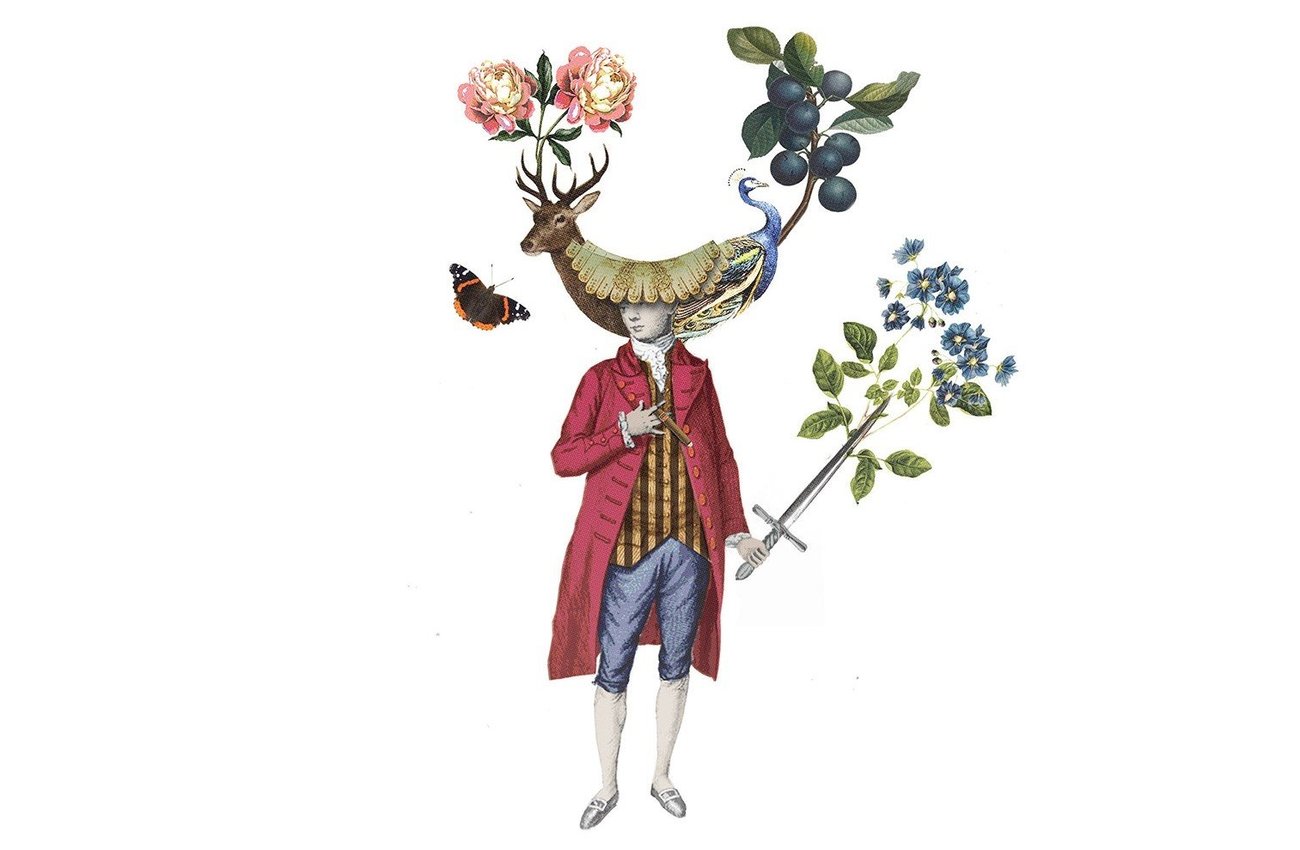
Rod McDonald Wines won the Red Wine Trophy for its Rod McDonald ‘One-Off’ Pinot Noir label, designed by Hawkes Bay-based Zoe Chisholm from Font Studio. Perhaps unsurprisingly, owner (and company namesake) Rod McDonald is pretty stoked. “We are absolutely delighted with the win and it really puts us on the global map,” he explains. “It’s a huge testament to our unique branding approach and the talented team at Font Studio. The idea behind One Off is that we can make, blend and bottle it with a healthy disregard for brand families, consumer research and marketing fundamentals. The only catch is that it’s a one off, once it’s gone, it’s gone, so we basically gave our designers free reign with the brand design and they came back to us with the ‘One Off’ character concept.”
Behind the One-Off concept is a group of characters whose adornments reflect the style of the wines they embody – blueberries, peony rose, violets, the deer, a cigar, the peacock and the admiral butterfly. Each of these elements give the consumer an insight to what the wine might taste like before they read the ingredients on the back label.
In their notes, the judges commented that the wines “really stood out in the lineup,” with the “beautiful and slightly mysterious label image drawing you in.” They went further, too: “Design is incredibly important with drinks because it often precedes smell and taste when it comes to encouraging a customer to pluck a bottle from the shelf, it also adds lustre to the longevity of engagement with a brand.”

McDonald says that what the award really shows is how design can build both buzz and strengthen the appeal of a product – but also hurt it if not done properly. “The whole One Off concept has developed a bit of a cult following creating high demand for the product range,” he says. “The release of each One Off is always keenly anticipated with some almost selling out prior to release. Wine is more than just slapping a label on a bottle, there are several elements to consider to get the product right and this win gives us the confidence to continue doing what we are doing. It’s fantastic for a small Hawkes Bay company like ours to be recognised from such a prestigious award.”
We’ll drink to that.