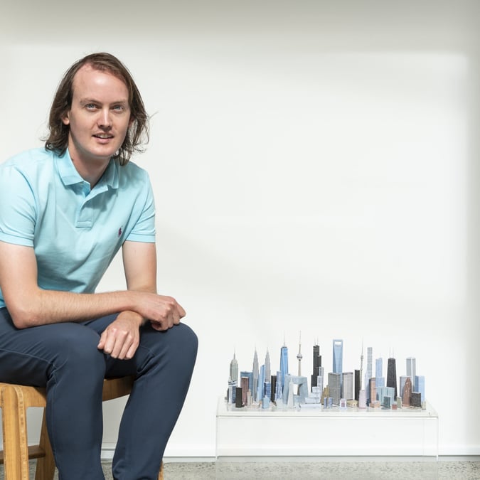

We saw Kris Sowersby of Klim Type Foundry honoured the John Britten Award Black Pin for his (more than) impressive contribution to the art of type design, and a Purple Pin for his Financier font that now fronts the prestigious Financial Times.
And we were part of the standing ovation for Tony Parker, awardee of this year’s Outstanding Achievement Award Black Pin – the creative brain behind a slew of innovative designs, from petrol pumps to the Hulme Prototype F1 Supercar to high-tech agricultural products, as well as nurturing some of the best designers in the industry.
But without further ado, the results you’ve all been waiting for: the Purple Pin winners of the Best Design Awards 2015.


GRAPHIC
Financial Times Redesign, by Klim Type Foundry
Purple Pin winner, Design Craft – Typography (Gold), Editorial & Books (Gold)
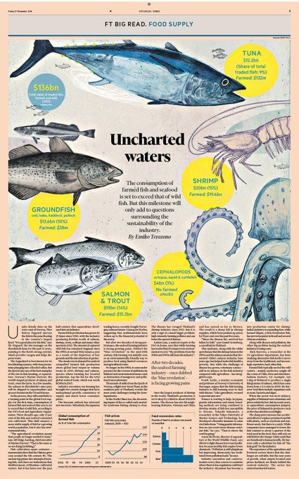
At first glance, The Financial Times doesn’t immediately appear to be different – it’s still salmon pink and it’s still a broadsheet. But look closer, and you’ll see the 127-year-old British newspaper has had a facelift, a modernisation.
For the redesign, the editor expressed a commitment to retaining the paper’s prestige as a high quality product. The newspaper’s history and power as a brand demanded an authoritative design, calling on its British heritage. It was also important that the physical edition complement the website.
These priorities shaped the decision to commission a new custom serif typeface called Financier, made by kiwi Kris Sowersby of Klim Type Foundry. “The idea was to produce an elegant, authoritative serif with a British heritage and versatility to handle news as well as features stories,” says Sowersby.


According to the client, Kevin Wilson of FT, the personality and energy of Sowersby’s typefaces drew interest from the newspaper. “After a couple of experiments, and some very interesting discussions, we hit upon Financier. The reaction from readers to the font and redesign has been very positive.” Readers have described it as “elegant” “distinctive” and “more attractive to a modern readership”.
Studio: Klim Type Foundry
Contributor: Kris Sowersby
Design director: Mark Leeds
Creative director: Kevin Wilson
Design team: Christopher Campbell, Kari-Ruth Pedersen


PRODUCT
Magic Carpet, by Syrp
Purple Pin winner, Non-Consumer (Gold)
As an answer to a market filled with clunky and/or expensive camera sliders, product design studio Syrp set out to develop equipment to combat both problems. The Magic Carpet promises smoother manual tracking shots, and comes with quick release legs, vertical operation, and other clever features – all good news for filmmakers and photographers.
The judges commented on the product’s clarity of purpose, commitment to filmmaking values as well as its quality of design. “It embodies an informed empathy with customer interests in understated, elegantly designed and precision-engineered format.”
Studio: Syrp
Design Director: Chris Thomson
Creative Director: Ben Ryan
Design team: Nick Baker, Christian Tucker
Contributor: Liz Richardson


SPATIAL
Lonely Ponsonby, by Rufus Knight
Purple Pin winner, Emerging Designer (Gold), Retail – Up to 150m2 (Gold)
Beyond the stark shopfront of Lonely Heart’s flagship store in Auckland lies an equally pared-back retail fitout, that works equally well, design-wise. Sandblasted marble walls,salvaged timber parquetry and accents of gold bring the layers and luxury.
Lonely Hearts, along with its lingerie brand Lonely, already has fans in France, Japan and Australia, and panel judges called the design a “superb, international quality fitout that would hold its own in any fashion district”.
Studio: Knight Associates Ltd.
Creative Directors: Rufus Knight, Steve Ferguson
Contributors: Hamish Stirrat, Stuart Robinson, Paul Nannestad, Oliver Booth


PUBLIC GOOD
Designing Better Healthcare Experiences, by DHW Lab
Purple Pin winner
It’s not only medical students receiving real world learning at Auckland Hospital these days. This year, the Auckland District Health Board and AUT University joined forces, starting the Design for Health and Wellbeing Lab.
The lab houses a hive of design students, graduates, staff and collaborators working on creating hospital solutions with the Auckland DHB and its patients. Judges said they couldn’t go past this example of “design in action for the good of us all”.
Projects being trialled in the hospital include a new navigation guide for patients in the Emergency Department, and a child-friendly pole to hold IV drips, the Sprout, designed by Neerali Parbhu.
Studio: DHW Lab in partnership with AUT/Auckland DHB
Design director: Reid Douglas, Nick Hayes
Creative Director:Steve Reay, Justin Kennedy-Good
Design team: Eden Short, Emme Jacob, Deinika Elston, Josh Munn, Guy Collier


INTERACTIVE
PwC Extraordinary Challenges, by Assembly
Purple Pin winner, Moving Images – Interactive (Gold)
For PwC’s first brand campaign in over a decade, Assembly created a dynamic interactive environment to show off the accounting and consultancy firm’s capabilities – from using big data to fight cancer, to helping a domestic airline fly its planes internationally.
The Extraordinary Challenges website opens up to a choose-your-own-story scenario, asking visitors to pick between three journeys. One click, and they’re suddenly in a 365 degree view of that world at work, with reactive sounds and ways to interact.
This year, for the first time, Moving Images was made a category of its own in the Best Design Awards, and according to judges it was a unanimous decision to award Assembly’s entry with the inaugural Purple Pin.
“The level of finish was exceptional and the design consistency across a large amount of content ultimately lifted it above the other entries,” they said.


Te Oro Community Website, by Sons & Co, in partnership with Alt Group
Purple Pin winner, Small Scale Websites (Gold)
The Auckland suburb of Glen Innes recently opened the doors to its own Te Oro, a community arts and cultural centre right in the heart of the neighbourhood. And as part of the centre, a corresponding website was set up to keep the community updated on Te Oro’s offerings.
Visually, the design features a strong Pacific colour scheme and a custom display typeface, based on the traditional tukutuku weaving panel. Practically, it acts as a programme showing the calendar of events and workshops on offer that provide opportunities for young people to access the arts.
For 20 years the local board has asked for a community centre to take kids off the street, and provide a dedicated space to nurture their creative talents and celebrate cultures – here lies part of the result. “It’s a small project with a big role to play,” say the designers.
Studio: Sons & Co. in partnership with Alt Group
Creative Directors: Timothy Kelleher, Dean Poole
Design team: Matthew Arnold, Greg Brown, Kris Lane, Tyrone Ohia


NGA AHO
PURE P?kati, by Whybin, Klim Type Foundry, ARAHIA Pathfinders and Rangi Kipa
Purple Pin winner
The push of the ‘100% Pure’ NZ brand has been successful in promoting our clean and green image to the world. However, Tourism New Zealand felt something was missing from the message – in particular, a cultural narrative and image that embraced our indigenous heritage.
As part of the brand rethink, the tourism board turned to the M?ori Tourism Society and leading kiwi carvers. Together, they created a new brand system and typeface.
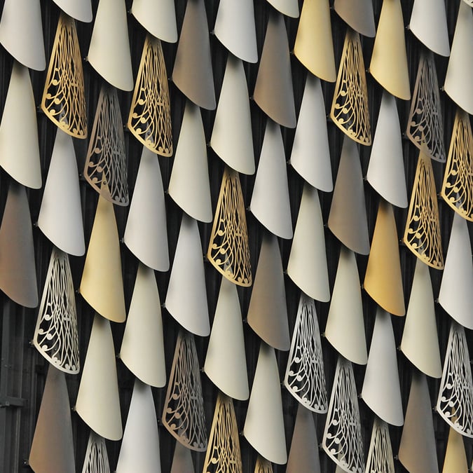
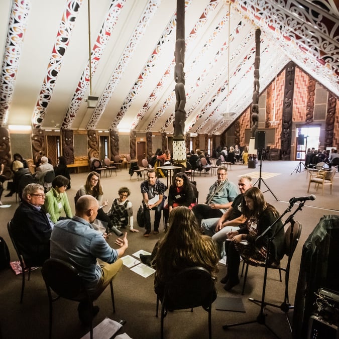
The typeface, labelled PURE P?kati, was realised by Klim Type Foundry, and finished using the practice of whaikairo rakau (wood carving) to produce a handcrafted and authentic style. Rangi Kipa (pictured) carved the font out of kauri blocks, using a recurring pattern of three notches; this is often seen on the painted rafters within carved whare tupuna (ancestral houses).
The finished letters were ink stamped, scanned and now form the digital version of the type. The new branding and font now sits across the Tourism NZ website.
Studio: Whybin/TBWA in partnership with KLIM Type Foundry, ARAHIA Pathfinders, Rangi Kipa
Creative director: Phillip Kelly
Design directors: Kris Sowersby, Karl Wixon, Rangi Kipa
Contributors: NZ MÄori Tourism


BEST EFFECT
Barkers Redesign, by Switch and AND
Purple Pin winner
Like a true gentleman, the 42-year old Barkers brand has quietly been polishing its look in recent years. Read about its recent design identity changes, and winning design formula, in our Best Effect round up here.
Studio: Switch and AND
Creative directors: Chris Jones, Jamie Whiting, Adrian Nancekivell
Design team: Paul Biddle, Glenn Cracknell, Bevan Tonks
Contributors: Kylee Trebilco, Alyssa Longville, William Odes, Mabel Gong, Stephen Tilley, Brandon Beattie, Duncan Grieve, Big Colour Imaging, Senior Construction, Brian Harris Quality Woodwork, Solutionists
AND THE GOLD PIN WINNERS ARE…
GRAPHIC
Business Communication
OzHarvest Annual Report, by Frost*collective
Design Communications
Reduce Speed Dial, Colenso BBDO
Shihad FVEY, by Alt Group
Portraits of Our Place, by Devcich&Co.
Design Craft
Living Memories, by Y&R New Zealand
United Services Medals Collection Trust, by CELT
Contact Energy – Operational Photography, by Designworks
Financier Typeface Family, by Klim Type Foundry
Editorial & Books
Saison: A year at The French Café, by Emma Hayes Studio
The Financial Times Redesign, by Klim Type Foundry
Environmental Graphics
Pop Ping Pong, by Alt Group
Large Brand
Me Bank, by Dick & Jane
Karen Walker Brand Identity, by Osborne Shiwan
Child Labor Free, by Saatchi & Saatchi Design Worldwide
Te Oro, Alt Group
Packaging
The Boneline, by Inhouse
Karen Walker, by Osborn Shiwan
Pams Confectionery Range, by Brother Design
Self Promotion
26 Characters, by Alt Group
Small Brand
The Boneline, by Inhouse
NZCGE Identity, by Humdinger Design
United Services Medals Collection Trust, by CELT
Graphic – Student
Kidult, by Camille Perret
Reject the Box, by Felicia Irene
Bl nk: A Graphic Design Exploration of [Visual] Space, by Kirsty Randell
INTERACTIVE
Applications
Taku Tamaki Exhibition – Collect And Connect Multi-User Interactive Table, by Flightless
Seafarers Private Members Club, by Roam Creative
Marketing
Supreme Supreme Double Shot, by Sons & Co.
Large Scale Websites
Te Papa Gallipoli Digital Experience, by Designworks
Team All Blacks, by DNA
Small Scale Websites
4NewsWall, by Resn
ECC Architectural, by Sons & Co.
Beth Ellery, by Sons & Co.
Te Oro, by Sons & Co.
Moving Images
PwC Extraordinary Challenges, by Assembly
Dry July. Imagine what you could achieve without a hangover?, by TOYBOX
ASB ‘Ambition’, by Assembly
Interactive – Student
Reapercussions, by Corey Wakelin-McDonald
Camp Hope Falls, by Tom Bellamy
PRODUCT
Concept/Experimental
Inverse Conditioning System, by Locus Research Ltd
Consumer
Aurajet Aio Showers, by Methven Ltd
ActiveSmart Slide-in Fridge, by Fisher & Paykel Appliances
Furniture
Lumber Table, by Fletcher Systems
Lighting
Mesh Space Pendant, by Resident
Torchon, by Cheshire Architects
Non-Consumer
Container Weighing Jacks, by BISON Group Ltd
Magic Carpet, by Syrp
Structural Packaging
B&F Papers – The Medium Is The Message, by Supply
Product – Student
?Triple Skin BMX helmet, by Philip Leyten
Rethinking Refrigerated Containment, by William Nicholson
Insight Fetal Monitoring, by Avara Moody
SPATIAL
Offices and Workplace – between 200 & 1000 square metres
TRA, by Jose Gutierrez
Retail – up to 150 square metres
Lonely Ponsonby, by Knight Associates
Exhibition Installations and Temporary Structures
Gallipoli: The Scale of our War, by Museum of New Zealand Te Papa Tongarewa
Emerging Designer
Lonely Ponsonby, by Rufus Knight
Exhibition Installations and Temporary Structures
2degrees Mobile/Play the Bridge, by Special Group
Home Smart Home, by Colenso BBDO
Hospitality – Accommodation
Aro Ha Wellness Retreat
Hospitality – Food & Beverage
Miss Moonshine’s and The Street Food Collective, by Paul Izzard Design
Offices and Workplace – Up to 200 square metres
Tooth Company, by Cheshire Architects
Offices and Workplace – between 200 & 1000 square metres
TRA, by Jose Gutierrez
Offices and Workplace – over 1000 square metres
Icebreaker Workplace Design, by Jasmax
Public and Institutional Spaces
The Blyth Performing Arts Centre, by Stevens Lawson Architects
Residential
A Georgian Home at Judges Bay, by Hare Interiors
Retail – up to 150 square metres
Lonely Ponsonby, by Knight Associates
Spatial – Student
Extraction Lands, by Nathan Swaney
Rotovegas: Playground of Flux, by Natalee Tan
From here to here: du sel sur la neige, by Sophie Hermann
Architecture of Coexistence: Regenerating Royal Oak through Urban Acupuncture, by Raimana Jones
NGA AHO
Lisa Reihana: In Pursuit of Venus, by Philip Kelly Studio
Te Oro Tukutuku Panel, by Alt Group
BEST EFFECT
The Les Mills SMARTSTEP, by Les Mills International and 4ormfunction
PUBLIC GOOD
An insight into the experience of rough sleeping in central Auckland, by ThinkPlace
Not Beersies, by FCB New Zealand
BEST AWARDS LINGO
The Best Design Awards celebrate the best of New Zealand design, and are run by the Designers Institute of New Zealand.
Entries are split into seven disciplines: Graphic, Spatial, Public Good, Product, Interactive, Ng? Aho, and Best Effect.
A Gold Pin is awarded to the best designs in the categories which make up each of the disciplines. The best of each discipline is awarded the coveted Purple Pin.
The Ng? Aho award recognises a meaningful collaboration between M?ori and non-M?ori in design, and responds to New Zealand’s indigenous culture, heritage and sense of place.
The Best Effect award celebrates design that has produced a measurable effect on the success of an organisation or product.


