
Gareth Morgan is a big proponent of changing the flag. For him, our national flag is something “that tells a lie and is an insult to Maoridom”.
But when the government came up with a flag changing campaign, he thought it wasn’t as great as it could be. Morgan felt the brief was inadequate, people didn’t understand the history of the existing flag, and didn’t feel the Treaty of Waitangi was being placed at the core of the process. So he did something about it.
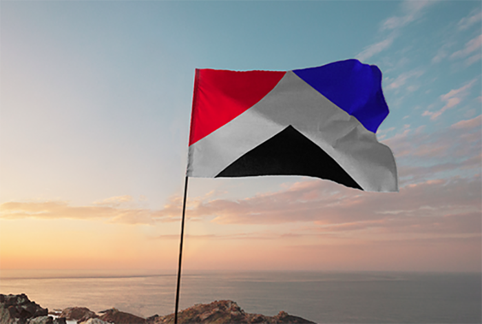
Stumping up $20k and galvanising designers up and down the country, he got them to come up with something that would tell the story of New Zealand. And Auckland design agency Studio Alexander beat out around 1000 entries for the prize with ‘W? k?inga / Home’.


Like the Auckland Council’s crowd-sourced logo competition a few years back, some design proponents felt the discipline was being devalued by the crowd-sourced submission process and the fact that no compensation was to be given to those who created the designs that went on to be chosen for the upcoming referendum. So the Morgan Foundation’s incentivisation was a welcome initiative.
“Our imagination was captured by the Morgan Foundation’s professional approach,” says Studio Alexander principal Grant Alexander. “A good brief, design professionals judging and an appropriate financial reward. Our design team, Alice Murray, ThomasLawlor, Jared McDowell and I have worked together successfully on other award winning projects, so I felt confident about having a go at the flag.”
In a post explaining the rationale for the competition and the reasons this design won, Morgan said it brings the different parts of New Zealand society together, similar to the South African flag. The three coloured triangles symbolise Maori (red) who invited their Treaty partners to share the land, the heritage of British settlers (blue), and our modern multicultural society (black). These three influences are brought together by the white space, which is also reminiscent of the Maihi (the diagonal bargeboards) on the front of a Maori meeting house.
To choose the winner Morgan enlisted the help of a team of designers Mark Pennington, (head designer Formway), Catherine Griffiths (designer and typographer) and Desna Whaanga-Schollum (Nga Aho co-chair). The judges focused on the flag design, while Morgan was more interested in the story behind the flag. And Studio Alexander’s effort was the one design they could agree told a strong story and adhered to the principles of good flag design, something host of the 99% Invisible podcast Roman Mars discussed in an entertaining TED Talk.
As the judges said: “A thoughtful, well-executed submission displaying pure graphic form, this design reached the judge’s second-level shortlist, before being a late inclusion in the final selection. The symmetry of the composition conveys a formal sense of place and calm, however, there was a reservation that this tended to an overly cerebral geometric, rather than an emotional force which would engender strong attachment and feelings. In one breath this design is identifiably Aotearoa New Zealand, in another it just holds back from entering new territory expressive of inherent explorative and innovative characteristics of New Zealanders.”
- Check out the finalists named by the judges here.
Morgan said Studio Alexander’s effort won because it “meets both criteria or substance as well as flag design requirements. In other words it was the only flag that was on my short list as well as that of the judges.”
Each entry was put forward as a public submission and the winning entry will now be put forward as Morgan’s submission. But there’s no guarantee the consideration panel will choose it as one of the four that are scheduled to be voted on in November.
==========
This is an edited article originally published on our sibling publication, Stoppress.co.nz


