
?And while the conventional FMCG wisdom when in this position is ‘don’t rock the boat’, both brands have called on the Dow Group to give them a makeover.
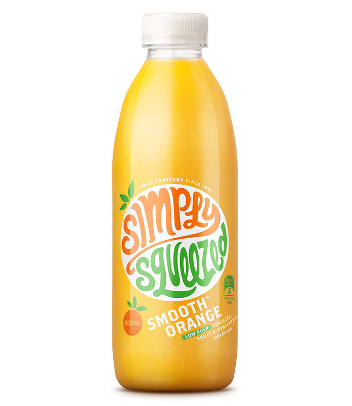
Frucor’s Simply Squeezed has refreshed its look with bolder, brighter coloured packaging by Dow Design, and it’s a big change from the simplistic outfit it wore before. 
Although it’s a “market leader”, Simply Squeezed spokesperson Jo Turner says it felt the need for a revamp because people are now expecting more from juice.
She says since the rebrand was launched in November 2014, as well as the introduction of new products such as a range of smoothies, its quarterly sales are up 15 percent from the year before. ?
Dow Design’s creative director Donna McCort says the juice is “good stuff” but the label and logo didn’t tell the hands-on story of the product.
“The name kind of says it all. We wanted to make it the hero, rather than a pile of oranges. So we built a brand mark that totally owns the pack, and is hopping and skipping. The hand-drawn logo combines movement with joy and comes in a bunch of bright colours to match each flavour.”

Elsewhere in the supermarket, Wellington-based Farrah Breads, which has been slowly dominating the wrap market since its wraps were introduced to supermarkets in 2010, has also been given a creative injection from Dow Design’s sister company Brother Design.
Farrah Breads owner Jovan ?anak says it opted for the change since New Zealand’s appetite for wraps was exploding and competition was high.

The whole flatbread market is currently worth $119 million in New Zealand and US$11 billion annually in the United States.
Farrah’s is currently growing 10.3 percent in value in total grocery on a moving annual total basis and represents 48.1 percent share of the wraps segment. It is currently contributing 30.8 percent of the segment growth.
Not bad considering the company’s humble beginnings in 1998, supplying hand rolled wraps to the hospitality industry. The company now produces 50,000 wraps per hour, the biggest wrap and tortilla production line in Australasia, with its spinach wrap being the best-selling in New Zealand. Its products are now sold to hospitality trade and are available in over 300 supermarkets.
Business development director at Brother Design Jenny McMillan says with Farrah’s in a leadership position, making radical changes could have been risky, but market dynamics made it a good time to make a move.
“We’re all aware that, as market leader, the conventional wisdom is ‘don’t rock the boat’. But the boat in this instance was already being rocked, as so many competitors clambered in and started charging about with launches, derivatives and me-too range extensions.”
Brother Design’s director Debbie Hyde says the aim with Farrah’s new packaging was to inspire people.
“Give them [consumers] the confidence to use the wraps a little more adventurously. So the delicious-looking photography is almost a recipe: you can see what to do at a glance. And the design uses a clear window to show the actual wrap under the photography, making fantastic results seem that much closer.”
This article originally appeared on stoppress.co.nz.