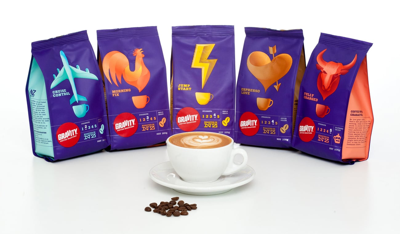


Gravity’s old packaging was apparently being perceived as ‘coffee from outer space’ and like many other ranges, suffered from insufficient differentiation between individual variants.
Bright and vibrant new shades were brought in to contrast against the purple and make each style stand out of its own accord.
Five different illustrations were also introduced to reinforce the benefits of each style and enable consumers to tell them apart at a glance.


