
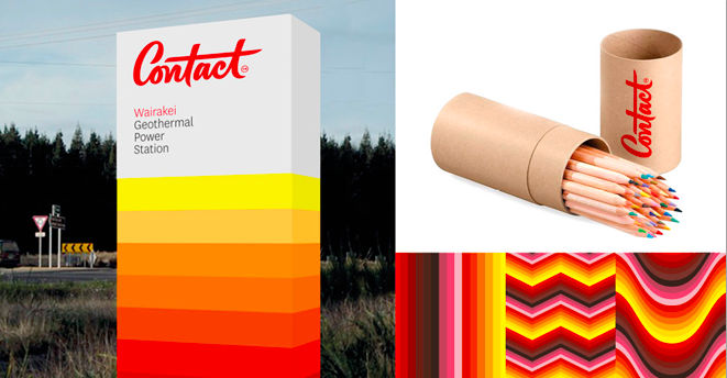
?Contact Energy has added a bit of playfulness to its power of late, with lights in Wellington’s cable car tunnel and a Twitter competition to decide the winner of the People’s Choice Award at the Fringe Festival. And that attitude seems to be in keeping with its whimsical new brand identity, which was created by Wellington’s Designworks and San Francisco-based type designer Jessica Hische.
On her website, Hische says Contact and Designworks wanted “something that felt like it had heritage to it but was still modern and forward thinking. The end result is a brush script that has a lot of energy unto itself”.
{% gallery ‘contact’ %}
There’s generally not too much love for power companies among consumers, and Contact, like most other big energy companies, has long been a fairly fusty corporate brand that tended to stick to the company colours of red and white.? But Powershop has done a good job of adding a personal, progressive touch to this commoditised industry and Contact’s colourful new look, which kicked off with its new look annual report last year, does a good job of making it seem friendlier and more approachable.
So is that a good idea for a big energy company? As design website Brand New said under a post entitled Artisanal Energy:
The old logo was… something. I’m sure there were a dozen positive meanings for what the swooshes meant but, in terms of logos with apparent meaning, it had none. The italic typography was sort of interesting. The old logo simply looked like other energy company logos are meant to look (except this one wasn’t blue). The new logo is a fine piece of lettering, I love me a good brush script as much as the next craft beer maker but it feels too far-fetched to use it for an energy company. It’s obvious (and highly commendable) that Contact wants to look friendlier and more approachable than other energy companies and is looking to visually differentiate itself but this wordmark makes the company look small, like a boutique energy company where you pay for your energy on an iPad using a Square and take it home in a mason jar with a letterpress label on it and a candy-cane-colored ribbon tied around it. If I were buying marshmallows I would love this and think it’s perfect.
Shaun Jones, manager, corporate communications, customer Insight, marketing and communications at Contact, says the new look is being progressively rolled out over an 18 month to two year period, so it can be introduced “in a cost efficient manner”.
This post originally appeared on StopPress