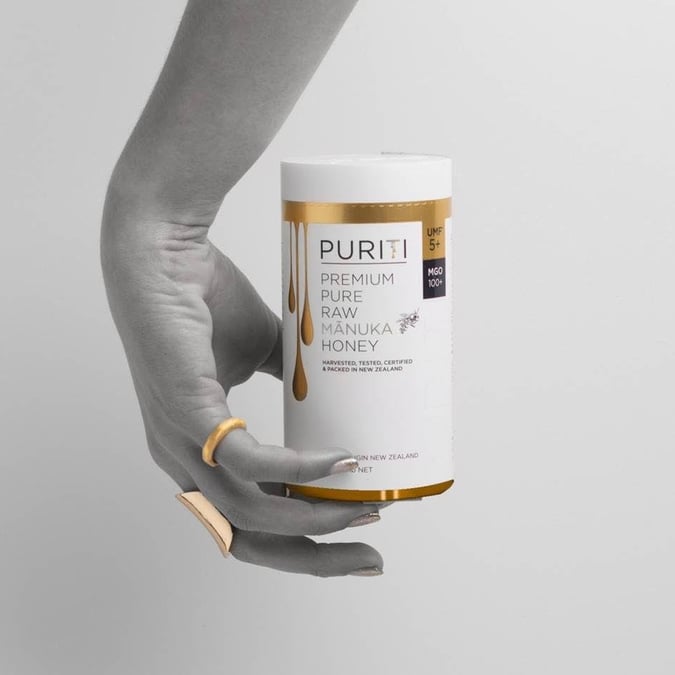
Steens Honey teams up with David Trubridge, Think Packaging and Wrapology to create a new premium m?nuka honey product


The operation is intensely seasonal and is based on the short period m?nuka flowers are open, where bees are able to harvest the nectar to make the honey. According to Steens Honey, its unique WholeComb extraction method captures more of the health benefits of the honey, which are generally lost through commercial honey pasteurising and filtration techniques. These rare properties means there is limited amounts available annually. Steens global brand manager Todd Murdoch further explains the idea.
“Our target customers have an affinity with M?nuka honey and view it as being the healthy essence of New Zealand’s most remote natural environments,” Murdoch says. “It was this insight coupled with the fact that the highest grades are used for gifting, that inspired us to add another uniquely New Zealand twist to this limited release by collaborating with some of our best creatives.”
The focus on quality is further embodied in how it’s packaged. This fell on the shoulders of designer, David Trubridge, who bucked existing styles of m?nuka honey packaging and focused on the relationship between the bee and the m?nuka honey. Notably, this was shown through in the use of colour as bees are innately attracted to brighter colours.
{% gallery ‘trubridge’ %}
Trubridge says, “We rethought the whole idea of honey packaging, which tends to go for the gold connection, partly because of the colour of the m?nuka honey, and partly because of its value. So, we decided to do something different. We focused on the essence of bees and honey and bright colours.”
Additionally, Mat Bogust (founder of Think Packaging) and Trubridge have designed an experience, which recreates the journey of the honey bee arriving to the flower. This is featured on the inside of box where the petals of the flower are used to pull the jar of honey out.
Trubridge says, “It’s a very kinetic function, it’s not just a visual piece. It was a challenging and lengthy process to execute the design. We meticulously handcrafted and engineered everything, ensuring the outer box and the flower perfectly and seamlessly opened, revealing the jar inside.”
Further features see the jar secured by two straps – which keeps the m?nuka honey secure during transit and general movement –as well as a friction fit booklet holder on the underside of the lid – revealing the honey’s benefits and origin.
Trubridge says, “It’s something to come up with an idea, it is another to make it. We did a number of experiences with paper to try to make it work, it was quite tricky, and it wasn’t until Mat Bogust came in from Think packaging before we realised this.
“He is a brilliant maker with materials, what he can do with paper and cardboard is incredible, we had an idea but he made it work.”
Another party who assisted in the project was offshore packaging manufacturer, Wrapology, who managed the production. The company was behind the fabrication and the wrapping of the box, as well as the dye cutting for the flower. And was chosen because of its skill in hand assembly and ability to finish off components, which were vital to the projects success.
The project is considerably different from the vernacular lighting projects customarily aligned to David Trubridge design, yet it retains similarities in the creative process.
“While we are well known for our lighting, we do a whole range of different design projects, from big outdoor sculptors to small packaging like this. The more variety, the more interesting it is for us.
“While this is not recognisably Trubridge in its look, it absolutely is in its creativity.”


