
Why all design is a political act: Raph Roake shares his transition into the industry
Although he stands on young legs, Roake has an experienced eye. His portfolio is varied, yet retains a distinct voice seen vividly in his project – ‘All design is a political act’ – a collection of interviews hinged on design ethics.
{% gallery ‘ad’ %}
The project spurred during a guest lecture when Massey University design alumni Seb McLauchlan – who currently works at London based design studio OK-RM – ruminated whether ‘all design is a political act?’ , which sent Roake into a chamber of contemplation.
“At first I didn’t understand what he was saying, but it stuck with me. You can always bring design back into the political – not necessarily in the context of politicians jerking it out in parliament – but in your decision of who you work for, what projects you are involved with, and who you hire.”
The process saw Roake reach out to various acclaimed designers, such as Mary Faber, Thierry Blancpain, and Michael Bierut, and others, where he posed questions of how to navigate ethical tensions in design practise.
Roake says one of the most pivotal points in the project was when Michael Bierut, designer and partner at Pentagram, issued the response: ‘The biggest challenge we face is that we live in a vast, interconnected world and almost any engagement with it on any level brings a risk of compromising one’s ethics’.
Roake states,“That to me felt like this is going to be an issue at some point, but the only thing you can do is try to engage really positively with everything that you can. To try your best, not be frightened and understand that this is going to be an issue for you because of the world that we undertake.”
Other answers Roake resonated with were Thierry Blancpain and Noël Leu – founders of independent swiss type foundry Grilli Type – who theorised that as a business they can’t be discriminatory in regard to what clients/customers they get.
“They sell a product to everyday people or business who all buy and sell that product under the same price. Obviously, they wouldn’t be stoked if a tobacco company used their typeface, but they don’t see that as their job to morally police that.”
The project is as equally abstract as it is grounded in political rhetoric. And It’s clear that he has put balanced consideration into both the visuals and the dialogue. This is seen in the fitting design arrangements which allow for space among dense text.
The layout canvasses a salutary white background against thin lines to frame the text. Roake tells me, “these were chosen to mimic the grid harking back to early web design”, and continues to dispatch his own work: “using Times and Helvetica might be understood as a utilitarian decision, an egalitarian approach, a humbleness. Mixing Times with Helvetica also takes the edge off the High Modernist baggage that Helvetica travels with. Times brings some significance of authority, through its connections with news publishing.”
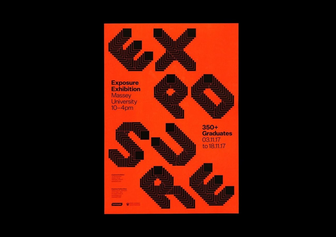
Another integral piece in Roakes cabinet is his gold pin winning ‘C.O.C.A Exposure Brand Identity and Website’ designed in collaboration with Luke Hoban and Jeremy Hooper. The collection of works seeded when they approached Massey University with a proposition – to allow students to create the branding for their graduate exhibition.

Roake shares how the idea was mooted: “We thought that as a student cohort, we should be representing ourselves in all aspects of the exhibition including the external communication, way-finding/signage and online in the form of a promotional and archival website.
“We wanted to begin to create an evolution, year by year, rather than totally rehauling the identity. The two aspects of the previous years identity that we looked to evolve were the colour and the graphic system. The fluro worked excellently for external communication so we looked at the same paper stock pallet and settled on a blood orange. It worked the best in terms of switching between the negative and positive printing and could be receded elegantly in negative or shout in full orange when the situation called for it.”

Roake says the graphic system was examined and conceptualised by university experiences. He shares key design components of the works: “We chose Untitled Sans as our secondary typeface because we wanted to pair the bold typographic forms that we had created with a neutral, plain face. This decision was also informed by how we wanted to approach the different levels of communication. External communications needed to be loud and grab people’s attention, way-finding around the exhibition itself needed to be clear and stand out.”
Both projects resemble Roakes fruits during his time spent at Massey University in Wellington, as he follows a path travelled by student designers keen to implant themselves into the industry. So, what are some of his learnings from working for a university?
Roake says, “There is no one solution to a design problem. And that was sometimes the rhetoric that was communicated at Massey, was that there is a single solution as opposed to a more investigative approach.”
Asked how much value he attaches to his awards, Roake says, “It’s a sensitive topic, but I do place a lot of importance on them for me. It’s got me in the door to the industry and validates that your work is of a certain calibre. DINZ have done an amazing job at building the awards and has helped to get the public to understand the value of design. It’s also nice to be recognised for the work you have been flogging out for a year.”
Further questioned whether he believes the awards are representative of the top student talent – and if student projects should be gated from industry work at the awards, Roake says, “I think it is. And it is a really good thing to have a student category because it is distinct as to what it is based on. It’s a level playing field, and is in an area you personally have investigated in with no client involved. Although we had a massive client in the university. But seriously, it is the most even keeled field that is available at the awards and it’s really important to have that category.”
Moving ahead, for Roake it will be less about bathing in his pool of success and more about his continued kayak upstream, as he joins a cluster of young talent paddling into the industry.