
The Auckland roaster and café company was founded in 1992, and although the distinctive atom logo was recognisable, it was outdated, says creative director Jon Chapman-Smith from Fuman graphic design studio, which undertook the rebranding.
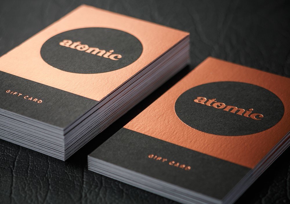
He says they opted for a simpler logo, for “a more modern look”. They also decided to add metallic copper foil, and a “hand crafted type” to the mix, and drop the “since 1992” tagline.
One problem Atomic had with its old black-on-black look was legibility, Chapman-Smith says, and the copper was introduced as the brand’s “hero colour” to stand out.
Still, the use of copper foil wasn’t the easiest choice, he says.
“We were well aware of the challenges of using foil treatment across an entire brand. This is precisely why we chose it.”


