You wouldn’t think that a standard cabbage tree would be the inspiration for such a vibrant space, yet the Titi Tutahi, which is the cabbage tree standing alone, was an important part of Newmarket’s history which the team worked hard to implement in the space, yet with a modern outlook.
“For us Newmarket is an incredibly concrete place,” says Evie Kemp, designer behind the café’s ?murals and other decor. “Newbie goes against that and we wanted to bring in a bit of sunlight and love and that natural element. We kept it quite New Zealand rather than making it too generic.”
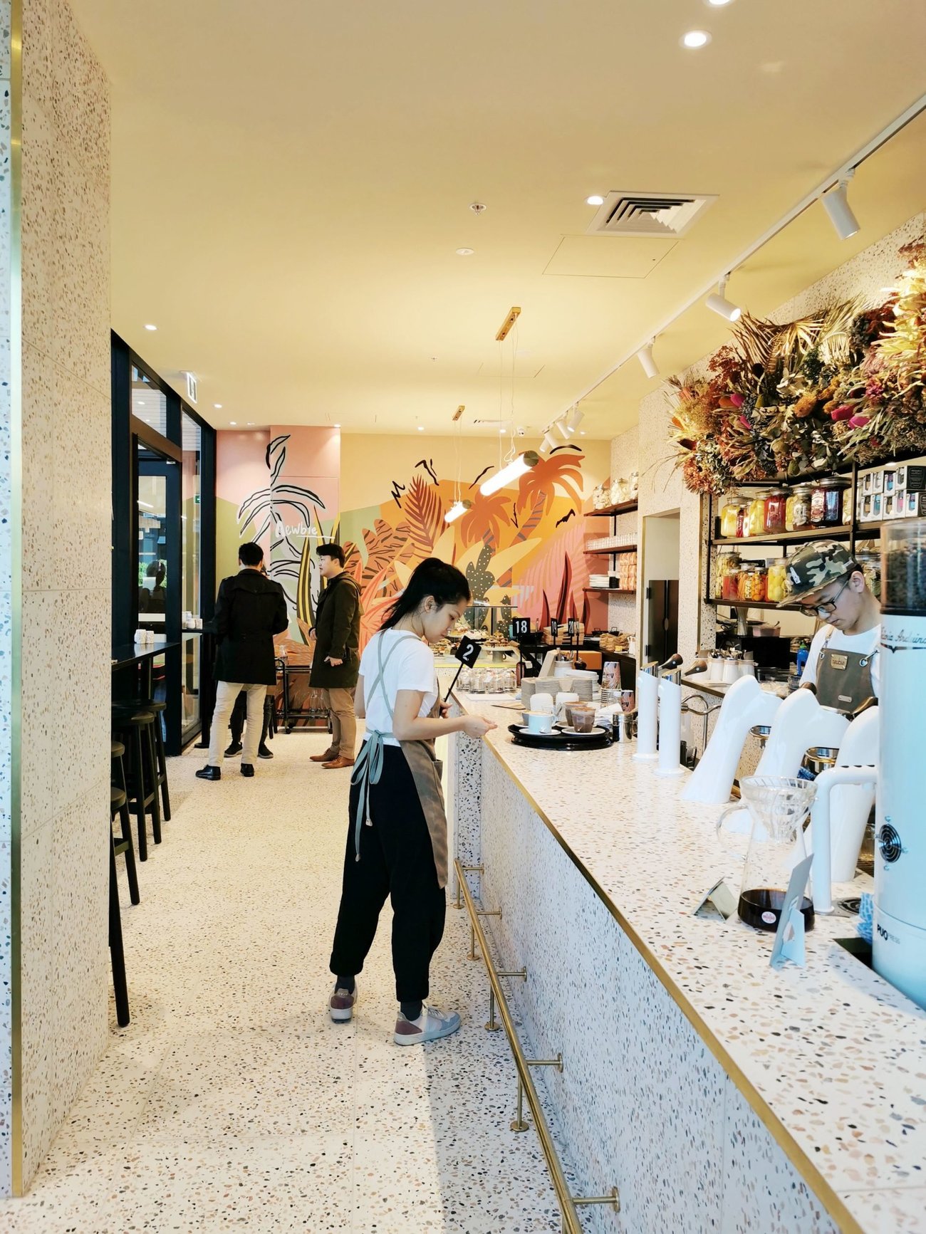
Located off Broadway, the space is anything but generic, with bright tones of onyx, butter yellow celling, intricate tilling, colourful murals and large dried flower arrangements, it is a space which is both inviting and invigorating in design.

“Material Creative have really linked it back to that ‘art deco’ heyday in Newmarket, when everything was at its most fabulous.They added in that plant detailing to signal what the area was before the city had expanded that far,” Kemp says.
Kemp, a known designer based in Mangere, was tasked with brining the space to life with her designs. Using the fabled cabbage tree as the main source of reference for the mural wall, logo and décor aspects such as coffee cups and upholstery.
“I’m just really happy to see such a cool collaborative space, the thing I’m most proud about is just being part of it. Obviously, I love the huge mural, I think it all ties together nicely. It’s amazing to see some color and pattern in the area as well.”

Liv Patience, director and interior designer at Material Creative, agrees with Kemp that Newmarket traditionally forgoes colour for industrial design.
“We saw an opportunity to create a little jewel within the area. We love working with colour and it is just so easy to bring it in, because in Newmarket they’re not very adventurous in terms of their exteriors and design. At Material Creative we like to supply a unique point of difference.”
Newbie was named for its location in Newmarket as well as channeling a cooler new kid on the block vibe. Patience says as added diversity comes into the area in the shape of the new 277 Westfield, its important for them to have a big effect in a little space.
“Space allocation was a huge shift and did affect how we laid it all out. So, we needed to fit this big kitchen in without it feeling like there was space to walk in and experience the café… Newmarket used to be this eclectic space that had a lot of personality, and that has been dialed down over the years. We wanted to encompass that in this tiny little space and see if we could emulate it.”

Material Creative often start their fit-out journeys with research of the area, which lead them to the cabbage trees importance which they worked to be consistent in the cafés design and allowed them to differentiate from the foliage trend.
“We could play with design for a lot of the aspects, but at the same time we wanted to teach people about the history of the area too, as it is the story of the café. Flora and fauna at the moment is quite on trend, with the palm tree and Monstera plant, so we wanted to bring some of that element into it but we didn’t want to do whatever one else was doing. So, the cabbage tree was a great opportunity to shift away from what everyone else was doing.”
The colours are a hue of deep browns, light yellows, oranges, greens, blues and pink, with black ascents and light white flooring drawing the space together.
“We thought to do the whole front in terrazzo tiles, and it feels a lot larger and a lot more unified. With the bar that became a whole feature in itself too, so people don’t really notice the kitchen. All the tiles have colour through setting the glass into concrete. We actually found the tiles first, then the colours all stemmed from there.”
“I’m really happy with the tiles the most, because we did have a lot of issues with them,” Patience says. “They came in from overseas and they just ended up beautifully. I love the colour pallet, sometimes on paper you can be really adventurous, and you can choose things which sit on a fine line whether you’ll pull it off or not.

I think once the onyx went in with the butter yellow on the celling, with the tiles and the black accents, we were really happy with how well it came together in the end, it looks absolutely beautiful.”
Both Patience and Kemp agree that new finished space is a striking addition to the building, with a small area being completely amassed by the colourful café.
“That is the great thing with designing for hospitality, it encompasses bringing people together and encouraging community,” Patience says.